


We know you’ve been here:
You’re browsing the Internet and you come across a website or two that you like right away. You aren’t sure why you like them, but you know that they’ve not only caught, but held your attention. Though you may think these sites have something special, the answer to their success is actually very simple: they’re well designed.
We know what you’re thinking. Isn’t design subjective? How could a nice design make such a difference? The simple truth is that when something is well designed, it can make a world of difference. Aesthetic is often everything in today’s highly visual world. Design is as important as your actual business plan because customers respond nice designs.
Website Design Best Practices
But what makes these well designed websites so great, you ask? What do these websites have in common that make them so effective? There are actually a few factors that will catch your eye every time. They are as follows:
Effortless Simplicity
A minimalist aesthetic is one of the biggest trends right now. The best way to attract people to your website is to keep it clean, especially in the above-the-fold space at the top of the page. Keep it simple. You don’t want to overwhelm your viewer. Gone are the days of flashing lights and images. A website with clean lines, sweeping images, and a clear message always gets the best response. An organized website lets your viewer know exactly where they should be focusing. When there are little to no distractions, your viewer should be able to access the answer to any questions that they may have.
Easy to Digest Information
Like we mentioned above, your site should answer your visitor’s questions. Make sure that your well designed websites have all the information that your potential consumers might need. Yet, you don’t want to go overwhelming them. You don’t need big blocks of text offering them all the answers. Remember, the great part about website building is that you don’t have to speak in complete sentences. Keep to the main points, and make it clear how and when your consumers should get in contact with you. If they have further questions, and effective website will point them in the right direction with simple directions.
A Dynamic Set Up
Yes, we did say that the key to having a well designed website was to keep it simple, and now we are claiming that it needs to be dynamic. Seems like an oxymoron, huh? Well, hear us out. When we say that the website should be dynamic, we mean that the energy of the website should be complex and stimulating. How can you achieve this? The right color schemes, fonts, and banners can work wonders. We’ll get more into detail regarding this step below. A visual example can give better context and inspiration. To clarify, while we say that simplicity is key, you don’t want to confuse that for making your site boring. A simple site is a clean site, not a blank, scarce site. Still not getting it? No worries. You’ll see what we mean down below.
5 Well Designed Websites To Give You Pointers & Inspiration
The following five websites each showcase some of what we talked about above. We’ll run through why these sites are so eye catching, as well as highlight what they have to offer. By the end of each, you should have a better idea of how being dynamic, simple, and informative can go a long way.
AirBnB
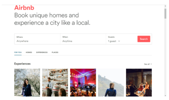
When you first land on the Airbnb homepage, you immediately see the perfect example of a clean design. Right beneath the logo is the legend, “Book unique homes and experience a city like a local.” This gives the visitor a clear understanding of what Airbnb is all about. After this, you can see the following options:
- For You
- Homes
- Experiences
- Places
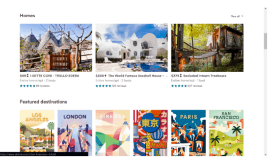
Each of these categories can be further explored below and showcase breathtaking images. These add extra flair and information in one fell swoop. Though the color scheme on this site mainly relies on whitespace and clean font, there is still a dynamic style. The use of image gives something extra, catching attention and making the visitor want to stay and explore.
Other components we enjoy:
- Ample use of image and color
- Minimalist color scheme
- Easy to Understand Layout
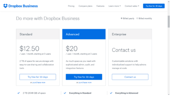
DropBox (Business)
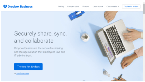
The Dropbox (Business) site has something that stands out right away: a call to action. A call to action, or CTA, gives the visitor something to do when they visit your site. It is best to add a call to action as a form of instruction, especially when you are offering a specific service or services.
Conveniently located up top is the navigation. While this is a typical place to keep navigation, it is even more effective given the page design. The large sweeping image shows people using Dropbox services and the call to action is front and center. When you scroll down, you can find monthly plans for use and payment. In short, this site is well designed because of its use of simplicity, image, color, and direction. Though the site has an apparent minimalist look, there is no denying that it’s dynamic as well. Visitors have a lot to explore and engage with, upping the likelihood of conversions.
Some other components we enjoy:
- The cool use of blue
- Plenty of choices for visitors
- Multiple opportunities to engage the CTA
HubSpot
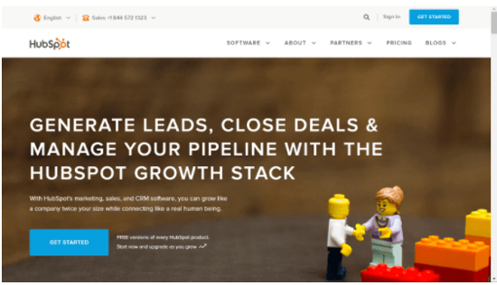
Hubspot immediately tells the visitor what they do on their homepage. After they layout what they can do for you, they offer a call to action right below, asking you to “get started.” The good use of stock photos (who doesn’t love Legos?!) also draws the visitor in by relating to them. Moving on to elements of design, this website also offers a clean, minimalist design. It is very informative but not cluttered, uses images without being overwhelming, and instructive. When you scroll down you can find awesome testimonies. Reviews and testimonies can help a visitor decide whether they want to do business with you or not. Including testimonies from prominent names, as Hubspot has done, can hasten a positive decision. The site also offers a blog, pricing, and types of software. On the first page alone, the visitor is given all the information they need.
Other components we enjoy:
- The vibrant color scheme. Do some scrolling and see the wide variety of color and image they use.
- Breakdown of CRM, Marketing, and Sales
- Instructions on How to Contact
- Dynamic and Informative without Clutter
Peoplespace
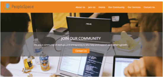
When you visit this site, you’re greeted with two key things: images and information. The homepage immediately tells you about the company what they specialize in, who they are, and how you can get in contact with them. It presents the perfect balance dynamic simplicity. The short meaningful phrases, pictures of people enjoying their services, and clear list of what they offer are aspects you can copy. Scrolling down you’ll see a few more awesome offers.
Each of these services is obvious and easy to identify for visitors. As far as design goes, the excellent use of color, image, and information comes together almost effortlessly. Everything looks smooth, simple, and portrays a clear aesthetic.
Other components we enjoy:
- The slide option of service and images
- Testimonials
- Offered Perks
- Pricing PLans
- Video
The Cutting Edge Landscape
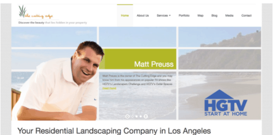
We love this website design for so many reasons. First of all – the dynamic use of color is wonderful. They kept the design simple by making most of the website white. Yet, being a landscape company, they added some extra interest by using splashes of green here and there. We also love how the first thing you see on the website is the trustworthy and warm smile of the owner along with the inspiring slogan, “Discover Your Dream.” As you scroll, the services and testimonies are easy to find. Each of these things gives the site a personable feeling while also being aesthetically pleasing. Other aspects of the site include:
- Accomplishments
- Services
- Portfolio
- Maps
Each of the mentioned aspects give the visitor information without being to wordy. Like we mentioned, you don’t have to speak in complete sentences to get your point across. In fact, when designing your website, bite-sized sentences are more effective. You can see the credentials and accolades of the company and get a clear feeling of why you want to do business with them.
Other components we enjoy:
- Personable Images
- Use of Color
- Easy Navigation
- Slide Images
Conclusion
Part of the secret of a successful website is a great design. Perhaps you picked up on the fact that websites listed here have rather large customer followings. They do great business, are continuing to grow, and offer services people care about and need. Emulating some of what we have outlined here is a sure-fire way to find success in your own site and business. What’s more, if you would like help with designing your website, digital marketing, and other marketing strategies, Directive Consulting can help. We specialize in website design and digital marketing. You can explore our site to learn more about us and what we can do for you. When you let us make one of these well-designed websites for you, you won’t regret it and you won’t forget it!


