

Looking for a list of website design best practices that you can use to improve conversions and drive more revenue on your website?
When it comes to optimizing your website for conversions, there are several different factors to keep in mind. Providing a seamless user experience for your customers, following visual design principles, optimizing functionality and page speed, and maintaining excellent technical SEO are all equally important elements of building a successful website.
To help you get started, we’ve put together a list of 18 key website design best practices that you should be following. These best practices will help you maximize the performance of your website, improve technical SEO, and deliver quality, user-friendly, on-brand experiences for your visitors.
We’ll even include examples throughout so you can see how other successful websites follow these website design best practices to get the best results from their digital marketing efforts.
18 Key Website Design Best Practices to Follow
Deploy Consistent Branding Everywhere
Branding is one of the most important aspects of marketing your business. Your brand includes your business name, logo, symbols, slogans, and images that you use to distinguish your company in the marketplace and communicate your values to prospective customers. Branding gives your business a unique identity and associations that make it memorable for customers.
Having consistent branding on your website means that you’re using every page of your website to increase brand awareness and make your business more familiar and memorable for your visitors. You can achieve consistent branding by:
- Using your company logo as the favicon for your website.
- Ensuring that your company name is written and spelled the same way, and present in the header menu on every page of your website.
- Ensuring that only one version of your logo is presented in your marketing materials.
- Using the same font on every page of your website and across marketing channels, including in videos, white papers, etc.
Use a Consistent and Well-Defined Color Palette
Most small business owners know that branding is important, but those without a background in visual design may overlook the importance of defining a color palette to represent their brand.
Not only does defining a color palette ensure that you’re using the same few colors in all of your marketing materials, but your choice of colors can also actually communicate something about your business. The color red is associated with emotions like passion or anger, blue conveys a feeling of trustworthiness, green is related to environmental consciousness, gold with wealth, yellow with cheerfulness (or danger), and purple with luxury.
Defining a color palette will help guide the aesthetic development of your website and send prospective customers a strong message about the values behind your brand.
Leverage Negative/White Space
White space or negative space refers to the space between page elements, such as between text, or between images or navigation menus on the page. Here’s why it’s one of our most important website design best practices:
- Navigation – Having too much content on the page is confusing for users. It makes it hard for users to decide where to click, what to read, or where to navigate, and they may simply give up.
- Conversions – If you want your users to click onto the sales page, bombarding them with links to 100 other pages is not helpful. Using white space helps emphasize and guide users towards the most important links and calls-to-action on each page.
- User Experience – Pages with too much content on them are simply unpleasant for users. They can cause a headache! Just look at this example!

Image: Here’s a textbook case of a website with nearly zero white space. With so many links on the page, arrows, advertisements bright colors, and flashing lights, this website is potentially confusing and overwhelming for visitors.
Create a Hierarchical Website Architecture
Organizing the content on your website into a hierarchical structure has several benefits.
When you create a hierarchy of content, your website becomes logically organized and human users can discover the content they’re searching for more easily.
Creating a content hierarchy is also the best way to ensure that search engine crawlers can efficiently discover and index new content that you publish on your website.
Here’s how to set up your content hierarchy:
- Your content hierarchy should have a maximum of three or four tiers. This would allow a human or robot visitor to start at your home page and navigate to any page of your website within just a few clicks.
- Your home page should be found at your root domain and should occupy the highest position (Tier 1) in the content hierarchy.
- Tier 2 pages include your content category pages (products, services, solutions, blogs, etc.). These pages should help users navigate to different sections of your website where they can find relevant content to their interests.
- Tier 3 pages include individual product pages, service pages, solutions pages, and blog posts. They should be grouped and published under the appropriate Tier 2 category or section.
Set up Breadcrumbs
Breadcrumbs are a website navigation feature that tells users where they are in your hierarchy of content.
The idea for breadcrumbs comes from the Hansel and Gretel fairy tale where the siblings leave a trail of breadcrumbs to help them find their way back through the woods. In the same way, breadcrumbs on your website help your visitors find their way back from an individual page to the top of that portion of your content hierarchy.
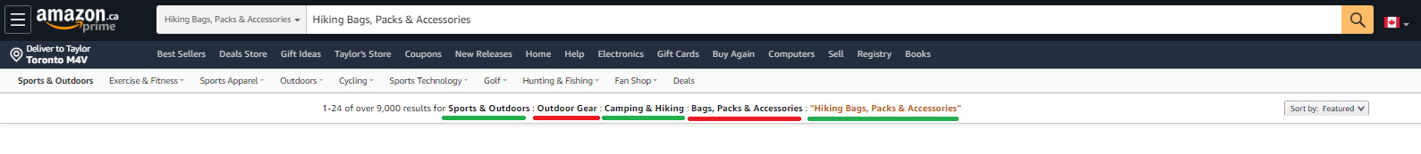
Image: Amazon uses breadcrumbs to help shoppers navigate between categories and subcategories while shopping. In this image, users can use the breadcrumb links (there are five of them, underlined in alternating colors) to quickly navigate to any level in the hierarchy of product categories and sub-categories.
Optimize Website Navigation
Optimizing your website navigation means ensuring that visitors can find the information they want on your website both quickly and easily. In addition to setting up breadcrumbs and a content hierarchy, here are a few other optimizations you should try to incorporate into your website design best practices:
- Add a search bar if your website has a lot of content
- Include “Back to Top” buttons on long pages so users don’t have to scroll
- Use short, descriptive URLs for each page
- Categorize blog posts so users can more easily find older content that’s related to their interests
- Avoid cluttered menus with too many options
Build Pages with a Purpose
When used by a business as a marketing tool, a website has a clear purpose: to drive lead generation and revenue creation for your company.
Your business website should be set up like a marketing/sales funnel, driving users towards the pages where they can take actions that satisfy your business objectives, such as purchasing a product, signing up for an email newsletter, or requesting a quote.
When you add a new page of content, ask yourself:
- Where does this content exist in my sales funnel?
- Where do I want my visitors to go after reading this?
- What will be my reader’s next question once they finish reading this page? What is their next logical step?
Incorporate CTAs to Drive User Action
A call-to-action (CTA) directly asks visitors to your website to perform a specific action that corresponds to your business objectives, such as starting a free trial, registering for a webinar, requesting a quote, or adding a product to their cart.
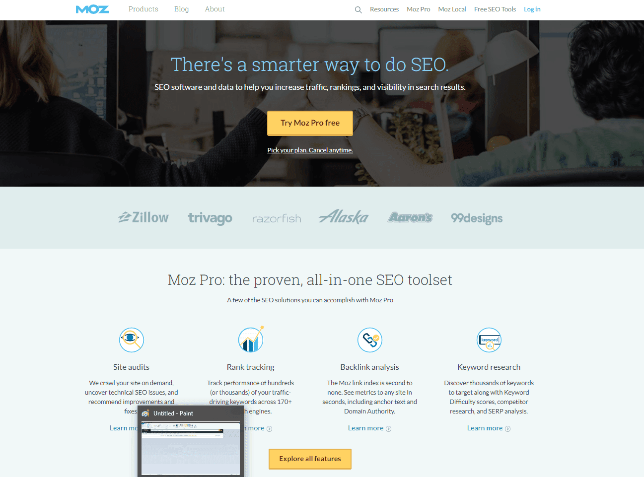
Image: Bright CTA Buttons and ample white space are used by Moz to show visitors exactly where they should be clicking on this page to advance through the customer journey.
An effective CTA drives user action by offering something valuable, creating urgency, promising ease and convenience, demonstrating social proof, triggering the fear of missing out (FOMO), and reducing friction.
Use Consistent CTAs to Reinforce the Desired User Action
If your website uses CTAs on multiple pages, it is a good idea to have similar or identically worded CTAs on each page. Many websites do this by having the same CTA located in the upper-right corner on each page.
Showing users the same call-to-action on multiple pages reinforces the desired user action and makes users more likely to eventually click.
Use Colors or Shapes to Emphasize CTAs
Web designers should use (on-brand) colors and shapes to emphasize their CTAs on each page. A CTA needs to stand out on the page, making it clear where users should click to advance to the next stage of the customer journey.
A brightly colored button with contrasting text is the tried-and-true formula for a CTA that’s easily recognized and tells the customer exactly what to do next.
Use Familiar UX Elements
While it is advisable to design a website with a look and feel that’s unique to your brand, there are some elements that you really shouldn’t mess with when it comes to user experience. Creating a website with familiar design elements makes it easier for users to navigate around your website. Some website design best practices here include:
- Hyperlinks should follow the traditional format with blue underlined text
- Website logo on the top of every page links to the home page
- The primary navigation menu at the top of the page
- Avoid customization options that change the user’s cursor
Create User-friendly Content
User-friendly content is informative, logically structured, error-free, easy to read, and easy to share. Make your content more user-friendly with these web design best practices:
- Use keyword research to inform your content marketing strategy. Take the time to learn and understand what your audience is searching for, then address their biggest needs and pain points with relevant content.
- Use a spell checker to edit your content for spelling and grammar
- Write short, simple sentences to maximize readability.
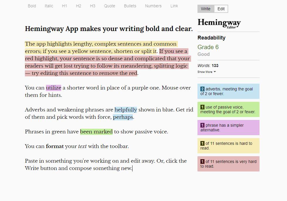
Image: A readability app like the Hemingway Editor can help you edit your content in real-time for clarity, conciseness, spelling, grammar, more.
- Use short paragraphs, lists, and bullet points to break up content on the page and make it easier to read
- Use short, descriptive URLs to make it easier for visitors to share your content or visit your pages directly
Design for Technical SEO Requirements
Designing your website for technical SEO requirements meaning ensuing that search engine crawlers can efficiently crawl and access content on every page of your website. Start by following this website design best practices:
- Categorize your content into sections, but avoid subdomains.
- Avoid framing content from other websites on pages of your website
- Watch out for large media files that can impact page loading speeds and disrupt crawlers
- Avoid publishing “orphan content” that can’t be found by navigating your website via internal links
Design for Mobile Responsiveness
More than half of all searches come from mobile devices, and your website will seriously suffer in the search rankings if it doesn’t work properly on mobile.
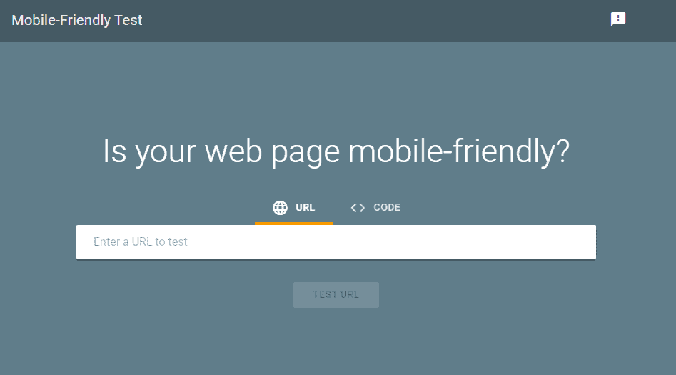
Image: Use Google’s free mobile-friendly test to make sure your website works properly on mobile devices.
A responsive design ensures that every page of your website looks and functions correctly on devices of every type and screen size.
Don’t Forget About Page Speed
Slow page loading times have been correlated with high bounce rates, low conversion rates, and poor organic search performance. Use Google PageSpeed Insights to optimize your page loading times.
Incorporate Human Elements
The strongest businesses understand the power of human connection – even when it comes to their marketing material.

Images: Connect with your customers and humanize your online presence by including images of real people on your website.
Including pictures of real humans on your website is a great way to forge a genuine connection and build trust with your audience.
Include Engaging Images, Graphs, and Data
Humans are visual creatures – we have a strong capacity to connect with and receive information from images. Digital marketers should know that using engaging visuals, graphs, infographics, and data presentations as part of their web design efforts will have a tremendously positive effect on user engagement.
Collect User Behavior Data & Iterate
Optimizing your web design for conversions is an ongoing process – you shouldn’t expect to get it 100% correct on your first try. That’s why there are tools like Google Analytics that marketers can use to collect user behavior data and analyze it for opportunities to increase conversions.
Summary
Thanks for checking out our list of the 18 key website design best practices you should be following!
For an in-depth look at how to optimize design elements on your website, check out our lesson on Directive Institute.


