

There are some website design elements that you can’t overlook if you’re hoping to maximize conversions.
The best digital marketers understand that building an effective website means optimizing the website’s visual design and the user experiences offered on each landing page. Modern web design incorporates a range of key elements and best practices to maximize appeal to potential customers and make website visitors more likely to convert.
If you’re pushing forward with a search engine optimization (SEO) or social media marketing strategy, the right website design elements can help you maximize your results and drive return-on-investment (ROI) for all of your online efforts.
To help you get started, we’ve created this cheat sheet with 10 website design elements that you can leverage on your website to improve visual design, optimize user experience, and drive more conversions.
Top 10 Website Design Elements to Pay Attention to
Layout
Your layout is the basic structure of your website that underlies all of the content you publish.
The most basic websites use a simple layout that includes a header, a main navigation menu, a main content area, and a footer. Layouts can also include sub-navigation menus, space for banners or other advertisements, lead generation forms, a search bar, space for video content, or just about anything else.
Website layouts are extremely flexible, but one of the keys to success is consistency. Each page of your website should use the same navigation menu, logo, header, and footer to avoid confusing users. This creates a consistent and recognizable experience that helps build trust between your customers and your brand.
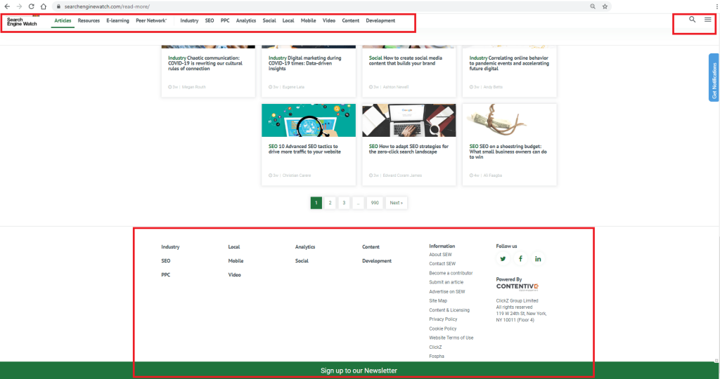
Image: Search Engine Watch uses a consistent header, logo image, navigation menu, and footer on all pages of its website, leading to a consistent and recognizable experience for users.
Color
Color is one of the most important website design elements. Leading online brands understand how color usage, color schemes, and color contrast can be leveraged on their websites to focus user attention and drive conversions.
Websites with too many colors on the page can be distracting or confusing. The most successful websites use a simple, on-brand color palette that consists of 2-4 different colors. After viewing one or two pages, users expect to see those colors everywhere on the website. This creates opportunities for brands to introduce high-contrast CTA buttons that stand out against the background and against the website’s normal color palette.
Shapes
Lines and shapes are a delicate website design element that can be used to grab or direct user attention towards a specific image, piece of ad copy, or CTA.
Triangles, squares, circles, hexagons, and amorphous blobs are all used by web designers in different ways to communicate with the user and grab their attention.
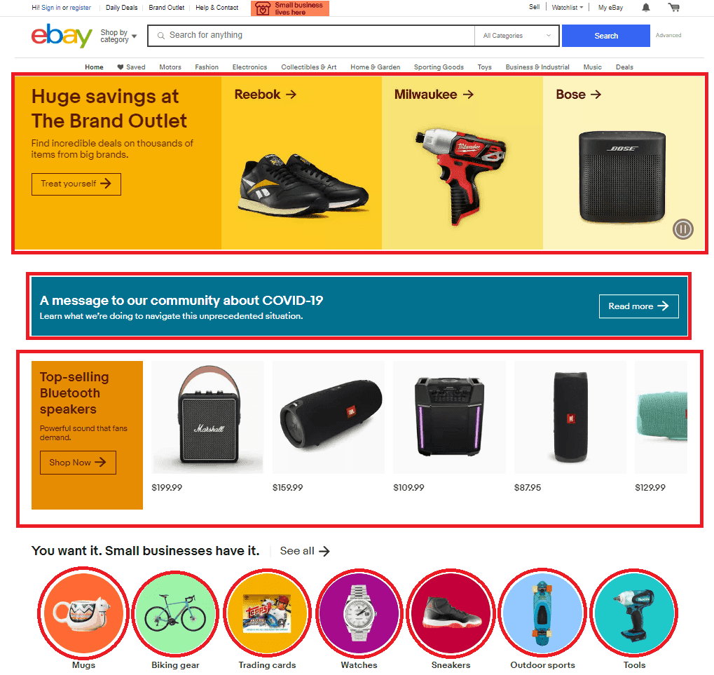
Image: Ebay uses a combination of shapes and colors to highlight featured promotions or product categories. These visual design features stimulate users, encouraging them to stick around and shop instead of navigating away from the page.
Typography
When it comes to reducing bounce rate and driving conversions, great typography can make or break your website. Having great typography means choosing fonts that are clear, legible, visually appealing, and easy to read.
Your fonts are part of your brand, so choose ones that stand out and reflect your values – not Times New Roman or Comic Sans. Each typeface has its own personality and character, so it makes sense to choose a typeface that resonates with your target market.
Marketers can use a combination of fonts on their websites to create contrast and draw the attention of website visitors to a specific area of the page.
Spacing & Negative Space
The spacing of elements on your website and the use of negative space are two of the most important website design elements for optimizing visual design and driving conversions.
Elements on your website such as text, images, advertisements, and navigation menus need to be spaced out properly. This makes them easier to read and helps your visitors find the information they’re searching for more quickly. Packing too much content into a small area makes it hard for users to find the information they want, and makes it impossible for you to efficiently direct their attention.
Negative space is the background of your website – the space that exists between elements. When you reduce the amount of content on the page and replace it with negative space, you leave users with a simplified interface and fewer options. This makes it easier to direct the user’s attention toward your highest-performing offers and CTAs.
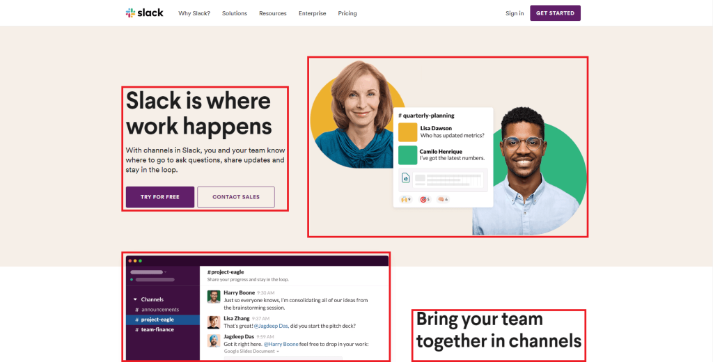
Image: Slack uses lots of negative space on their home page to direct users to their most important content: high-impact valuable propositions and high-contrast CTA buttons that drive conversions.
Directional Elements
Directional cues include things like arrows, pointing fingers or hands, and a face with eyes looking in a specific direction (like at a CTA button, for example).

Image: Unbounce uses directional arrows to draw the user’s attention to these CTA links where they can learn more about specific uses cases for the company’s software product.
Directional cues are obvious in some cases and subtle in others, but they play the same role either way: gently guiding users towards your conversion goals on the page.
Navigation/Breadcrumbs
Designing the navigation menus for your website requires careful thought and attention to detail.
The easier and faster you make it for your website visitors to find the information they’re searching for, the more likely it is that they’ll stay engaged and keep browsing.
Adding simple shortcuts, like a “Back to Top” button that users can click to auto-scroll to the top of the page after reading a long content piece can save users time and enhance their experience. Another great navigation feature is category pages for your blog posts – visitors will be able to quickly discover content that matches their interests, even if it’s months old (all you have to do is spend some time tagging your posts).
Breadcrumbs are another user-friendly feature – they help visitors avoid getting “lost” while navigating your content hierarchy.
Element Sizing
When it comes to website design elements, size definitely matters. Elements need to be sized properly to maximize their visual appeal to users.
Text on a page should usually follow a size hierarchy, with the largest text used for the title and progressively smaller text used for subheadings further down the page.
Users also place greater importance on elements that are larger in size. The most important page elements should be larger and nearer to the top of the page.
Engaging Text & Images
Engaging text and images capture the attention of website visitors and make them less likely to bounce and more likely to convert.
Many online brands are incorporating more images of real people into their web design, in an effort to humanize the online presentation of their brands and build trust with potential customers.
Engaging text is accessible for the target audience, easy to scan, and easy to read. The most engaging sales copy and blog posts avoid large blocks of text, favoring small paragraphs, bulleted or numbered lists, and short, concise sentences with simple language.
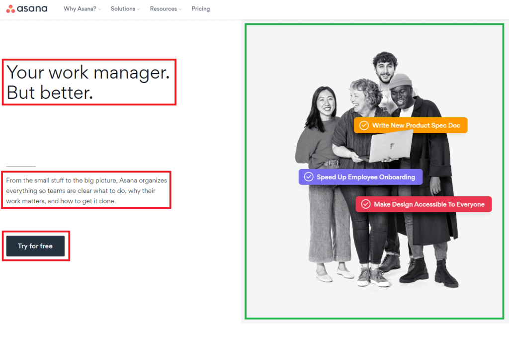
Image: Asana combines effective element sizing with an engaging image to drive conversions on its home page. The text on the left size follows a size hierarchy, with the most important headline in the largest font at the top and smaller fonts used for text further down the page. The image on the right engages the audience, eliciting feelings of togetherness and cooperation – both associated with Asana’s brand.
Powerful Calls-to-Action (CTAs)
If your website is a marketing tool for your business, then your ultimate goal for website visitors is that they’ll be converted into customers.
Maybe your visitors can make a purchase directly on your website, or maybe you’re using your website to generate leads for a sales team – either way, you need to be using calls-to-action (CTAs) to funnel your visitors toward that ultimate goal and give them a reason to convert.
A call-to-action directly invites your visitors to advance to the next stage of the marketing/sales funnel. Best practices for CTAs on your website include:
- Using brightly-colored, high-contrast CTA buttons to draw the attention of potential customers
- Positioning CTAs above the fold
- Using direct language
- Creating Urgency
- Offering something valuable, like the solution to a significant problem
- Offering something free, like a free trial or free product sample
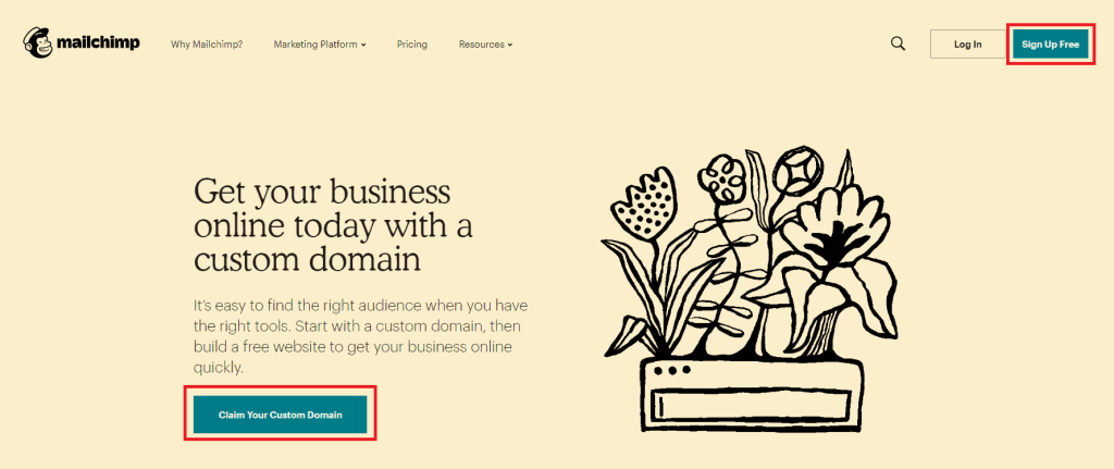
Image: MailChimp’s website ticks all the boxes when it comes to delivering a powerful CTA.
Summary
Thanks for checking out our list of the 10 most important website design elements that you should pay attention to!


