


Interested in mastering website forms design and generating more leads than ever for your business?
Designing forms for your website is both an art and a science. On the scientific side, there are some best practices that should be implemented in almost every website forms’ design to reduce friction and optimize for user experience. On the artistic side, lead forms can vary significantly depending on the nature of the offer and user intent.
The key to effective website forms design is to apply best practices for UX while optimizing your form fields, layout, and design for your unique offer and target audience.
To help guide you through the form optimization process, we’ve created this resource that highlights some of the most important aspects of website form design and how to integrate them into your own forms.
Website Form Design: 11 Best Practices & Examples
Use a Single Column Design & Include Field Titles
When you start looking at different website form designs, including the ones pictured in this article, you’ll notice that some use a two-column design and others use a single-column design. While both options can work, we’d recommend using a single column design in most cases. Here’s why:
English users read left-to-right and top-to-bottom. When you use a two-column design, users can get confused about the flow of your form – should they go left-to-right on every line, or fill out the first column and then the second column?
Using a single-column design makes it easy for users to figure out how to fill out the information you’re asking for in the most logical way.

Image: Jamf’s single-column website forms design offers a great user experience – it’s easy for prospects to figure out the flow and add information in a logical order. Source: Jamf
Another feature you’ll notice in the example pictured here is the field titles included with every form field. Field titles should be positioned above each of the input fields and aligned to the left – this helps ensure that users will understand which titles are for which fields and enter their information in the right location.
Guide Customers with Placeholder Text
Another way you can optimize your website forms design and make life easier for users is by adding placeholder text. Also known as “hint text”, placeholder text is automatically placed into the form fields when a user loads your form, but it will be removed once the user begins typing their information into that field.
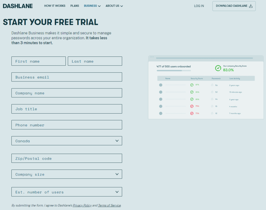
Image: Dashlane uses placeholder text in every field of this form to guide customers through the process of starting a free trial of their Internet security products. Source: Dashlane
In the example pictured above, Dashlane uses placeholder text instead of field titles to guide users through the sign-up process.
One benefit of this design choice is that it reduces the total size of the form since the field titles would take up additional space between the form fields.
A drawback, however, is that the fields are no longer labeled once the user starts interacting with them.
In general, we’d recommend using both field titles and placement text to label form fields, unless there’s a compelling reason to use just one or the other.
Enable Autofill to Reduce Friction
In today’s consumer culture, your prospective customers expect a convenient sign-up experience that’s as painless as possible for them.
That’s what reducing friction is all about: making the process of engaging with your website lead forms as painless as possible for the customer – and one of the best ways you can do that is by enabling the autofill feature for your website forms.
People got sick and tired of having to type out their personal information into every form, so Google created a Chrome Browser feature called Address Manager to help streamline the process.
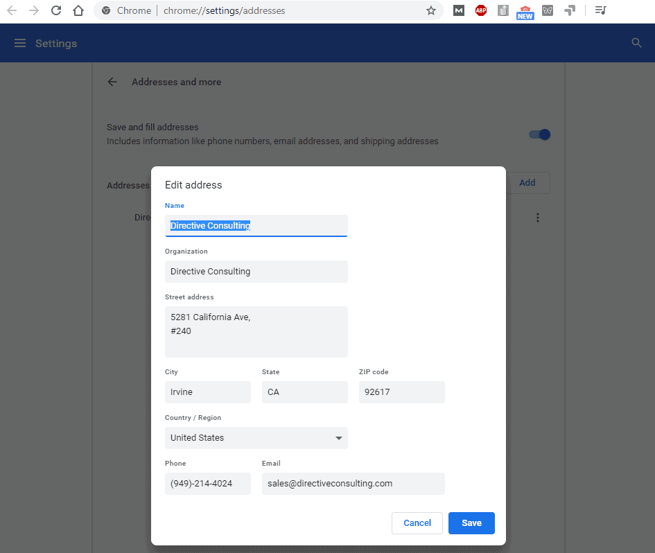
Image: Access the address manager in chrome settings and you can customize your own contact information to use autofill any time you encounter an autofill-enabled form on the Internet
Once users have saved their form data into the Google address manager, they can use it to automatically populate form fields with their information before signing up for a free trial.
In the following image, we’ve highlighted all form-fields that we were able to complete just by selecting the correct autofill option from the drop-down menu.
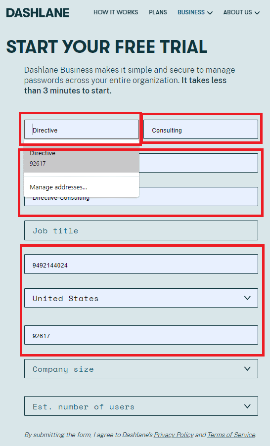
Image: This Dashlane form has a total of 10 fields, but 7 of them can be populated automatically using autofill. This significantly reduces friction by cutting down on the time it takes for users to complete the form. Source: Dashlane
In just a couple of clicks, a user can fill in 70% of this form with data that’s already been saved in their browser. This friction-reducing feature ultimately makes users more likely to complete the form and register for a trial.
Avoid Asking for Excess Information
Another way to reduce friction when you design forms to generate leads on your website is to avoid asking for excess information – however, there is a need to strike a balance here.
On the one hand, collecting more information about prospects can help you understand more about your audience and develop new ways of marketing to them in the future. Collecting more information also helps with lead scoring and qualification.
On the other hand, asking for too much information can make prospects feel like their time is being wasted and result in reduced total lead volume.
It’s worthwhile to experiment with different lead forms and find the sweet spot where you’re effectively qualifying prospects without sacrificing too much lead volume.

Image: Sophos does a great job of pushing this free trial with a simplified lead form that asks for just your first and last name and business email. Business email fields typically don’t accept email addresses from public providers like gmail and yahoo, so Sophos is already avoiding a lot of spam registrations and qualifying these leads by what company they work for. Source: Sophos
Use a Progress Bar for Multi-Step Forms
Multi-stepped forms can be off-putting for users if it’s unclear how long a registration or checkout process will take on your website. Not only is this poor UX design, but it will more than likely have a negative impact on your overall conversion rate. The best way to address this source of friction is to include a progress bar that guides your customers through the multi-step sign-up.

Image: Amazon is a world leader in technology and eCommerce, so we should probably take notes on how they’ve used this progress bar to guide customers through millions of annual transactions on the Amazon platform. This user-friendly progress bar shows customers exactly where they are in the checkout process and what steps are left to complete when placing an order. Source: Amazon
Multi-step forms are a natural fit for eCommerce checkouts, but they also work with multi-step free trial forms for SaaS companies.
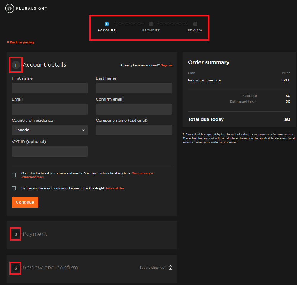
Image: Pluralsight uses a progress bar and collapsible form containers to guide customers through a multi-stepped free trial registration process on a single, user-friendly page. Source: Pluralsight
Indicate Required Fields & Optimize Error Messages
When it comes to indicating required fields and optimizing error messages, there are several different ways you can implement.
Most website forms simply place an asterisk at the end of the field title (often in red) to indicate required fields. Others, like the Pluralsight form pictured below, add text to field titles to indicate which fields are optional.
We generally prefer the asterisk method, as it’s more familiar to users.
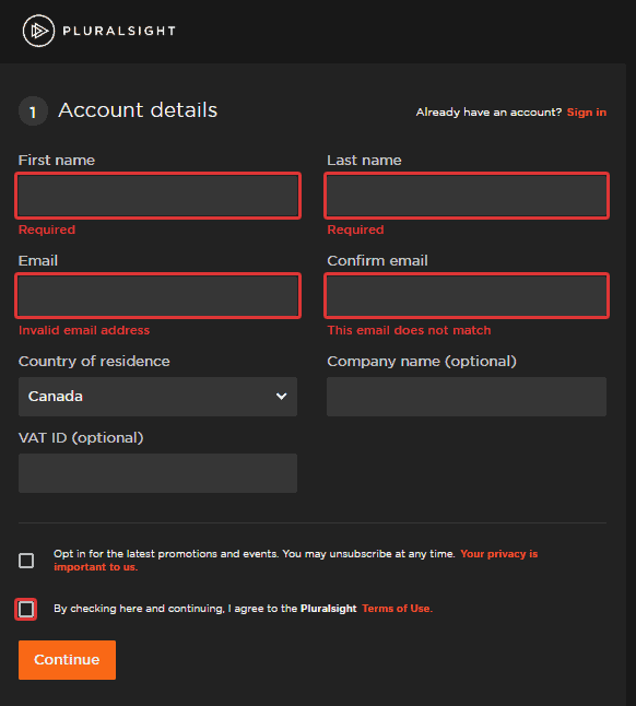
Image: When a user tries to submit an incomplete form, this Pluralsight form indicates exactly which fields need to be updated to rectify the issue. Source: Pluralsight
It’s also important to think about what happens when users fill out a form incorrectly. Ideally, there should be individualized error messages for every form field, indicating whether data was missing, invalid, or incorrectly formatted. In the image above, Pluralsight uses individualized error messages for each form field that was missed.
Validate Input in Real-Time
Real-time input validation is a great way to provide incremental feedback and encouragement to users, especially when they’re filling out a longer form with more fields. That little green check-mark gives users a feeling of accomplishment and validates that they’ve input the proper information in the correct format, every step of the way.
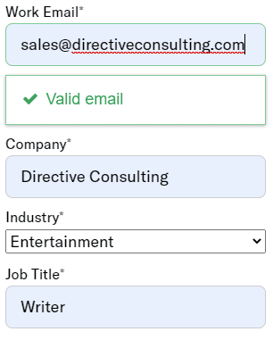
Image: In this clipping of an Airship free trial registration form, you’ll notice that work email inputs are validated automatically. This is common for forms that required a work e-mail, but input validation can be implemented for all types of fields, including email addresses, phone numbers, and birthdays. Source: Airship
Add Assisting Text & Write a Clever Call to Action
Assisting text sits at the top of your form and tells users exactly why you’re asking for their information and what they can expect to get in return.
You don’t have to include a huge amount of detail with your assisted text – just a line or three is enough to help keep users focused on why they’re bothering to fill out your form in the first place.
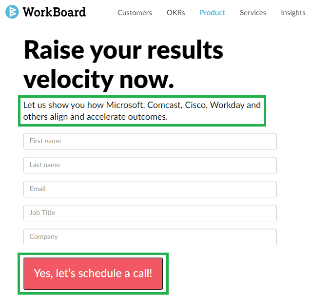
Image: WorkBoard uses assisted text and a customized call to action button, both examples of effective UX design for website forms. Source: WorkBoard
It’s also worth experimenting with your call to action text to optimize for conversion rate.
You may choose to start with basic CTA text like “Submit” or “Get Started”, but these generic calls to action are may be confusing for a prospective customer and don’t really describe what’s going to happen next. We like the example above because it cleverly tells prospects exactly what they’re signing up for, in an enthusiastic and positive tone, and in very few words.
Summary
Thanks for checking out our list of best practices for website form design!
Next, be sure to check out our complete guide to form optimization on Directive Institute! With our step-by-step guidance, you’ll be able to produce fully optimized website forms and maximize lead generation or free trial sign-ups with your next marketing campaign.


