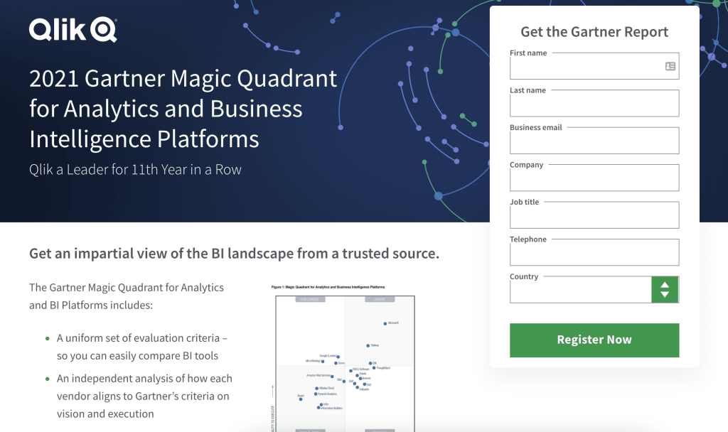
Ahh… B2B SaaS landing page mistakes. See, websites function as an initial handshake in the digital age. Yet, time and time again, we find brands offering sweaty palms or too firm grasps to their potential leads (to continue the handshake metaphor).
These repeated errors result in a poor user experience and a missed opportunity to connect with their target audience. We’d like to take the time to not only highlight what’s going wrong but provide your team with actionable solutions on how to optimize your dedicated landing pages.
8 Common B2B Landing Page Mistakes (And Their Solutions)
To make things nice and clear, we broke down our 8 most frequently seen SaaS landing page mistakes into a mistake, a solution, and—for some added benefit—a why behind the psychology of each optimization decision. So let’s get started, shall we?
1. Mismatched pre-click and post-click experience
Mistake: The ad showed one thing, but the landing page delivered something else entirely, confusing your customer and causing them to bounce off of the page before converting. When we give conflicting information, the person (rightfully) assumes that we’ve made a mistake and we lose their trust.
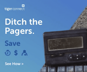
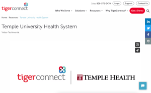
Wait, how exactly does this relate to ditching pagers?
Solution: Consistency is key—not only for paid ads and pages but for your brand voice as a whole! Your ads should be incorporating the same visuals and headline found on the page we’re directing users to—at least for the hero section of the page (the first 700 pixels or so that users see when landing on a website). Once we’ve reassured users that they’re in the right place, we can have a little more flexibility with the sections below as to not be repetitive.
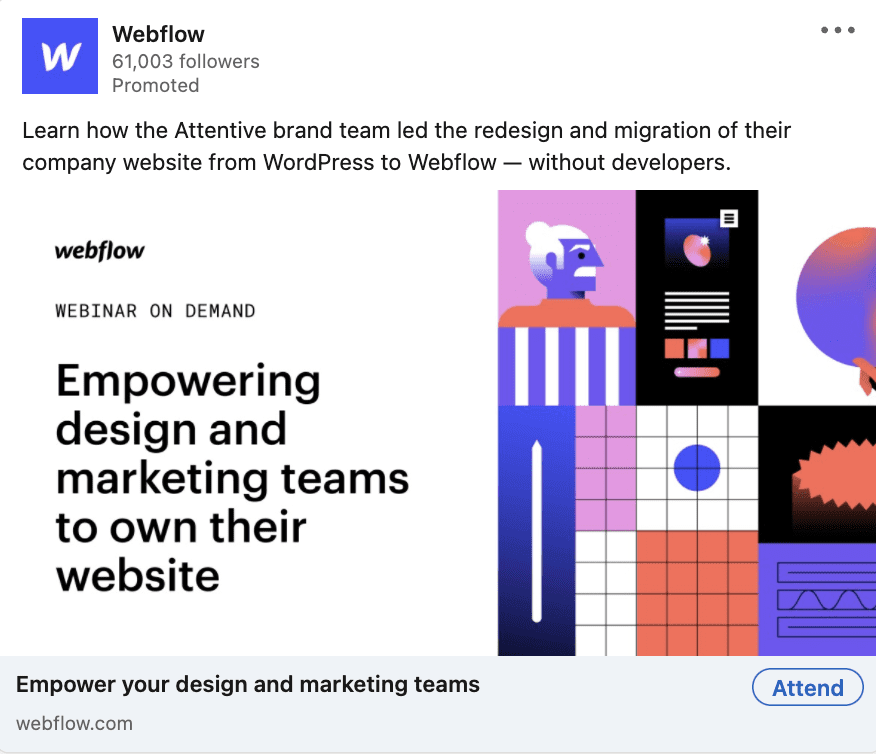
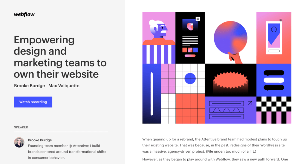
Same imagery, same messaging, consistent offering—we love to see it!
2. Lacking a single, clear call-to-action (CTA)
Mistake: It’s one of two problems: either there are no high-contrast CTA buttons or there are so many, that the user gets distracted from what we actually want them to do. Ideally, we want to give the user one goal in order to keep them on the landing page—not distract them with social pages or ebooks.
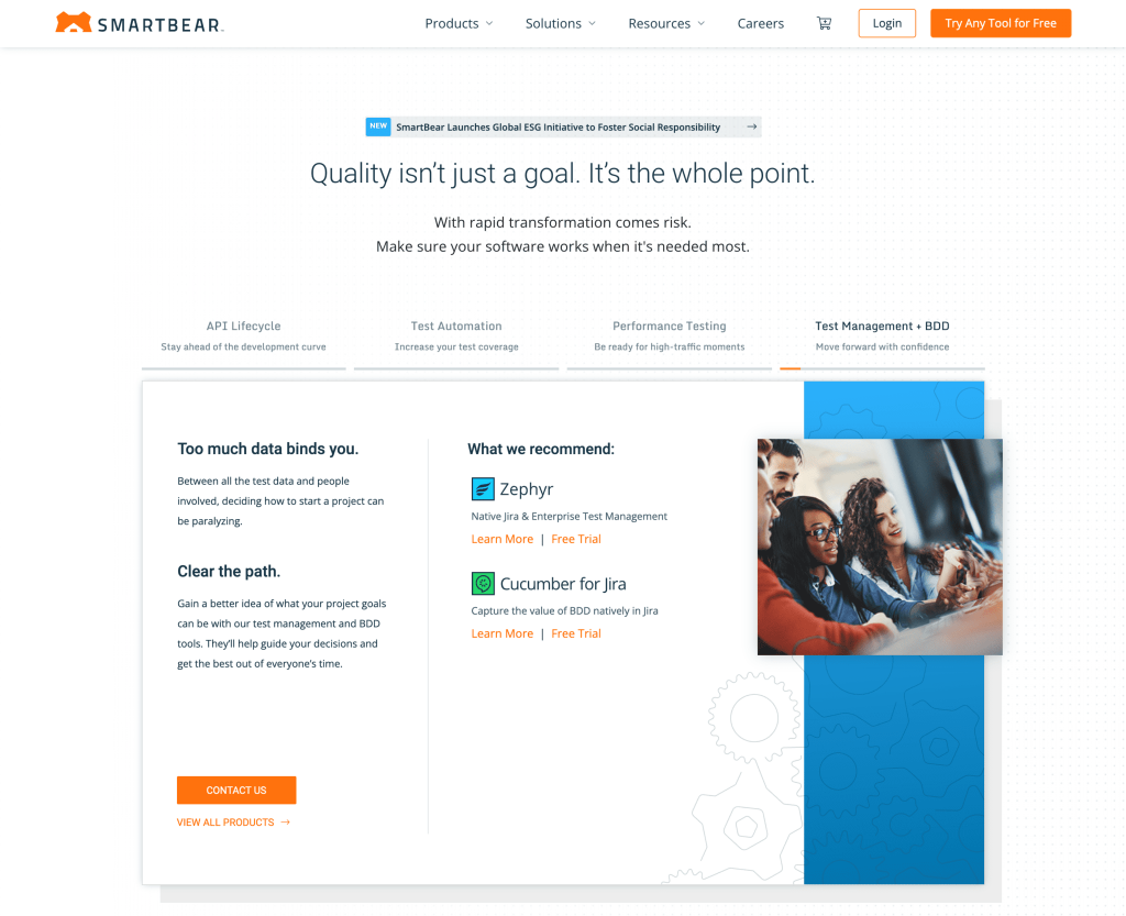
I can log in, try any tool, read about their new ESG initiative, contact them, learn more, or get a free trial and we’re only one or two scrolls into this page.
Solution: Decide upon a singular, actionable goal you want users to take. Then, make your CTA button stand out from the rest of the page with a high-contrast color, used sparingly elsewhere to draw the user’s eyes to it.
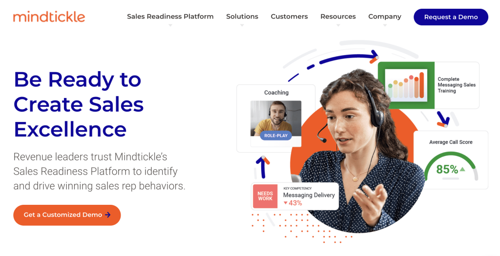
100% focus on moving users to a demo with an orange CTA that stands out on the page.
3. Not outlining what the user will get from submitting their personal information
Mistake: Even with a clear CTA stated on the page, if you’re not outlining what the user will get out of filling out a form, they may not understand the benefit of doing so. Merely saying “get your ebook/demo/trial” doesn’t clearly communicate what information they’ll learn, how long it will take, if it’s worth their time, etc.
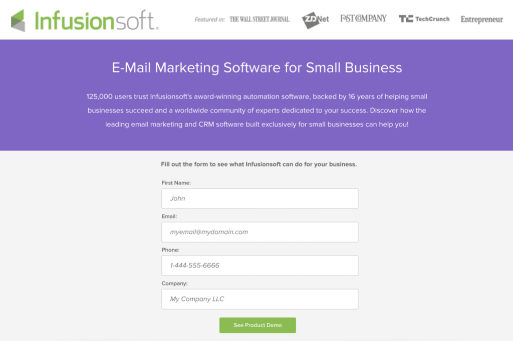
How long is the demo? Is it live? What is it going to cover?
Solution: Put yourself in their shoes—what do they get and what additional questions might they have? Think of the top 3-5 takeaways your user will get in exchange for their time and information and list them out next to your form. Disclose things like how long it will take (a 5-minute read, a 30-minute demo), whether it’s live or on-demand, or if they need to enter in credit card information.
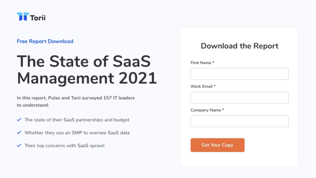
Awesome, I totally understand what information will be included in this download!
4. Asking for too much info in the form
Mistake: Once you’ve convinced your audience to take the next step, they’ll generally move to fill out a form. However, if that form is asking for too much or too personal information, you may miss out on a great prospective customer.
Why on earth do you need my phone number, company, and country for a whitepaper download?
Solution: There are some general accessibility rules to consider, such as keeping field labels outside of the form field, but ultimately it boils down to “what information does our sales team 100% need to know in order to qualify this lead?” Since most sales follow-ups are done via email these days, it’s likely you’ll almost never need to ask for someone’s phone number. But if you have different solutions based on the size of the company, the pain point they’re trying to solve, their industry—those are questions to consider including. Not only will you get a better understanding of how to solve their problem, but you can also ask those questions first to help ease the user into filling out more personal information such as their name and email address.
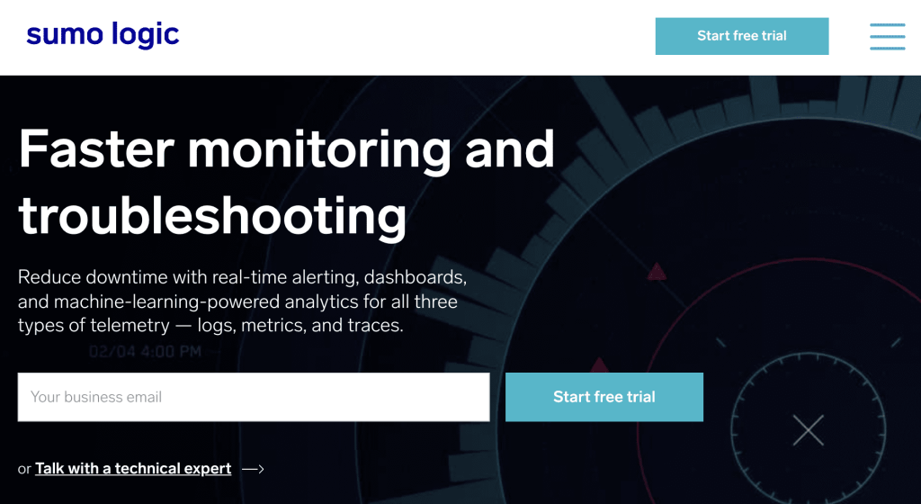
All it takes is an email? Sign me up!
5. No reason to believe
Mistake: You’ve talked a big game about how incredible your solution is but forgot to back it up with any substantial evidence. Your customers want to fix their problems but won’t trust that you have the answer without some social proof.
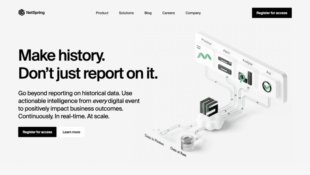
And? How can I trust that this solution will work for me?
Solution: Evidence can come in many forms: a logo farm of clients (bonus points for big names), case studies that outline how you fixed someone else’s problem, statistics from customer success stories. Anything that highlights how you’ve solved the same problems for others, especially if you can highlight different pieces of social proof that resonate with specific audience segments. Even better if you include these above the fold (within that first 700 pixels or so) and sprinkled throughout the page to remind prospective customers that you can be trusted.
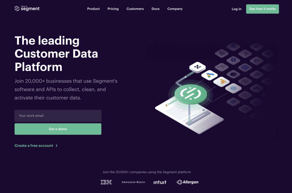
Oh hey, I know who IBM is—they’re a huge, successful company!
6. Telling instead of showing
Mistake: With consumer, attention spans ever-shortening, lengthy paragraphs of text can lead users to skip over the information entirely. The most compelling copy in the world won’t convince your target audience that you have all the answers unless they can also visualize how you’d pull it off. In the digital age, there are more visual learners than ever before and they need to see it to believe it. What you include should clearly communicate a specific benefit or feature—no random screengrabs of dashboards where the user can’t tell what the product actually does.
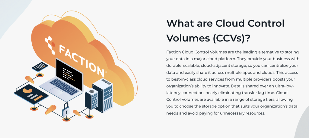
I read 800-page novels on a regular basis but I will never take the time to read a block of text like this on a website.
Solution: There are so many ways to do this—chunking information into bullet points or sections, showing product walkthrough videos, high-quality UI mockups, even lifestyle imagery if you’re targeting a specific industry or persona. If it helps your customer understand how they could use and benefit from your solution, it’s well worth the time and effort to create it.
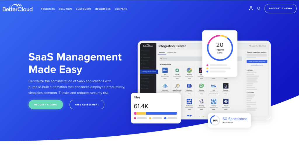
An easy-to-read headline and product shot where the important parts of the dashboard are being magnified in order to help me understand how this platform works!
7. Product-focused rather than person-focused.
Mistake: Donald Miller (author of Building a Story Brand) said it best: “The customer is the hero, not your brand.” When companies only focus on how great they are, they miss out on connecting with their customers’ pain points and goals. No emotional connection means no customer and wasted marketing spend.
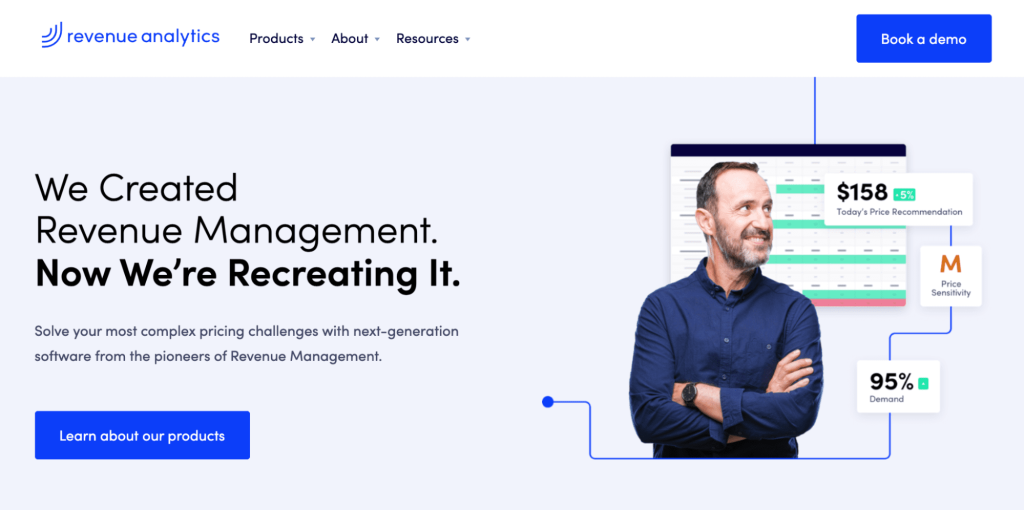
Good for you, but how is this supposed to help me?
Solution: Rework your messaging and visuals to focus on the page’s target audience. Have a pain points and benefits section that highlights how your solution is going to make their lives better. In keeping with the Donald Miller lessons, your brand should be the Yoda to their Luke Skywalker.
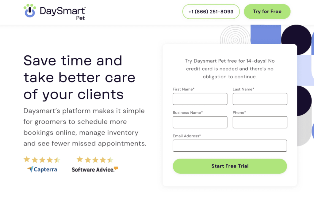
Oh perfect, this is exactly what I’m trying to do here!
8. And lastly… the design sucks
Mistake: Plain and simple—if you’ve got misaligned elements, text that doesn’t meet accessibility standards, a demo video made in PowerPoint, or pixelated imagery? Your users will take that lack of quality control as an indication of how your product looks and feels too.
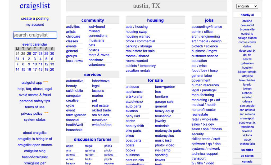
While effective, Craigslist is probably the most anti-designed website in popular knowledge.
Solution: Invest in quality. Directive’s Performance Creative Service team brings strategy together with best-practice land page design to turn page visitors into customers. Our retainer-based model includes full design and build of pages, ongoing variant testing, and image ads for display and social to go with.
Our designers also work side-by-side with an exceptional motion design team for dynamic explainer and demo videos, or just to add engaging motion graphics to your pages.
*chef’s kiss* MAGNIFICENT!
Looking to take your B2B Landing Pages to the next level?
In today’s post-digital marketing world, you can’t afford to put design on the back burner and expect to see results. If you want to truly impress the scrutinizing eyes of today’s SaaS marketers, you can’t afford to have any inexcusable B2B landing page mistakes tripping you up. It’s time we all start investing in creative and PCS services with the confidence we all know it deserves. It’s time to start putting the performance back into Performance Creative Services.
If you’re looking to take your SaaS creative assets to the next level and want to beef up your SaaS design knowledge base, be sure to join Society or—even better—book an intro call with us to see how Directive can help scale your SaaS performance creative needs.
-
Jess Browder
Did you enjoy this article?
Share it with someone!


