Google data studio examples are a great starting point for understanding the power of Google’s data visualization platform for digital marketers.
Every digital marketer can benefit from learning how to use Google data studio to generate campaign insights. You can connect your data from Google Analytics, Google Ads, Search Console, Google Sheets, and other data sources to generate a customized analytics dashboard with the most important information about your campaign performance.
If you’re not quite ready to customize your own performance dashboard, we’ve put together this list of the 14 best Google data studio examples that you can copy. Instead of designing your own dashboard, just copy one of these Google data studio examples and plug-in data from your own sources to make it apply to your business—it’s that easy!
14 Best Google Data Studio Examples to Copy
Google Ads Monitoring Report by Search Foresight
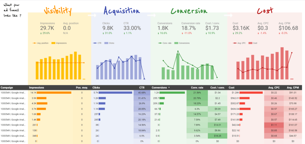
Why You Should Copy It: The first of our Google Data Studio examples, this dashboard makes it easy to quickly measure and compare the performance of your Google Ads campaigns. You can quickly visualize your entire marketing funnel and see which campaigns are generating the most conversions for the lowest CPC. Additionally, you can monitor changes in acquisition rates over time and make strategic decisions on how to focus your conversion rate optimization efforts.
Overview of Google Analytics (Blue World Report)
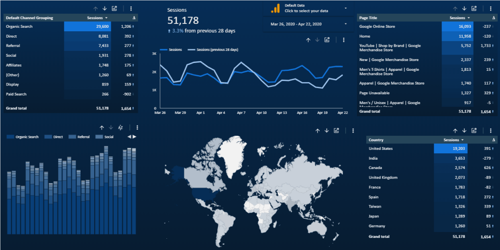
Why You Should Copy It: This SEO dashboard offers broad insights into your web analytics data so you can get a quick overview of traffic and performance. The modules in this dashboard show a breakdown of all traffic by referral source, landing page, and country, so you can see exactly where and how your traffic is originating. You might combine this with another dashboard that shows conversion rates by referral source, then update your marketing strategies to target the most profitable traffic sources.
Performance Dashboard by Aro Digital
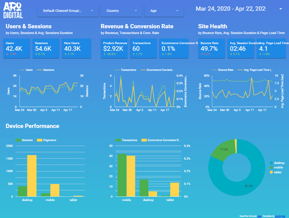
Why You Should Copy It: This dashboard combines conversion rate data with website and device performance metrics, helping users develop insights into the relationship between performance and conversions. Marketers can identify which devices are driving the most transactions, then optimize their landing pages to provide the best user experience for users with targeted devices.
Web Activity Overview Dashboard
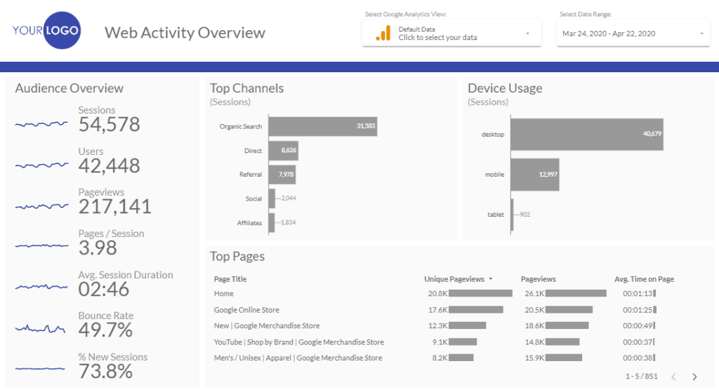
Why You Should Copy It: This simple dashboard gives a general overview of your web activity with 7 key metrics. Even better, each one is accompanied by its own graph so you can see how those metrics are changing over time. This dashboard also helps marketers visualize top-performing referral sources, which devices are most frequently used to access content, and which pages are getting the most views with the longest session times. Use this dashboard to identify optimization opportunities that focus on the most profitable channels and audiences.
Sales & Shopping Behavior Report by My Digital Lab
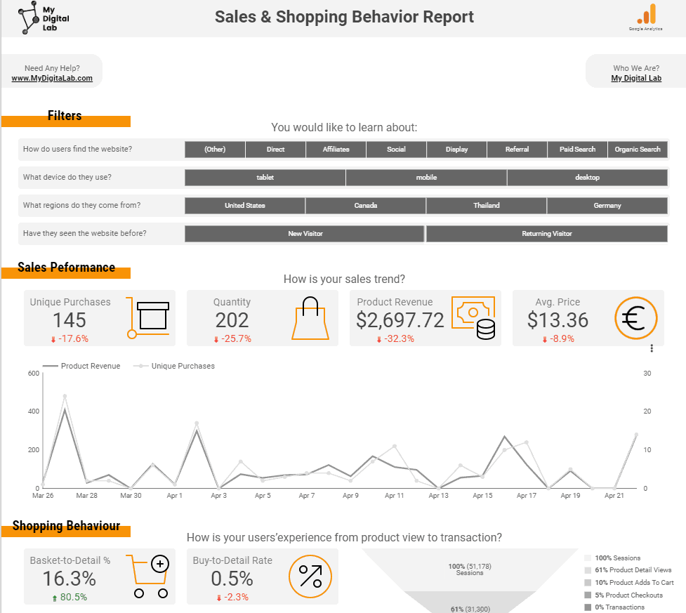
Why You Should Copy It: This dashboard provides a detailed, in-depth look at how users are engaging and interacting with your e-commerce store. Marketers can use it to quickly identify the top-performing products, brands, channels, devices, and referral sources that are driving the most revenue. Additionally, there’s an amazing sales funnel visualization that shows exactly how many users are moving through each stage of the purchasing process. This was the most complete example of an e-commerce management dashboard that we could find.
Wix Site Sample Report
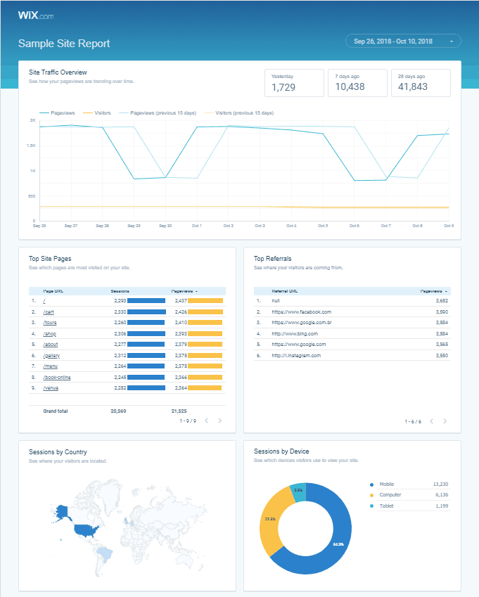
Why You Should Copy It: This Google data studio example was created by Wix to help their users quickly visualize their website traffic data in a way that provides actionable insights. Users can measure trends in their page views over time, see which of their pages get the most hits (and where they come from), identify high-performing referral sources, and segment visitors by city, country and device. Additionally, use the “Popular Times” table to discover at what time in the week your website typically gets the most traffic (Hint: This is the best time to release new content!)
Anthony Bourdain’s Travels and Tribulations
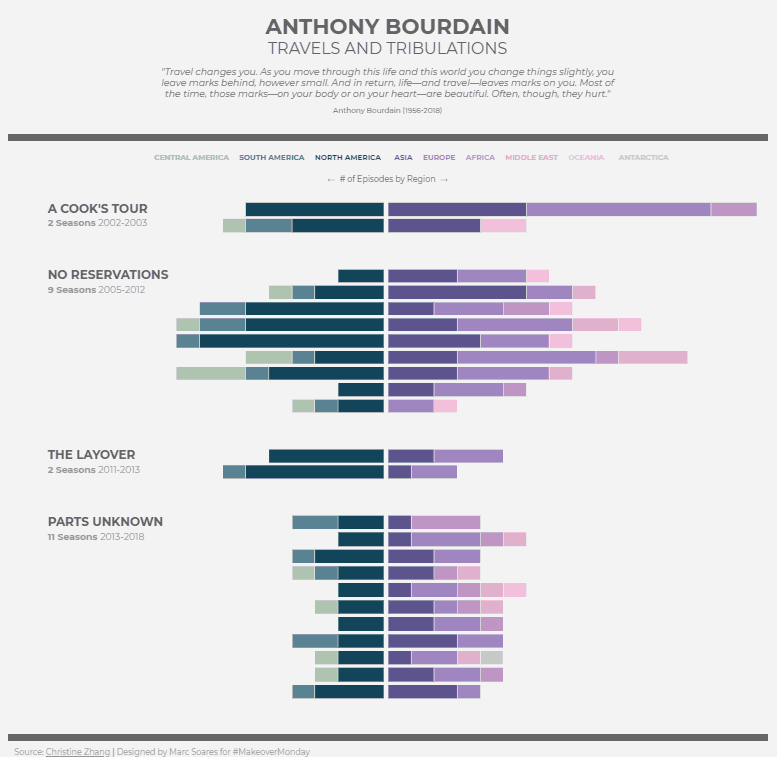
Why You Should Copy It: We included this example because we love how the data here is presented. You could replace “# of Episodes by Region” with “# of Visitors by Region” and use this to visualize referral sources for your website. Then, use the purple-pink side for paid sources and the green side for organic and unpaid sources. Additionally, replace the television seasons with the last 24 weeks or months of traffic on your website. Now you have a week-by-week visualization of exactly how much traffic you generated and where it came from!
How Much do Countries Invest in Research & Development?
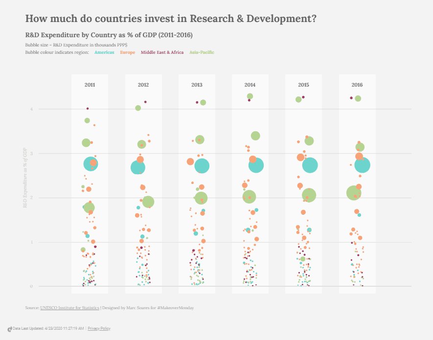
Why You Should Copy It: Here’s another one of our Google Data Studio examples that’s presenting data in a unique and interesting way. Here’s how to use this differently: Plot the landing page conversion rate on the Y-axis (change the scale to whatever fits your campaign/business), and plot weeks instead of years on the X-axis. Each dot will represent a specific page on your website, with its size corresponding to how much traffic it got. Now you can see exactly which pages are converting the most and start sending your best traffic in that direction.
Marketing Dashboard (Goal Completion by Channel)
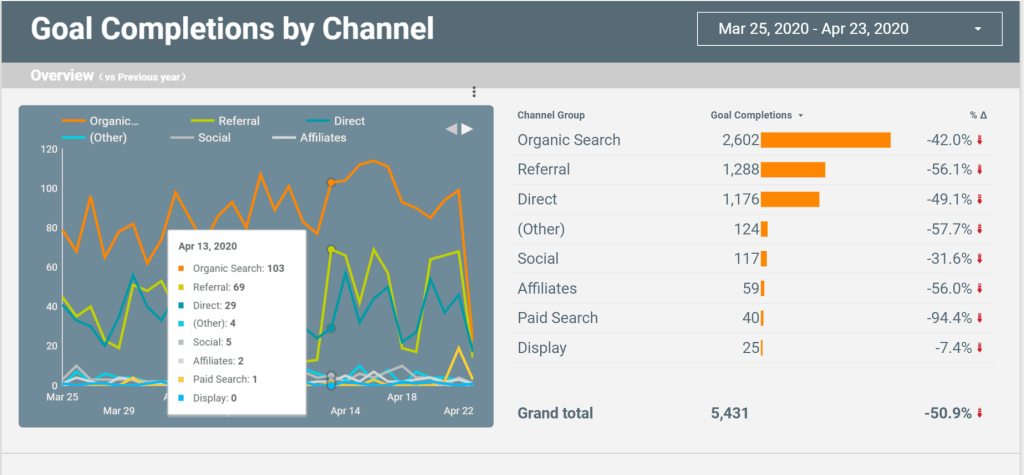
Why You Should Copy It: If you’re working with on-page conversion rate optimization for an e-commerce store or any type of online lead generation, this dashboard is worth replicating. Use it to generate a quick overview of how many goal completions your store or landing pages are generating across all platforms and referral sources.
Google Merchandise Store E-commerce Report
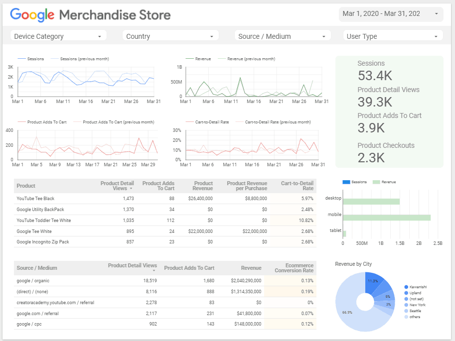
Why You Should Copy It: Pay attention to this dashboard. This is the dashboard you should already be using. That’s because all of the data you see here can be instantly and almost infinitely segmented using the four drop-down menus at the top of the page. You can choose exactly which countries, which devices, which referral sources and which user types you want to see data for and you’ll see every visualization on the page update when you make your choice. This makes it very easy to dig deep and figure out exactly how specific segments are performing.
Website Analytics Sandbox by ROI Insights
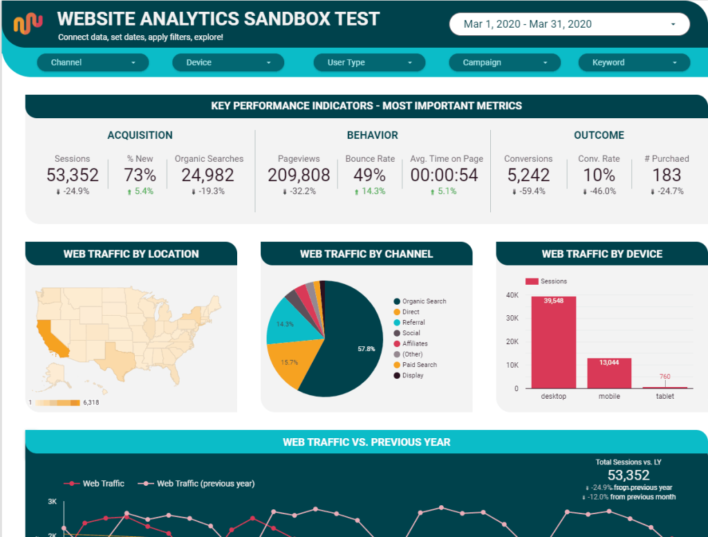
Why You Should Copy It: This Google data studio example combines useful data and insights with genuine visual appeal. The dashboard includes breakdowns of your web traffic by source, channel, location, device and even gender. Additionally, use it to check out the most viewed pages on your website and track other critical metrics like bounce rate and conversion rate. With the drop-down menus at the top, you can quickly segment data by channel, device, user type, campaign and even the keyword they used when accessing your page.
Google Analytics Starter Audit by Click Insights
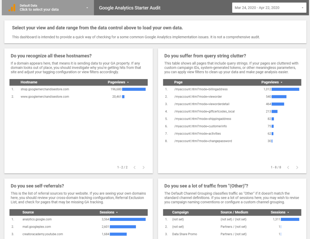
Why You Should Copy It: This is one of the Google Data Studio examples with a diagnostic approach that provides some unique value to marketers. The focus of this dashboard is on helping users resolve issues with implementing Google Analytics. It doesn’t provide a comprehensive audit, but it’s definitely useful for diagnosing some of the more common errors that can happen when implementing Google Analytics.
Website Performance Report by Data Runs Deep
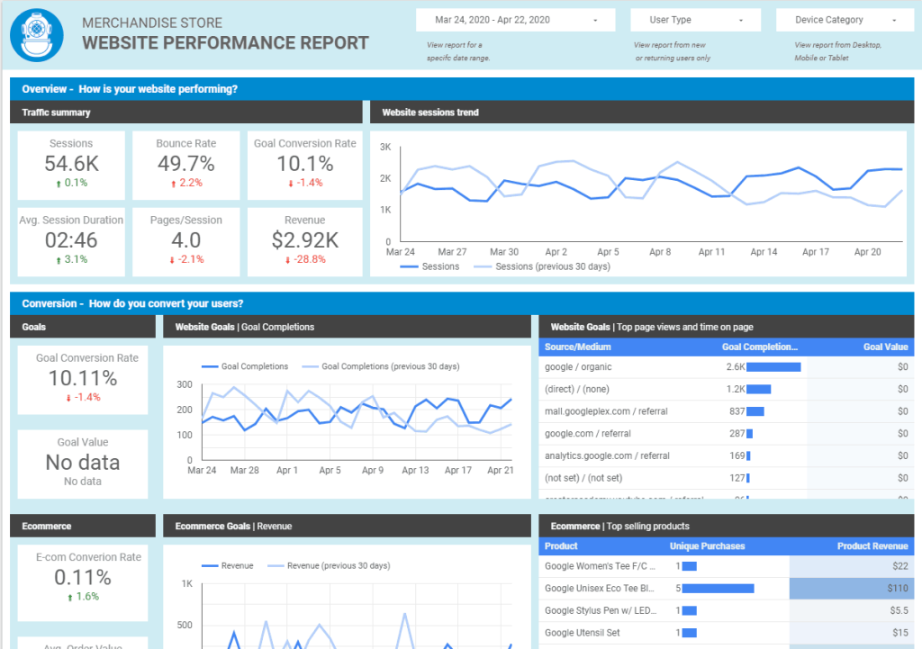
Why You Should Copy It: We love how Data Runs Deep created the layout for this dashboard, which is great for high-level insights into the performance of your e-commerce store. Marketers can see which products are selling the most, identify top referral sources for acquisition and track conversion rates and average order value. A useful feature here is that marketers can see which search terms result in the greatest number of sessions and the greatest average time on the page.
Google Analytics Website Data by Datasaurus Rex
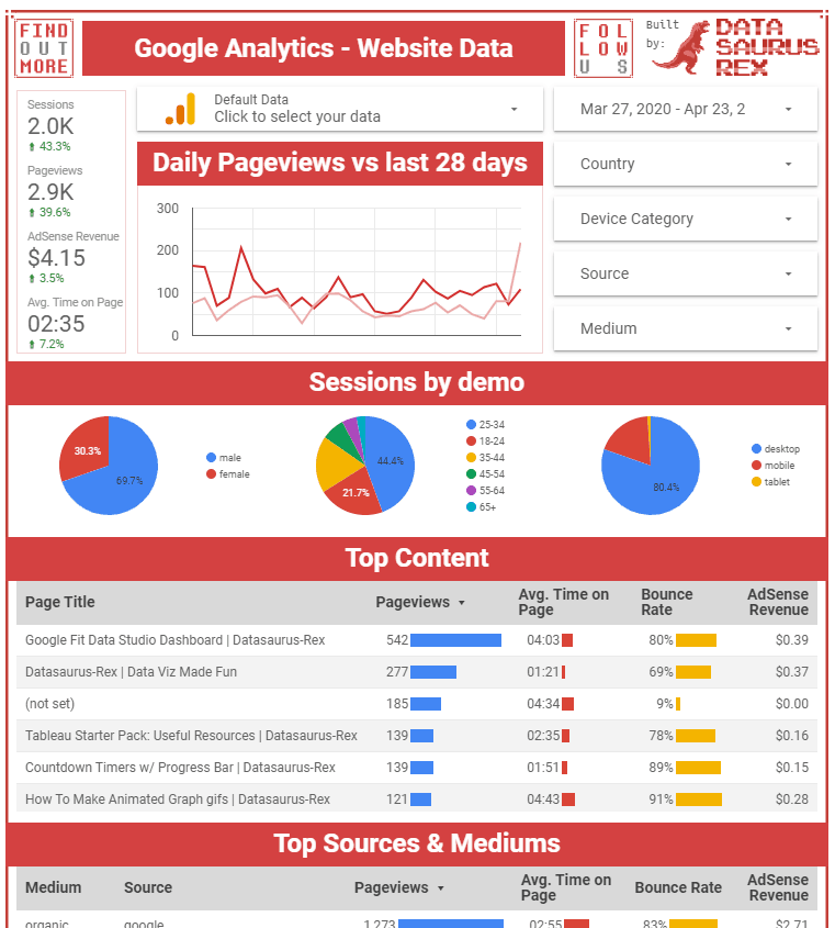
Why You Should Copy It: This comprehensive dashboard plugs into your Google Analytics and tells you everything you need to know about your website performance in 30 seconds. Marketers can see a breakdown of visitors by demographic and identify the best-performing content, referral sources, demographics and regions that are driving conversions. They can then work to develop strategies that preferentially target high-performing (or under-performing) demographics.
Summary
Unlocking the true potential of Google’s data visualization platform can be a daunting task for tech marketers. That’s why we believe that exploring Google Data Studio examples is a fantastic way to kickstart your journey toward becoming a data visualization master. Just plug in your own data and start using these dashboards to develop performance insights for your own marketing campaigns.
Making data-driven decisions are the only way you can ensure revenue growth, so if you need a partner in your quest for quality data, let’s get on a call. Unlock the full potential of Google Data Studio with our expert RevOps team.
-
CEO Garrett Mehrguth
Did you enjoy this article?
Share it with someone!


