Traffic, traffic, traffic.
Marketers are always strategizing ways to get more eyes on their website and brand. Whether you focus on organic SEO, pay-per-click, or both, the overarching goal is often to drive traffic.
By now, most marketers know that traffic is highly irregular. One algorithm update can dismantle months of hard work.
To take things a step further, not all traffic is good traffic. Web visitors that aren’t part of your target audience are little more than just a vanity metric.
For traffic to be valuable, the people that land on your website must take action.
This is why conversion rate optimization (CRO) is such a critical marketing practice. CRO is the final component that ties together all of your other inbound marketing efforts.
An effective CRO strategy will drive leads and directly make an impact on your business’s bottom line.
In this guide, we will share everything you need to know to build a conversion rate optimization strategy from the bottom up.

The Basics of CRO
Conversion rate optimization (CRO) is the process of optimizing your site or landing page experience to help improve desired actions (conversions).
Think about it this way: if traffic is the water, and your website is the leaky bucket, then CRO acts as the sealant that fixes that bucket so fewer leads are lost.
Additionally, you’ll learn throughout this guide that user experience (UX) is a key component of effective CRO. Taking the time to optimize for conversions can give you valuable insight into how user-friendly your website is and ways to make it better.
Let’s begin with the basics of conversion rate optimization.

What is a conversion?
Put simply, a conversion is transforming X into Y.
In digital marketing, the term usually refers to the process of turning a web visitor into a paying customer.
However, what’s considered a conversion can also vary from one industry to the next.
For example, most eCommerce companies consider a purchase as a successful conversion. On the other end, software-as-a-service (SaaS) companies count ebook downloads or free trial requests as meaningful conversions.
Here are some other examples of conversions:
- Signing up for an email newsletter
- Downloading an ebook or white paper
- Submitting a demo or free trial request
- Filling out a lead form
- Joining a webinar
- Registering for an event
Whatever the case may be, the purpose of a conversion is to bring a prospective buyer closer to becoming a customer.
How to calculate conversion rate
To calculate conversion rate (CVR), take the number of people who complete the desired action on a web page and divide it by the total number of visitors to that page. Then, multiply the result by one hundred.

In most cases, the desired action comes in the form of filling out a call-to-action (CTA) on the page. This could be a download, a sign-up, a registration — whatever you set your conversion to be.
If you had 4000 visitors and 30 of them took action, your formula would look like this:

What is a good conversion rate?
Now that you know how to calculate it, how do you define what constitutes an ideal or good conversion rate?
There’s no universal standard that qualifies a conversion rate as good or bad. This metric is influenced by a variety of factors including overall web traffic, industry, and your business offering. It also depends on what type of conversion you’re tracking.
With that in mind, the real answer is “better than what you had last month”. Instead of focusing on reaching a specific conversion rate, focus on figuring out how to improve your current rate little-by-little.
Start with a goal to increase your conversions by 5-10% and go from there. You’ll be surprised how obtainable that goal really is when you take it step-by-step and use your own web data as a benchmark.
Conversions don’t guarantee revenue
While it may be true that a high conversion rate is a positive indicator of marketing effectiveness, this metric isn’t the end all be all. Conversion rate is useful when evaluating whether or not your audience is receptive to your messaging.
However, you need to consider this within the context of other key metrics such as revenue per visitor, lead quality, profit margins, and average order values.
Remember that your business doesn’t run on conversions, it runs on revenue.
Your conversion rate can go down while revenue goes up at the same time. It’s not uncommon to see A/B test results where variant A has a lower conversion rate than variant B, but it brings in more revenue.
At the end of the day, growing revenue is the ultimate goal. Conversion rate is just one piece of the puzzle.
Factors that influence conversions
There are a number of factors to consider when optimizing your website for conversions. Some are in your control, others are not.
Either way, it’s important to be cognizant of all of the elements that can influence your CRO strategy.
Alignment between user intent and the offer presented
The audience always has to be at the center of your marketing strategy.
When talking conversions specifically, this means aligning your offer to match the intent of the user that’s visiting your landing page. You have to position your offer in a way that’s comfortable for the person on the receiving end.

For example, if someone is searching for “what is a CRM” they are likely at the very beginning stages of their buying journey.
At this point, they may not even know that the solution they require is even called a CRM. This user is unlikely to convert on a landing page that’s offering a free demo of a CRM software because that offer is too bottom-of-funnel.
On the other hand, a user that’s actively searching for “CRM platforms” or “CRM platform pricing” is using high-intent search terms that indicate they’re further along in their buying journey.
This type of user is likely to be much more responsive to a free demo offering.
Strong customer base
Although it may not be tangible, brand awareness and trust play a big part in how well your website converts.
If people are familiar with your brand and view it as trustworthy, it’s going to be a much easier sell than if they are learning about you for the first time.
This is why customer service and support are critical, especially in industries where subscription models are the norm, such as SaaS. Convincing a current customer to buy from you again is a lot easier than winning a completely new one.
The happier your customers are, the more likely they are to become advocates for your brand and refer others.

Value vs. cost
The way people perceive the value of your offer vs. the cost (either in money or amount of information) has an influence on conversions.
As a marketer, you have to put yourself in the shoes of the person on the other end. Would you give away five pieces of personal information for a 3-minute video testimonial? What about a white paper?
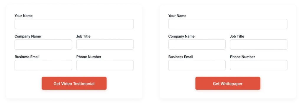
Even if you’re not charging money, asking for contact information is still very transactional.
The value of the asset has to equal or surpass the amount of info the web visitor is being asked to give. Failure to think about this is a quick way to drive your conversions to the ground.
Clear, concise messaging
What you say and how you say it is extremely important.
A landing page isn’t the place for complex language and metaphors. People want to get what they need and get out. Your messaging needs to clearly communicate the offer in a way that’s concise and easy to understand.
Approach every landing page with a clear vision of what action you want the user to take by the time they’re done reading. Use this to guide your copywriting process.
Remember that every word on a page is taking up precious real estate, so make sure it has a purpose.
Usability
On top of messaging, layout, and design, usability is a big factor that also influences conversion rate.
If your site is difficult to navigate or takes too long to load, visitors will get frustrated and leave. When optimizing your site, the goal should be to remove any and all barriers to conversion.
Do your lead forms work? Are all the images loading properly? Are there too many pop-ups?
A seamless browsing experience goes hand-in-hand with improved conversions.

Why CRO Matters
If your marketing efforts are focused on driving demand, then conversions are going to play a huge role in keeping the inbound engine running.
Think about it: a conversion is the moment in time when a previously anonymous prospective buyer raises their hand and expresses interest in your business. Building out a strategy to optimize this experience is absolutely vital to seeing success in your greater marketing efforts.
Let’s break this down further.
Winning at PPC is getting harder
With paid search becoming more expensive and competitive, conversion rate optimization is needed, now more than ever, to streamline your marketing funnel.
There’s a heightened level of competition in all of online marketing right now. You can’t just sit back and trust that your messaging is always going to work. Someone’s going to read your copy and counter it all the time. That’s why ongoing CRO is so crucial.
-Brady Cramm
To see a strong return on your paid search investment, CRO is a must as it’s the most effective way to keep a competitive edge.
This brings us back to the idea of traffic as a vanity metric. Your ads can generate clicks and pageviews, but that doesn’t mean much if those metrics don’t translate into revenue. This is what we call a “leaky funnel” in marketing.
You may have a healthy amount of traffic coming in, but those prospective buyers are falling off somewhere along the way to becoming customers. Effective CRO works as a complement to PPC to keep this from happening.
It’s testable and customizable
A landing page that worked for your audience a couple of months ago might not connect with them the same way today. Your website will never reach its full potential if all the pages are static. Luckily, CRO elements are easy to test and experiment with. This allows you to better understand your audience and cater to their needs as they change and evolve.
With CRO, there are no absolutes. You have the freedom to experiment with different copy, layouts, design, offers — the list goes on. A/B testing these pages elements allows you to identify what yields the best results. The data from one test can then serve as a benchmark to determine your next round of testing. This becomes an ongoing process of testing and continuous improvements.
Just as things change over time, user behavior also evolves. Best practices that were once thought to be timeless or universal may not apply to certain industries and audiences anymore. That’s why the growth mindset of CRO makes the journey of ongoing experiment testing so exciting.
– Grace Pan
Plus, a great CRO strategy has the potential to increase revenue without having to increase traffic. Every improvement you make will increase conversions which eventually leads to more sales.
If you improve the sales conversion rate even by 2%, it means that you’re getting 2% extra revenue day in and day out. If you have a high volume of sales, a 2% improvement can effectively translate into hundreds and thousands of extra dollars.
Gain a better understanding of visitor behavior
How can you sell to someone you don’t understand?
As part of building out a CRO strategy, you begin to learn about your audience and how they behave when they’re on your website. Tools such as heatmaps, clickmaps, and form analytics software are staples for CRO.
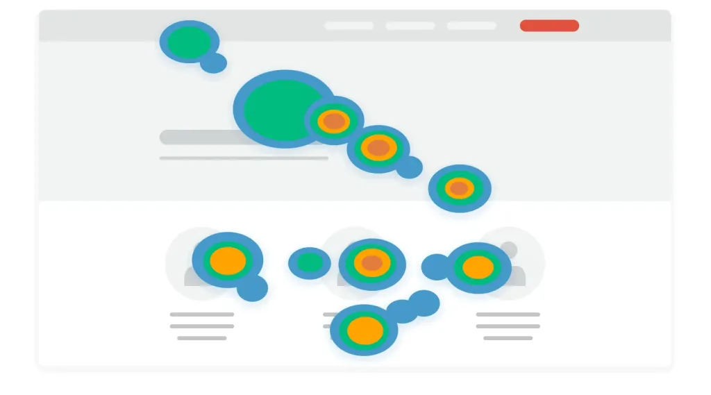
They allow you to see where your visitors are going, how far they’re scrolling, and where they’re clicking. Using this information, you’re able to determine if you’re bringing the correct information to the visitor quickly enough.
For example, let’s say you have a page that’s showing a huge drop off at the hero section — no one is scrolling past the fold.
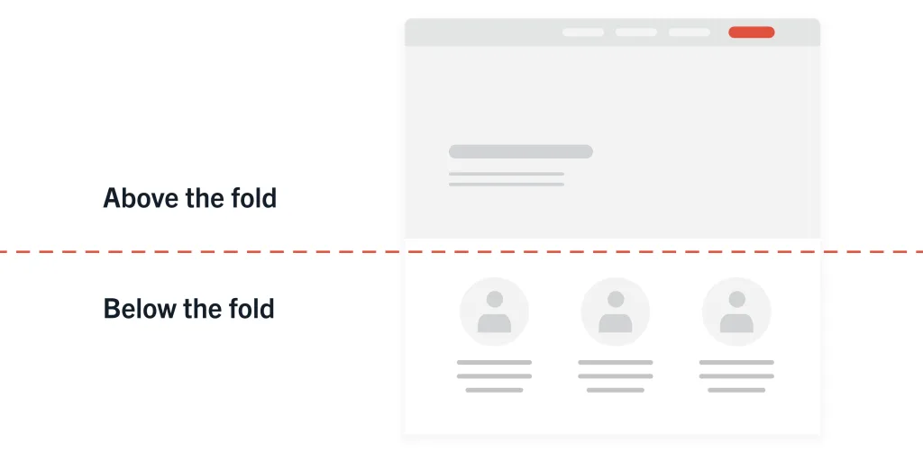
This could mean a couple of things: either the entire page is missing the mark, or the page is targeting the correct people but the information they need is not clearly visible. In this case, you may need to incorporate an element of social proof into the hero or update your headline to better communicate value in the visible screen.
Through observing the behavior of users who didn’t complete the goal on your site, you get a much better idea of what needs to be improved.
Advanced user experience
As previously mentioned, user experience and conversions go hand-in-hand.
A good UX won’t magically help your conversions skyrocket, but a bad UX can be largely detrimental to your CRO efforts. A website that’s glitchy or difficult to navigate is guaranteed to have low conversion rates.
Focusing on conversions will help you find areas of your website that need usability improvements.
The overarching purpose of CRO is to ensure that prospective customers have a positive experience when they land on your site. The easier it is for a web visitor to use your site and understand your offer, the easier it will be for them to take action.
With improved user experience and representation of your unique selling points, CRO has the potential to increase sales without having to put any additional effort toward increasing organic or paid traffic.
Core CRO Elements
In this guide, we will talk a lot about testable page elements. These are the variables that you modify during the CRO process to test and improve conversions. But let’s get more specific and look at each core element more in-depth.
Site navigation
Site navigation is a critical part of having a website that’s functional and easy-to-use.

Web visitors rely on navigation menus to find their way around. Normally, a user will start on the homepage and then has the option to explore various categories and subcategories. If this is unstructured, your visitors can become lost on your site.
Because of this, it’s important to optimize your site navigation to ensure that visitors can move between pages with ease. The goal is to structure the site in a way that allows users to find what they’re looking for in as few clicks as possible.
Copy
Visually pleasing website design will wow your visitors, but it’s the messaging that will keep them there and move them further down the funnel. Website copy is different from other types of writing — its main purpose is to market and sell.
We can break down copy in two main types:
Headline
The headline is the first thing your visitor sees when they land on the page.

As you can imagine, it must be powerful. A strong headline is concise, informative, and communicates enough value to draw the reader in. If someone lands on your page and reads a generic headline with no clear value add, there’s a good chance they’re exiting out of that page shortly after.
When writing headlines, think about the customer and what they’re looking to get out of the page. If you’re writing an article for the company blog, the headline should match the body content and clearly communicate what the piece will be about.
On the other hand, if you’re creating a landing page, focus on addressing customer pain points in your headline. Don’t be afraid to get creative and use language that shows off your brand personality. This is what will make your headline copy stand out.
Body content
You’ve got the reader’s attention, now it’s time to provide the real value in the body text of your page. You want the person on the other end to leave your site feeling like they got something useful out of it.
There are numerous types of pages on your website that require well-thought-out body text. Landing pages, product descriptions, testimonials, and blog articles are all examples of pages that require powerful copy.
Regardless of the type of page you’re working on, the same practice holds true: keep the reader and their needs at the center of your message.
A top-of-funnel educational blog article can be just as useful as a case study, as long as it’s written in a way that meets the reader at their unique point in the buying journey, adds something unique to the table, and is backed by data.
Writing good copy takes time to learn and perfect. For additional guidance, we recommended leveraging the various copywriting tools that are on the web — many of which are available for free.
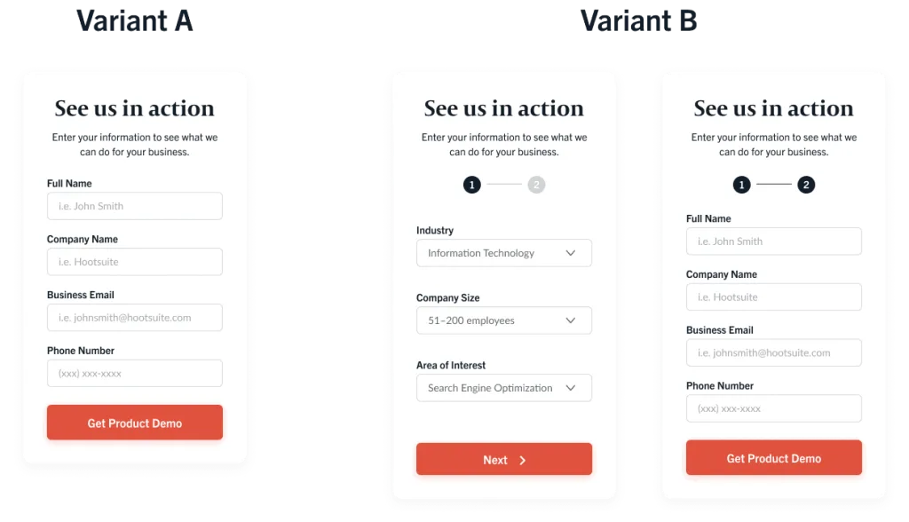
Variant A is a one-step form that asks for a company name, business email, phone number, and full name. You also have variant B which is two steps. The first step asks for industry, company size, and areas of interest. The second step asked for all of the same fields as variant A.
People are hesitant to give out a lot of personal information, so it’s natural to assume that the shorter form, variant A, will probably be more successful. Thanks to something called compliance psychology, this is not always the case.
In his best-selling book Influence: The Psychology of Persuasion, Dr. Robert Cialdini writes, “Once we’ve made a choice, we will encounter personal and interpersonal pressures to behave consistently with that commitment.”
In other words, once you commit to small things, you’re more likely to continue onto bigger commitments aligned with your initial decision. There are two main reasons why a two-step form, like the one used in the example above, works:
- The fields in the first step were impersonal and non-threatening
- The requested fields make the visitor feel that they are getting a custom response based on the information they enter
Making your visitors feel that they will be getting something of great value in exchange for their information is one of the most vital elements of a lead generation form.
Your message, offer, and visual design on the page all come into play when someone is making the decision to fill out your lead form or not.
– Brady Cramm
Call-to-action
A call-to-action (CTA) is exactly what it sounds like.
It is a statement that prompts a web visitor to take a desired action. The action could be a myriad of things: signing up for a demo, downloading a white paper, or joining a mailing list.
Similarly to a lead form, there are countless ways in which you could customize a CTA based on what you’re offering. This makes CTAs great candidates for conversion testing.

Landing pages
Landing pages are used as a tool to guide web visitors to a particular destination to complete a desired action.
The page itself is there to tell a story and communicate enough value to the viewer to encourage them to fill out a CTA or lead form.
It’s a CRO best practice to feature only one offer per landing page. We refer to this practice as a 1:1 attention ratio. If you display multiple CTAs or lead forms, you run the risk of overwhelming or confusing your audience.
A crowded page without a clear offer is a one-way ticket to lost conversions.
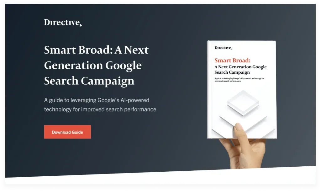
Because landing pages have a dedicated action tied to them, they tend to have much higher conversion rates than standard website pages. This is the value of the 1:1 attention ratio.
When it comes to creating landing pages, the way you layout the information of your page is just as important as the information itself.
Branding and aesthetic matters. People are drawn to pages that are visually appealing and nice to look at. This is a chance to flex your design muscles and let your brand personality shine.
When someone gets to your landing page, there are only two options for them. They either have to convert or leave.
When creativity meets data-driven strategy, there are endless ways to create design experiences that empathize, inspire, and meet users where they’re at with a valuable offer.
– Grace Pan
The CRO Process
Like most marketing efforts, there is a process to CRO.
If you try to tackle conversion testing and optimization without structure, you won’t be able to properly track the results of your efforts and your A/B testing will be inconclusive.
Conversion rate optimization can be broken down into five phases:
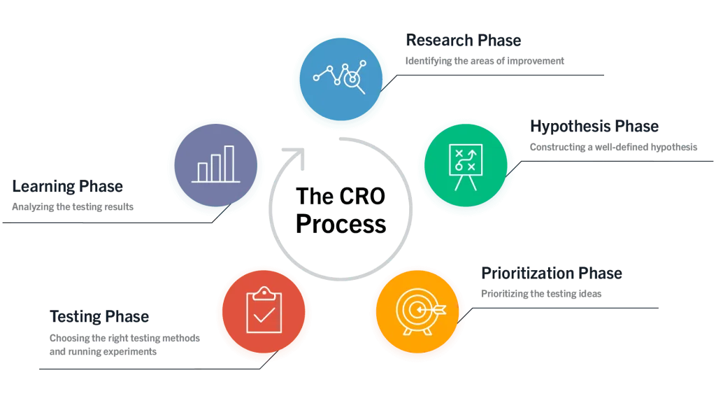
Step 1: Research
Building out a CRO strategy begins with conducting preliminary research. To start, you look at your company’s goals, unique value propositions (UVPs), website, and customer base.
These are the main questions you need to answer:
How does this tie into the greater company goals?
Your conversion optimization efforts need to be aligned with the company’s greater business and marketing goals. It’s not as simple as saying, “the goal is to increase revenue.” You need to get more granular.
Is the goal to increase free trial sign-ups? White paper downloads? Event registrations?
Your business may need more support throughout different areas of the funnel. Be aware of this and tailor your CRO strategy accordingly.
What is your unique value proposition?
A unique value proposition (UVP), sometimes referred to as a unique selling proposition (USP), is the thing that sets your business apart from others in your industry.
Is your software the best at reducing phishing attacks? Do you have data to support this? Are you the only vendor in your space that specifically caters to small businesses?
Whatever it is you do, make sure it’s at the center of all of your marketing efforts. The clearer it is to your audience why they should choose your brand over another, the better your conversions will be.
How do prospects and customers feel about your business?
Your internal sales and customer success teams are an invaluable resource.
Sales reps are your secret weapon who talk to prospective buyers day in and day out. They know which UVPs land when pitching prospects and have insight into the common objections that come up most frequently.
Similarly, the customer success team can help you to understand how current customers perceive your business and brand. They can provide insight into what customers like and dislike, as well as offer suggestions for improvement.
What does the sales process look like?
As marketers, it’s our job to know the sales process inside and out. From a conversions standpoint, you have to think about every touch point that leads a prospective customer to your website.
Where are buyers falling off? Are there roadblocks keeping people from getting to your website?
It’s equally as important to consider what happens after the conversion happens. Where does this person’s information go? What next steps are necessary to move this buyer further through the funnel?
What is your website’s current traffic breakdown?
Traffic is what fuels conversions, so it should come as no surprise that you need to have an in-depth understanding of how much traffic you’re getting and where it’s coming from.
Dig into the demographics data to better understand your web visitors and their needs.
This information will help paint an accurate picture of your audience and what they care about. You can then use this information to guide your efforts when you’re building and optimizing your web pages.
For example, if you notice that a majority of users are viewing your site on mobile, look into how your website shows up on a mobile device.

Is it slow to load? Is important information well below the fold? Now that you know this information about your audience, optimize the mobile browsing experience and instantly improve your conversions.
Step 2: Form a hypothesis
Using the information gathered during the research phase, you can now draft a hypothesis – which is a proposed explanation of an idea that aims to solve a problem.
This hypothesis will be the basis of your CRO testing.

A hypothesis can be broken into three main elements.
- A particular change – Based on insights derived from quantitative and qualitative data, this is the variable that needs to be changed and tested.
- A particular effect – This is the goal, conversion metric, or similar element which needs improvement.
- A particular reason – The reasoning behind why this specific change can bring about the desired effect.
Here’s an example of a good hypothesis:
If we add customer testimonials on our product pages, then we’re going to see a 5% increase in demo sign-ups, because social proof instills confidence in prospective buyers and helps our brand to look more credible.
Here’s a vague, ineffective hypothesis:
This method helped us increase conversions a few quarters back so let’s try it again.
The reason you want to avoid the second style is CRO is not a one-size-fits-all.
Although there are standard best practices that can be applied across multiple situations, you want to make sure your hypotheses are backed in data — not a hunch or assumption. Make sure you have enough quantitative and qualitative data to support your reasoning.
Once you have a solid data-driven hypothesis, you now have the ammo to execute on your ideas.
Step 3: Prioritization
Even simple websites can have hundreds of pages that are worth optimizing. It can feel daunting trying to figure out where to start.
To help you prioritize your CRO testing efforts, we recommend using the popular ICE scoring framework formulated by Sean Ellis at GrowthHackers:
Impact
Impact relates to how much potential there is to move the needle on your goals. For example, optimizing a core product page will likely make a much bigger impact over other pages with less traffic, such as an “About” page.
Confidence
How confident are you that this will have the desired impact? This item
can be tricky because it’s a bit more subjective. If possible, use data from previous tests on similar pages to help you quantify your confidence level. If a gut instinct is all you have to work with, use your best judgement.
Ease
When looking at your list of pages, consider that not all of them will be easy to test. Your homepage may need multiple people’s approval before you can begin optimizing it — meaning it could take much longer to get your efforts off the ground. It’s important to consider ease because unlike PPC or SEO, CRO is something that can have quick returns.
To come up with your ICE score, assign each item a score between 1 and 10, with 10 being the highest. Then, multiply all three numbers together. The product is your final ICE score.
Let’s say you give a page a score of 9 for impact, 6 for confidence, and 3 for ease. The ICE score is 162. The pages with the highest ICE scores should be at the top of your list.
Following the ICE scoring framework is a quick and effective way to help you prioritize your CRO activities. This will help you reach your goals sooner (and with fewer roadblocks!)
Step 4: Testing
Testing is a foundational component of conversion rate optimization.
This is the process of running a test with two or more variants of one or multiple web pages to determine which one is more successful at driving conversions.
It may seem straightforward, but there are various rules and minimums that should be followed to ensure that your results present solid data and cannot be skewed.
Statistical significance
Statistical significance is used to measure the probability that a result is unlikely to have occurred by chance. It’s frequently used in CRO to prove that the optimizations you’re making are what’s impacting conversions.
If you think about it, conversion testing is very similar to running an experiment.
You formulate a hypothesis and test variables against each other to identify which action leads to an improved result. Statistical significance is how you determine that the result is actually caused by the differences between the variants, instead of by error or mere coincidence.
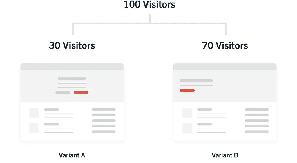
For example, let’s say you run a test for 100 visitors on your site and 70 of them converted on variant B, while 30 converted on variant A. It looks like variant B won by a landslide. Easy enough, right?
Not so fast.
If your website gets 10,000 visitors a day, that first sample size of 100 visitors only makes up a small portion of your daily traffic. The conversion rate could fluctuate quite a bit by the time you reach the end of the day.
This is what statistical significance is all about: did enough people see the A/B test and was enough time allotted to ensure that there is a consistent pattern in the data?
It’s recommended to run every test for about two weeks to reach a statistical significance of at least 90% — this is a solid benchmark for “optimal” statistical significance.
It means that there’s a 10% chance that your results occurred by chance or error. The two- week time frame accounts for any traffic fluctuations that could impact the final percentage. Keep in mind that if you have less traffic, it may take longer for you to reach significance.
To calculate statistical significance, we recommend choosing an A/B testing platform that comes with a built-in feature that will do the math for you. Unless you’re into crunching serious numbers, this is usually the easiest and most efficient option.
As tempting as it might be, try your best not to peek at the results before a test has truly gained proper statistical significance.
You may see that the conversion rate is higher or lower than expected and feel tempted to stop the test early. This can be hugely detrimental to your CRO efforts.
Remember that until your test reaches statistical significance, the data is likely incorrect. Looking at the results prematurely could lead to choosing a “winning” variant that is actually the losing variant. This will greatly hurt your conversions in the end.
Moral of the story: don’t peek. Always wait to declare a winner/loser only after the test has completed its run-time.
Types of conversion testing
A/B testing
For the sake of simplicity, most marketers go with A/B testing.
This method is used for comparing two web page variants that have very minor changes, usually just one web element at a time. For example, you would run an A/B test to figure out which CTA button color converts at a higher rate.
A/B tests are still able to reach statistical significance without needing a lot of web traffic, making this option very popular among all types of businesses.
Split URL testing
A split URL test essentially follows the same concept as an A/B test. For this reason, the terms are often used interchangeably or grouped under the same category.
The main difference to be aware of is that the two page variants are hosted on separate URLs.
This method is used when the web page requires heavy modifications or backend changes against its original version. In a situation where the page needs more robust changes, it’s much easier to create a separate page with a new URL.
Multivariate testing
In a multivariate test, you’re testing an increased number of variables on a page.
These elements are grouped together and there are multiple variations being tested within each element. For example, I would use this method to test a different sidebar CTA, headline copy, and hero image on a page against its original version.
This type of test is useful to drive more in-depth insights about the content and design of your web page since you’re able to test many different variables at once.
Unlike A/B and split URL testing, multivariate is more complex and requires that your website gets significant traffic in order to work properly.

Step 5: Learning
The CRO process doesn’t end when your tests end.
Sure, the heavy lifting is behind you (for now) and you have a mountain of data and insights to review. But data is only as valuable as what you do with it, and that’s exactly why this phase is so important.
Let’s go back to the initial hypothesis. Was it correct?
If so, that’s great. Time to roll out the changes and make them permanent.
If your hypothesis was incorrect, that’s OK too. It’s back to the drawing board. There are going to be times when it takes several tests before you reach the outcome you’re hoping for. We said CRO was effective, we never said it easy.
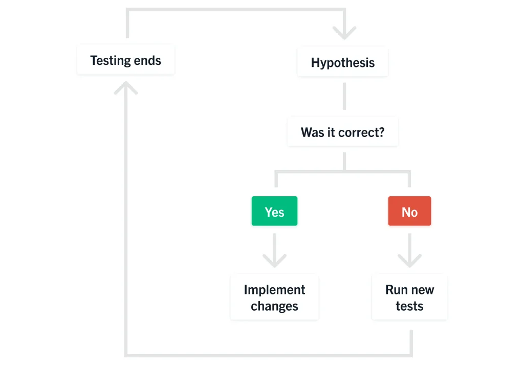
Above all, this phase is about learning and adjusting. Look at your results as an opportunity to get a deeper understanding of your audience and what they connect with the most.
At the same time, remember that just because something worked on one page, you won’t necessarily get the same results on a different page.
The reason CRO works is because every single page element is accounted for. This means that each landing page is unique, from the offer to the CTA and design layout. If one page is uber-successful, it’s because of all the ways that these elements fit together to form the optimal experience for the visitor.
With testing, the goal isn’t for your test to always win. It’s to find areas of user experience that really influence performance. If you make a change that impacts your page in a negative way, it’s still exciting because you found a piece that directly impacted people’s decisions and you can go from there until you get a win.
– Brady Cramm
The Website Optimization Hierarchy
Now that you have a robust understanding of the conversion optimization process, let’s look at the big picture: your website.
Wouldn’t it be silly to clog a leak on a boat that’s half an inch wide when there’s a 2-foot hole somewhere else on the boat? CRO works the same way.
Before you can execute on a CRO strategy, make sure your website works properly.
Your website is the digital foundation of your business. Not only is it an extension of your brand, but it also is a major driver of revenue. Put simply, CRO won’t work unless your website does.
We like to view the process of website optimization as a pyramid. This model helps to visualize how to approach working on your website and what steps should be prioritized over others.
To begin, we start from the bottom level of the hierarchy and work our way up.
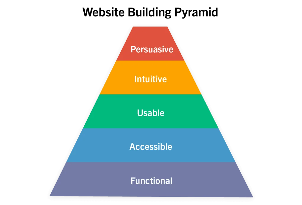
1. Functional
Above all else, your site must be functional.
This means no obvious technical errors, bugs, or glitches. While it’s true that server disruptions and outages happen, it’s imperative that you have a team to troubleshoot these issues as they arise.
Having a working website also goes hand-in-hand with improved technical SEO which allows leads to find you in the first place. For this reason, fixing functional problems can be low-hanging fruit that brings instant, and possibly very high gains.
2. Accessible
Your website should be easily accessible to anyone and everyone that uses the internet, regardless of what browser or device they’re using.
Nowadays, almost everyone has a smartphone with internet browsing capabilities. If you want to maximize your reach, having a mobile-friendly website is absolutely critical.
This also includes making sure that it’s accessible to people with disabilities that affect
the way they browse online. Focus on adding alt tags to images, creating readable font sizes, designing buttons so there’s contrast between the text and background, and so on. A working website is one that’s accessible to anyone that needs to use it.

3. Usable
Next on the pyramid is usability.
Your website should be simple to use and navigate. The user should be able to easily find what they’re looking for and jump from one page to the next without a problem.
4. Intuitive
A strong website is designed with the sales process in mind.
Reduce any friction that could hinder a potential sale or lead form fill. This is often where many businesses start to fall short: the site works and is navigable, but they haven’t taken into account all of the questions a potential buyer might have.
Here are some questions to consider:
- How long is the free trial? Is a credit card number required?
- What do I get out of a free trial?
- What happens next after I fill out this form?
- Will someone call me or will they email me?
- How soon after I fill this out will I hear from someone?
When you make a point to answer these questions early on, you’re setting your site up for better conversions and a lower bounce rate because you know what your customer needs.
Make it as simple as possible for someone to understand exactly what your business offering is.
5. Persuasive
At the top of the pyramid is persuasion.
At this point, it’s safe to say you have a fully functional website that’s catered toward helping potential buyers make a purchase. But what about the people that are still on the fence? That’s where persuasion comes into play.
Your website messaging should tell a compelling story that clearly communicates the value of your offering. This means writing copy that speaks to your target persona, addresses their problems, and explains how your product/service can help solve them. Clean design and compelling imagery are equally as important.
Everything related to product descriptions, feature tours, demos, and product comparisons (even with competitors) are considered persuasive elements. This also includes your service descriptions, case studies, testimonials, and white papers.
Put yourself in the shoes of your ideal customer and view your website’s core landing pages through their eyes.
CRO Best Practices
While it’s true that you should always base your CRO strategy on data that’s unique to your business, there are some general best practices to keep in mind.
Holding fast to these ideals will keep you from wasting time, money, and effort in the long run.
Only test elements that move the needle
The reality is that changing the CTA button color from blue to green probably isn’t going to make or break your conversions. Many people think that running small tests is better than running larger ones, but it’s usually the larger changes that pack the biggest punch.
For example, redesigning the hero section of a page or your website’s entire navigation menu will probably yield more significant results than updating the color of a CTA button.
Limit the number of tests running at once
If you test too many elements on one page, you may not be able to determine which of these changes actually made an impact on the conversion rate. This can put you in a difficult spot when it comes time to roll the changes out on other pages.
Don’t compromise accuracy by trying to run too many tests at once. Take it one step at a time.
Test one thing at a time. If you’re testing five things at once, you won’t be able to tell which element led to the change in performance. One change could be increasing performance, while another could be detracting.
– Brady Cramm
Create tests based on data, not opinion
There are no guarantees with conversion testing. That’s why it’s so important to launch tests based on hypotheses that are backed with accurate data.
Don’t just run tests on a whim.
As much as you may want to upgrade everything all at once, it’s better to be patient and test one or two things at a time. This allows you to collect the right data and form better hypotheses the next time around.
Avoid using vague, flowery language
There’s a time and a place for literature-style writing. Pages built for conversions are neither the time nor the place.
Web copy should clearly communicate your offering and the unique value proposition that sets your product/service apart from others. The right messaging can resonate with your audience and lead to an instant conversion. However, if your web copy is vague and doesn’t match your business’s goals, it becomes useless.
Conclusion
As digital marketing channels become increasingly more competitive, conversion rate optimization has proven to be a viable tactic for improved performance and revenue generation.
Taking everything you’ve learned in this guide, you’re in a secure position to kick off your first round of conversion testing.
At the very least, you’ll come out of it with a better understanding of the way web visitors interact with your site. At the most, you’ll transform your website into a well-oiled inbound marketing machine.