Creating conversion-optimized website buttons is both an art and science for digital marketers in 2020. Website button designs have a direct impact on conversion rates, and while there’s plenty of room for creativity and experimenting with new design trends and UI elements, there are at least a few best practices that produce consistently good results and simply can’t be overlooked.
In this article, we highlight some of our favorite website button designs and the features that make them great.
[optin-inline id=’fwfjw2tkjbgkq0vkoshq’]
What Makes a High Converting Website Button?
Marketers in 2020 use call-to-action (CTA) buttons to grab the attention of their visitors and encourage them to advance through the marketing funnel. In the past, a CTA might have been presented as a piece of hyperlinked text or even an image, but marketers have realized that CTA buttons result in the highest performance and the most clicks or conversions.
However, not all CTA buttons are created equal, and effective website button design is still necessary for maximizing conversions.
Here are some of the most common characteristics and design elements that make high-converting website buttons.
- The button appears clickable and all buttons look like buttons
- The button contrasts with the background
- The button appears in a logical or expected place
- The button is connected to a clear and descriptive CTA and users understand easily what the button does
- The button is an appropriate size for the platform
- The button is not cluttered by other on-screen elements or features
Check out our list of 7 website button designs that convert and you’ll see how each one follows these critical elements of design to deliver an optimized user experience that encourages their visitors to convert.
10 Website Button Designs that Convert
Evernote
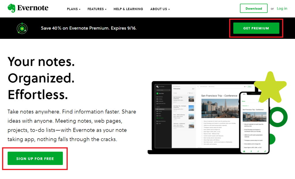
Overview: Evernote’s popular note-taking app is used by over 200 million people around the world. The Evernote homepage includes two prominently displayed CTA buttons: one asking users to sign up for Evernote and another asking users to get Evernote Premium.
Why It Works: Evernote follows all of the key website button design principles on this page. The CTA buttons are high-contrast (green on a white background) and easy to find. There’s also plenty of white space to minimize clutter and make it easy for visitors on this page to decide where they should click next.
Monday
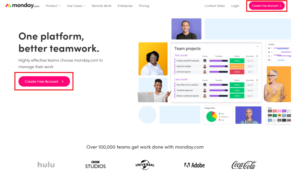
Overview: Monday offers a team management software platform that’s great for communication, file sharing, and more. Monday’s homepage includes two CTA buttons, each one encouraging visitors to get started by creating a free account.
Why It Works: Monday chooses a sleek website button design here – bright pink rectangular shapes with rounded edges that stand out against the background and grab the user’s attention. The use of brightly-colored buttons with white space ensures that these buttons won’t be overlooked by visitors, and the placement in the middle-left and top-right corner is exactly what the user is expecting.
Brooks Running
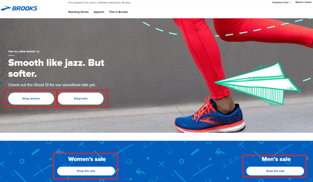
Overview: Brooks is a shoe and apparel brand that makes running gear for both men and women. On the homepage of their website, Brooks uses CTA buttons to initiate the purchasing process by directing men and women to the appropriate sections of their online store.
Why It Works: In a real-life retail clothing store, you walk in the door and either turn left for the women’s section or right for the men’s section. With the use of CTA buttons on their homepage, Brooks has adapted this experience to the online retail setting. Brooks uses descriptive calls-to-action, contrast, and negative space to make sure their buttons stand out on the page and generate clicks.
Sentiment.io
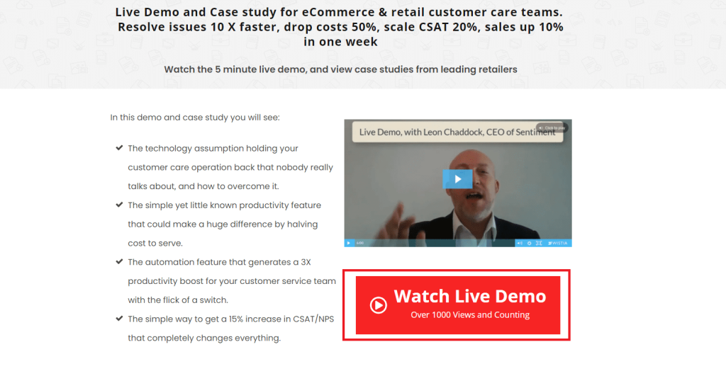
Overview: Sentiment is a multi-channel customer messaging platform for everyone from small retail stores to enterprise organizations. The CTA button on this page asks visitors to watch a live demo to find out more about Sentiment’s product and services.
Why It Works: The bright red color that Sentiment chose for this CTA button contrasts well with the white background and makes it impossible for visitors on this page to miss. We also like how the phrase “Over 1000 views and Counting” can trigger FOMO (the fear of missing out) and drive user engagement. The CTA used here is also descriptive and compelling – users know exactly what they’re going to get when they click on the button.
Demio
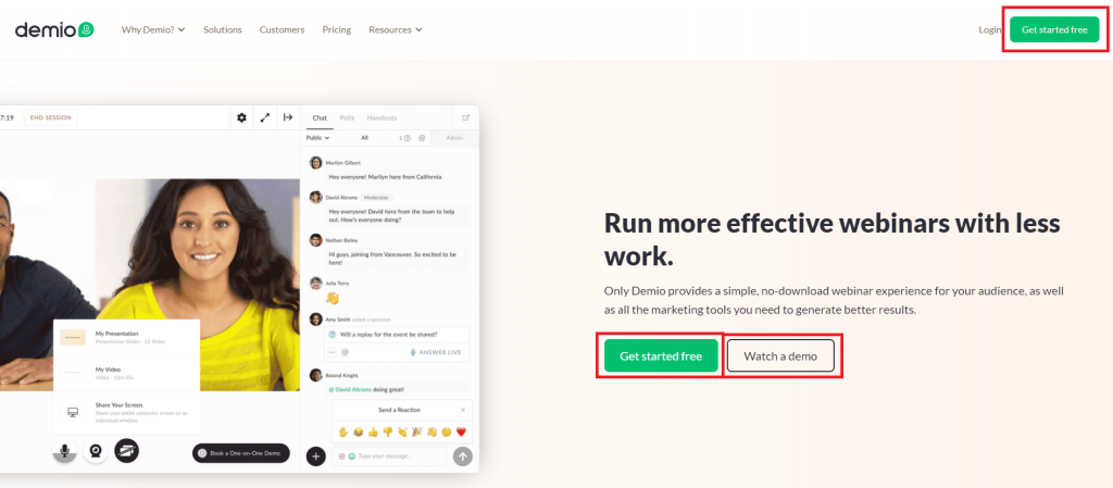
Overview: Demio builds software that helps marketers produce and distribute webinars to their audiences. This homepage features a CTA button that prompts visitors to “Get Started Free” and a ghost button that prompts visitors to “Watch a Demo”. A third CTA button in the upper-right corner gives the same CTA as the main one.
Why It Works: Demio’s homepage is an example of predictable (user-friendly) CTA button placement, high-contrast CTA buttons with bright colors, and the use of white space to simplify decision-making for the user.
Zendesk
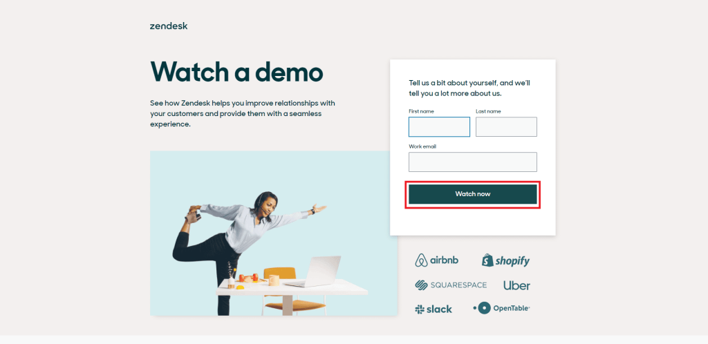
Overview: Zendesk makes software to help businesses with customer support, sales, and customer engagement. Their demo page pictured here uses a basic lead generation form to connect visitors with a demo video of Zendesk software.
Why It Works: This page does a great job of simplifying decision-making for the end-user by providing very few options besides filling out the form and watching the demo. The website button design looks great – there’s color, contrast, white space, and a descriptive CTA. The use of a short lead generation form with just three fields also helps to minimize friction and drive conversions on this page.
Spotify
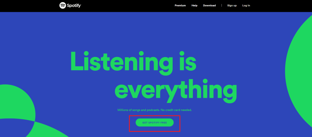
Overview: Spotify is a music streaming service with millions of customers around the world. On their homepage, Spotify uses a green CTA button to prompt users to download their music streaming app for free.
Why It Works: The primary goal of Spotify’s website is to encourage users to download their app and start listening to music. To support this objective, Spotify places a descriptive and relevant CTA front-and-center on its homepage. For a visitor who lands on this page, Spotify is making it as fast and easy as possible to get the app and start listening.
The rectangular-shaped button with rounded edges, contrasting colors, and use of negative space are all examples of effective website button design on this page.
Summary
Whether you’re doing interaction design for a mobile app or web design for a business website, the way you present your CTA buttons has a direct impact on how audiences respond. That’s why understanding effective website button design is such an important component of how to optimize a CTA. We hope this resource helps you understand and apply the principles of effective website button design on your next marketing campaign.
-
 CEO
Garrett Mehrguth
Did you enjoy this article?
Share it with someone!
