Do you know the difference between a squeeze page vs landing page?
You will soon!
This is a common source of confusion for anyone learning how to create a landing page, so we created this guide to explain the similarities and differences between a squeeze page vs landing page.
[optin-inline id=’d5yewatvtrhn8vieh0e4′]
Squeeze Page vs Landing Page: What’s the Difference?
What is a Landing Page?
Landing pages are the pages where visitors land after clicking on one of your digital advertisements or email marketing links. Your landing page for a given campaign could be your home page or a separate standalone page on your website.
Landing pages can have multiple conversion goals. They may encourage visitors to purchase a specific product or service, submit their contact information through a lead generation form, sign up for a free trial, or click through to another page.
Landing pages use persuasive sales copy and design features to encourage their visitors to complete the conversion goal.

Caption: A long-form landing page created by Udemy.
What is a Squeeze Page?
A squeeze page is a specific type of landing page that is super-optimized to squeeze two pieces of information from every visitor to the page: their name and email address.
The focus on this single conversion goal is what differentiates squeeze pages from landing pages, which can have many or multiple conversion goals.
On a typical squeeze page, visitors are given the opportunity to submit their email address or subscribe to a mailing list in exchange for an offer of value. Once a potential customer opts in to receive emails, marketers can send them newsletters, lead nurturing emails, or special offers to nudge them through the sales funnel and eventually convert them to a paying customer.
Squeeze pages usually follow a specific set of design techniques to maximize their conversion rates.

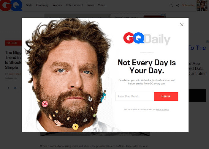
Caption: In 2020, brands like GQ are using pop-up squeeze pages to grab user attention and capture emails on multiple web pages.
How are Squeeze Pages and Landing Pages Similar?
Squeeze pages are really just a subset of landing pages, so as you might expect, they have a lot in common.
Both landing pages and squeeze pages use persuasive sales copy to communicate the value of their offer and create urgency. They both use social proof strategies, including testimonials and company badges, to build trust with their visitors. They can both incorporate lead generation forms that capture information from visitors. They both include calls-to-action (CTAs) that encourage visitors to complete the conversion goal.
Squeeze Page vs Landing Page: Three Key Differences
We’ve already highlighted the key difference between squeeze pages and landing pages:
Squeeze pages are only for collecting email addresses and building a subscriber list while landing pages can serve a variety of conversion goals.
Now let’s look at three of the most important design differences between landing pages and squeeze pages.
Squeeze Pages Are More Concise.
Landing pages that are designed to sell a product or service can sometimes be several pages long. Marketers include additional text and FAQs to overcome all possible objections on the page, encouraging visitors to keep reading until they’re ready to buy.
In contrast, squeeze pages usually have very little content on them. Their goal is to streamline lead generation as much as possible: to show the customer what they’re getting and how to get it as quickly and seamlessly as possible.

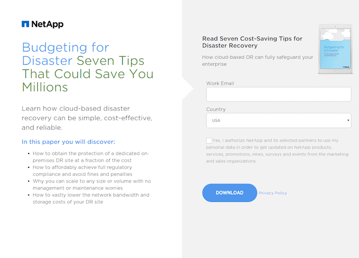
Caption: This squeeze page quickly explains what visitors can expect from their download and there’s only one form field required to redeem the offer. It’s both concise and effective.
Squeeze Pages Use Fewer Design Elements.
Squeeze pages usually follow a very basic layout: a headline at the top, a value proposition in the middle, an image somewhere, a small lead generation form, and a call-to-action. Using a minimal layout places the customer’s attention solely on the offer and maximizes the chances of capturing their email address.
Squeeze Pages Use Shorter Lead Generation Forms.
Some landing pages use long lead generation forms with fields for a company name, industry, market size, and more. These long forms are helpful for pre-qualifying leads in a B2B sales context, but they don’t belong on a squeeze page.
Lead generation forms on squeeze pages have just one or two form fields where visitors can enter their name and email address.
Five Squeeze Pages Offers that Generate Leads
Squeeze pages usually include a special offer that visitors can redeem by subscribing to the marketer’s email list. Here are five of the most common offers used to drive conversion rates on squeeze pages:
- Email Newsletter Subscription – Weekly or monthly with valuable industry insights
- Contest Entry – Entry into a contest or sweepstakes with a valued prize.
- Coupons & Discounts – A special coupon or discount code for online purchases.
- Downloadable Assets – Access to gated content, such as white papers, downloadable PDFs, templates, or guides.
- Streamed Content – Access to a pre-recorded webinar or product demo.
Summary
Remember, a squeeze page is just a landing page that’s optimized for building an email subscriber list. Use squeeze pages early in the market funnel when you want to generate leads and landing pages later in the marketing funnel when you want to convert visitors on the page.
-
 CEO
Garrett Mehrguth
Did you enjoy this article?
Share it with someone!
