What is a Heat Map?
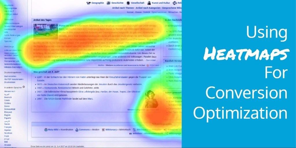
A heat map is a visual representation of data. They were first developed by Cormac Kinney in the mid-90s to help traders get ahead of financial markets. In digital marketing, a heat map allows marketers to record and quantify how Internet users use their mouse or trackpad and then display this data in a visually appealing way. In truth, heat maps are a rather broad category that includes a variety of map types, but we’ll get into those later.
When using a heat map, the best way to ensure that you’re making accurate inferences is to have enough of a sample size per page and screen before you act on the results. This can simply mean making any moves based on the data returned, like optimizing content, creating ads, or updating blogs. For best results, a useful sample size is 2,000-3,000 pageviews per screen design or per device. In other words, if your heat map is only based on 50 or so users, you really can’t trust it to represent any accurate data.
![]()
Why is Understanding Heat Maps Important?
A heat map is important because it acts as a useful tool for businesses to describe their sales, products, or financial information in a visual form. Rather than using numbers and spreadsheets, businesses are able to create visual heat maps to portray data using color shading. This is important because the standard heat map will not only show businesses what their current data looks like geographically but also suggest new opportunities for how to improve business.
Businesses that use a heat map can actually analyze their data to find areas of intensity that may reflect where most of their customers live, where there’s a higher risk of market saturation, and even which areas suggest that customers have lost interest and need a boost. Creating a heat map is fairly simple thanks to online software solutions like Map Business Online and more.
Most online maps software is cloud-based and extremely user-friendly so that all businesses really have to do is upload their address data from a database or spreadsheet so that they can view their business on the map. Once this is done, the software can easily generate a heat map to reflect the regions surrounding a business – or in the case of online businesses, which landing pages receive the most visits and what content receives the most clicks.

How Does a Heat Map Work?
How your heat map works depends largely on the goal of your data analysis. You can use a heat map to describe and measure productivity, marketing efforts, or any other topic that can be tracked numerically. To activate a heat map, you can import spreadsheets or CRM databases into your chosen business mapping software.
From here, the software will take the data and color shade it into an appropriate area of the amp. Knowing what data to use on your heat map depends, but there are three main ways heat maps are created: using points, areas, and the traditional approach. Let’s break each of these down further:
Point-Based Values
Heat maps work by pulling numerical values from your imported business data. These values are then plotted on the map as points of activity. Once plotted, the data on the map displays different heat levels (meaning interest levels amongst users) from hot to cold levels of activity. Point clouds or dot-density maps are portrayed using a color gradient to provide a visual of how your business activity is currently focused.
Area Based Values
In addition to numeric values turned to points of activity, heat maps can also show activity in specific areas. Each of these areas may be color shaded based on counties, states, zip codes, or other area criteria. Instead of points, you can assign a color to a certain numeric value. Most commonly, reds are used for high activity and blues are used for low activity. With this in mind, you can read the map based on the colors of each area.
Traditional Heat Maps
Traditional heat maps look a lot like weather maps. This happens when numeric business data imports are turned into overlaid color shades that show different intensities. Your data is spread across a graduated color scheme. On this map, too, high areas of activity are depicted in red while low areas are shown in blue.
What Are the Different Types of Heat Maps?
As mentioned, there are a few different types of heat maps. They include:
1. Hover Maps (Mouse-Movement Tracking)
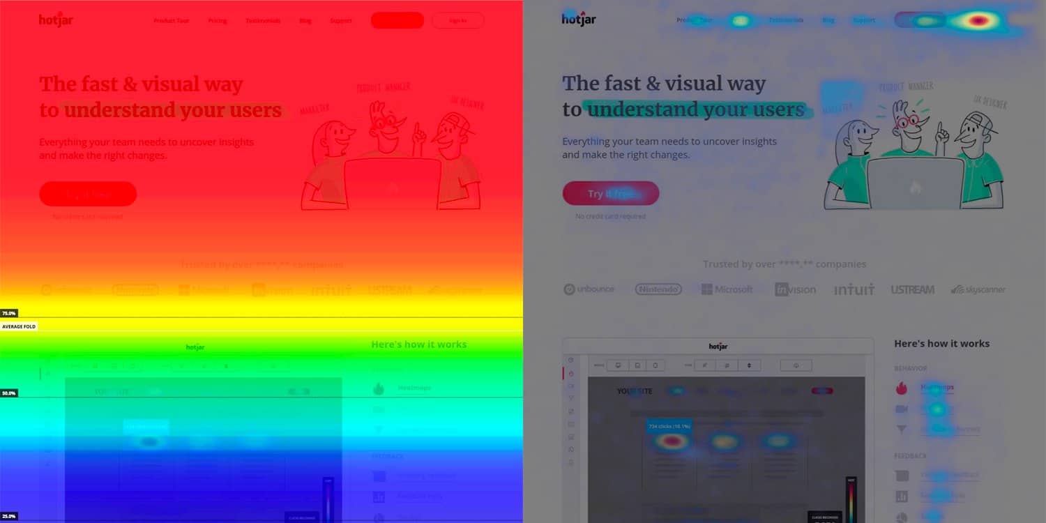
Most of the time, when someone in business talks about a heat map, they’re referring to a hover map. These maps show you the areas where people have hovered over a page with their mouse cursor. The logic behind this map is that people look where they hover, so a hover map shows you where your site visitor had the most interest.
2. Click Maps
Click maps display a heat map made up of aggregated click data. Typically, blue means fewer clicks while red indicated more clicks. Spots that are bright white or yellow mean that spot has the most clicks.
3. Scroll Maps
Scroll maps are heat maps that show how far down the page people scroll. Indicated by color shading, red indicates more popular areas of the page while blue means fewer views.
Each of these map types can get the job done depending on your business goals!

To improve your website’s performance, you also need to improve your website content, navigability, and information. Directive is considered one of the most innovative conversion rate optimization services in the world because we take your data and transform it into results. Get a free proposal from us today.