For the average B2B company, building landing pages that convert is an important job. Your products and services are the lifeblood of your company, so you want to do what you can to convert site visitors to customers immediately.
There are many important factors to think about when creating a landing page. A pleasing aesthetic, an easy to use page, and a clear call to action are essential. But they are only the tip of the iceberg.
The goal is to convert visitors into customers as soon as a few seconds to a few minutes after they land on your page. Of course, the hard part is knowing how to achieve this goal.
With this in mind, we could create a post that explains how to make the conversions possible, step by step. There is a more straightforward way that is more effective. Most people learn by example and visualization. Due to this, we want to meet readers halfway by providing useful examples you can draw inspiration from and mimic.
Check out the following cool B2B landing pages that convert!
15 B2B Landing Pages that Convert
The following 15 B2B landing pages are great examples of how to convert visitors to customers. On each of these pages, you will notice common threads and best practices. Though the following companies are different, their ties to B2B marketing serve as a connective theme.
For your own B2B landing page success, focus on how these pages are similar. From here, you can begin making plans to create your landing pages that convert.
Landing Page #1: Avalara
Avalara is a tax software company. They focus on helping other companies figure out their sales and tax transactions. Their tax automation software covers a range of needs. Avalara returns accurate data on geo-located sales tax rates, certificate management, and filing.
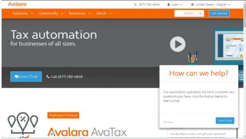
Immediately on their landing page, visitors know what Avalara does, and how they do it. They provide a quick overview of their business objectives. They also offer contact information, featured products, and testimonials from notable companies. This B2B landing page is useful because it gets straight to the point about what you need and how they can help.
Page Aspects to Emulate:
- Featured Products
- Concise Business Overview
- Notable Testimonials
Landing Page #2: SpaceCurve
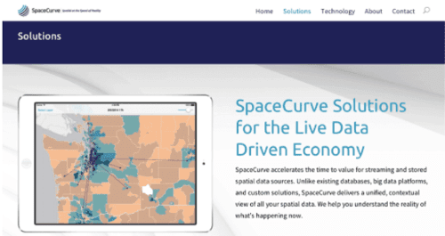
SpaceCurve utilizes animation to show, rather than tell, what their products do. As a provider of live data, it makes sense that SpaceCurve uses animated gifs to show their product at work. Immediately the visitor can visualize what this company does. They have a clear idea of what they’ll get for their money, which allows them to make a better-informed decision.
Page Aspects to Emulate:
- Visuals
- Concise Overview of Company
Landing Page #3: Bizible
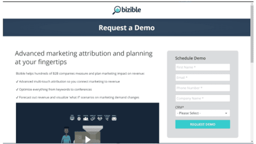
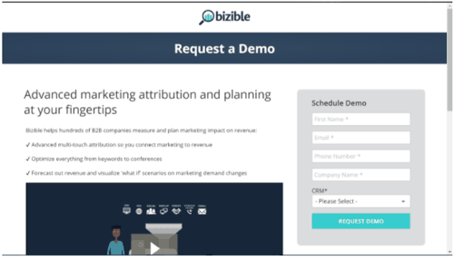
Bizible offers marketing performance management solution software. Their landing page immediately draws in the visitor with a demo of their services. Below are names of notable companies who use their solutions, building their credibility. Under the testimonials are different services they offer with a quick explanation of each.
The landing page also has a clear call to action. You can request a demo of Bizible services both at the top of the page and the bottom. This makes a nice bookend effect that gives visitors a clear idea of Bizible’s most prominent service.
Page Aspects to Emulate:
- Call to Action
- Notable Company Names
- Rundown of Services
Landing Page #4: GoodUI
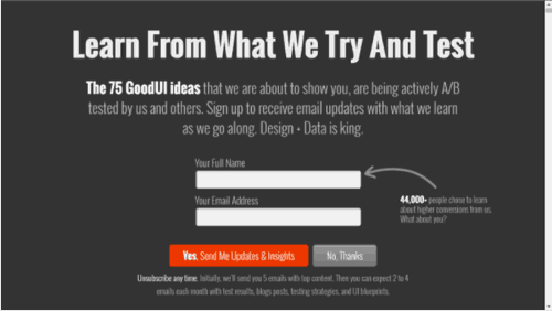
Though the GoodUI landing page is text heavy overall, your quick look at GoodUI is great for conversions. Straight away the site solicits the visitor to learn more about B2B ideas that are A/B tested. They invite you to learn more, see how the plans are executed and provide your information.
GoodUI immediately asks for your name and email before launching into graphic-heavy calls to action. This page offers examples, contact, and immediate engagement, which is a strong strategy, as you only have a few seconds to convert valuable users.
Page Aspects to Emulate:
- Immediate Engagement
- Call to Action
- Visual Examples
Landing Page #5: PayScale
This B2B landing page is all about handling your money correctly. PayScale starts by asking two questions: “What Am I Worth?” and “What Should I Pay?” They then answer these questions with links to their services. This landing page is a perfect example of giving your visitors insight into who you are while catering to what they need. They also provide accurate data that explains how they create their services.
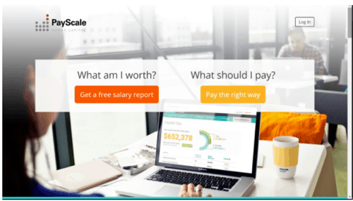
Research reports, ROI reports, and guides are on this landing page, backing up each of their claims. At the very bottom, PayScale offers visitors to take a survey. While this survey focuses on the visitor, it plays an active role in creating a conversion for the company.
Page Aspects to Emulate:
- Question and Linked Answers
- Survey
- Available Data and Research
Landing Page #6: Optimum Energy
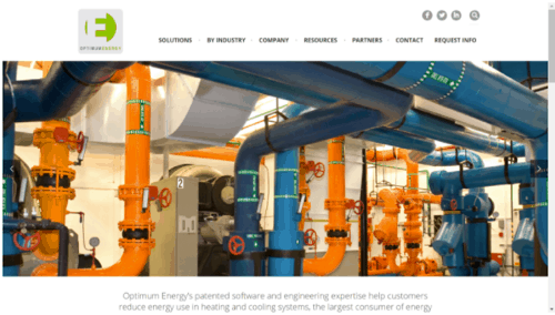
Optimum Energy‘s landing pages each do the same job: offer their visitor what they need most. The company provides energy efficient software solutions for companies, and each page is a gateway to a useful product. On its main products page, Optimum runs through its most valuable products. Concise overviews and contact information may be the bare minimum, but it gets the job done.
Page Aspects to Emulate:
- Visuals
- Product Overviews
Landing Page #7: Vibe
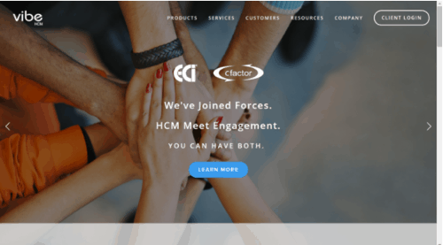
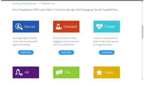
Vibe is payroll software with a snappy landing page that is short and to the point. Immediately the page asks you to request a demo so you can see, firsthand, what this company is all about. As you move through the landing page, Vibe does an excellent job of showing both the simplicity and mastery of their products and services. Short but understandable buzzwords get the point across:
- HR
- Onboard
- Pay
- Engage
- Talent
With each of these options is the chance to learn more. Visitors will find this site easy to navigate.
Page Aspects to Emulate:
- Clean Design
- Clear Product and Service Links
- A Grabbing Ad Upfront
Landing Page #8: BabyTel
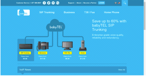
This landing page immediately shows you what products this company is selling with outlinks. Babytel helps businesses set up their phones and other contact devices. These links lead to each individual product in case the visitor wants to buy straight away. This is excellent for conversions because it provides but doesn’t demand immediate action. Also, BabyTel offers news, testimonials, and partners on their landing page. Again, this one is a little text heavy, but it wins points for its quick links to products when the page first opens.
Page Aspects to Emulate:
- Quick Product Links
Landing Page #9: Halogen
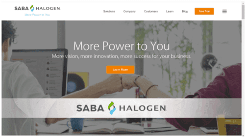
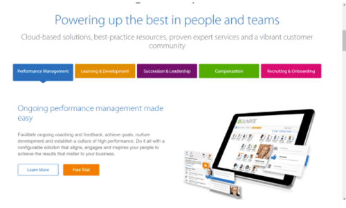
Halogen is a bit of a different B2B site in that it’s about managing your company talent. This site’s landing page immediately offers visitors to learn more, while outlining what it is they do. “Powering up the best in people and teams” is their tagline, followed by a short explanation of their services. Halogen offers software solutions, and their landing page lets you know it. Their solutions page also has useful visuals along with links out to their services.
Page Aspects to Emulate:
- Sleek and Simple Design
- Concise Overview of Services
- “Learn More” Option
Landing Page #10: DesignCrowd
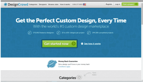
DesignCrowd is a great B2B company with an even greater B2B landing page. The “get started now” option invites the visitor to engage with the company at once. However, the rest of the page (and the company name) makes it clear what they do. Also on the landing page are categories of service. They have a well-designed and easy to understand overview of each type of design they offer.
Page Aspects to Emulate:
- Excellent Design
- Easy Option Display
- “Get Started Now”
Landing Page #11: UpWork
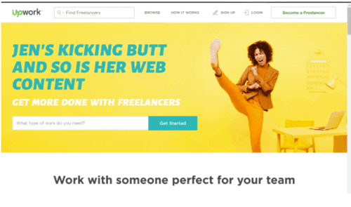
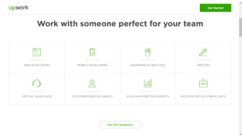
Upwork‘s landing page is a perfect example of an excellent call to action. Prominent, easy to navigate, and comprehensive, this C.T.A. gets the point across quickly. In addition to this, Upwork lets the visitor know what the site is for and what it does right away. They show what the site does, what it offers, and how it can help you and your business. Further, there are easy step-by-step visuals to how the Upwork website works.
Page Aspects to Emulate:
- Simplicity
- Eye-Catching Design
- Prominent Call to Action
Landing Page #12: OpenAir

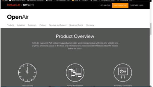
A tremendous B2B resource and landing page, OpenAir offers a clean design and a prominent call to action. Right away the visitor knows what the site offers and what they need to do to take part. This landing page also showcases excellent use of testimonies, product overviews, and help. Their homepage acts as a one-stop landing page in a truly effective way.
Page Aspects to Emulate:
- One-Stop Shop Design
- Call to Action
- Testimonies
Landing Page #13: Zoho
The most enticing aspects of Zoho‘s landing page are these:
- Sign Up for Free Option
- Heavy Visuals
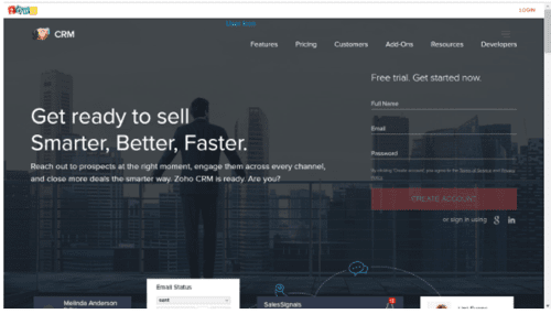
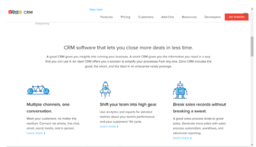
The free option gives visitors a sense of welcome while also relieving pressure that they have to do something. This is an exciting option that still works towards conversion over time. Zoho’s landing page does an excellent job of showing what they do, how they do it, and how what they do can help you and your company. Like many of the other landing pages, this one also offers testimonials and notable names of the industry.
Page Aspects to Emulate:
- Free Sign Up Option
- Visuals
Landing Page #14: iAcquire
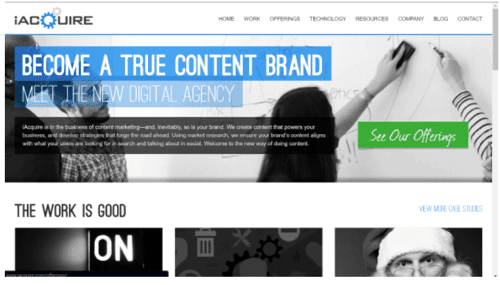
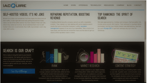
iAcquire‘s landing page makes good use of bold and text to tell visitors what they do and what they offer. Immediately they have an overview of services, research and case studies, and a handy link to offerings. Though the page is undoubtedly a little busy, conversions can still be made. The main objectives (services and products) are front and center, getting the point across quickly.
Page Aspects to Emulate:
- Case Studies
- Offerings
- Bold Lettering for Important Messages
Landing Page #15: Unbounce
Unbounce has the most helpful landing page of all. A useful site with many services, Unbounce places their knowledge on how to build landing pages for conversions front and center. Unbounce expertly offers its most useful information first with a call to action close behind. From here, Unbounce has plenty of visuals of their other services that explain how they do what they do: make you a better marketer. Of course, Unbounce also offers notable names they work with, testimonials, and a second call to action at the end of the page, inviting visitors to peruse their plans.
Page Aspects to Emulate:
- Put Best Foot Forward (Offer Information Customers Want First)
- A Relevant Call to Action
Takeaways
These 15 B2B landing pages each have their strengths, but a common theme is a prominent call to action. When the visitor knows what you can do for them straight away, it makes a landing page that much more effective. As you build your landing pages, use these example for reference and inspiration. In the end, you’ll have pages that convert.
-
Kathryn Ross
Did you enjoy this article?
Share it with someone!
