Do you have a terrible lead generation landing page? Let’s find out.
Don’t miss a video! Subscribe on YouTube!
[ Note: Learn or retain more by reading? We got you. Here is the video above in blog format. You’re welcome. ]
Does your landing page have external links?
You don’t need them. External links are things that you have on your website. Those are your:
- Menu links
- Links to more information
- Anything that takes users off of your landing page
Our goal should be to effectively communicate the value of our product or service directly on that one page. If you need to give more information, you can use what’s called “light boxes.”
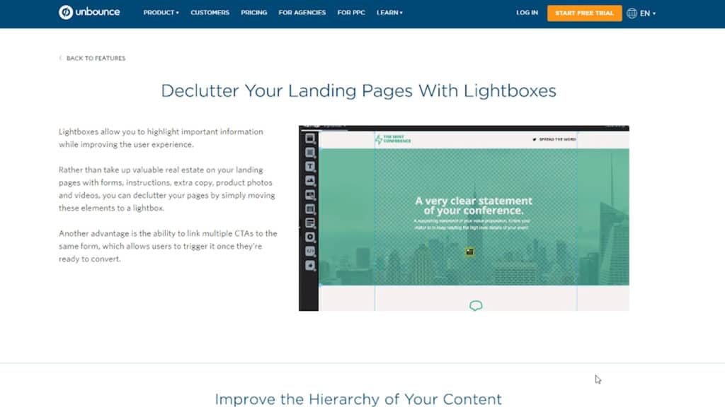
But ideally, we want to keep our users focused on a singular objective — converting.
Uh-oh, are we missing a call to action?
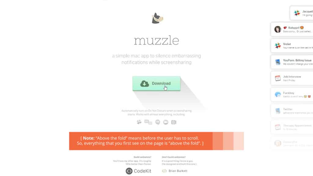
It’s most important to have the call to action is “above the fold”.
This can be a button that goes down to a form. This can be a button that triggers a pop-up form. This could even be the form, but you need to have a call to action above the fold. If not, you’re killing me.
You’re not on mobile? C’mon, man. It’s 2018.
You’ve got to be on mobile. A lot of your users are actually going to your site on their mobile devices or looking at your ads on their mobile devices.
A lot of times, clients come to us and they just have random bid adjustments on their devices in AdWords so that they don’t show their ads to mobile users.
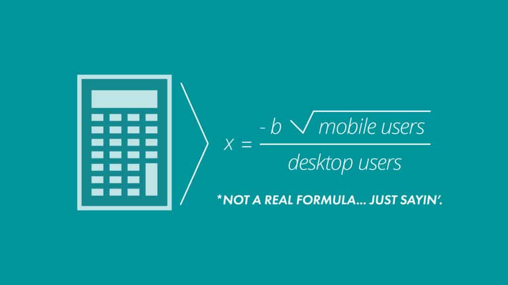
There should be a calculated formula deciding how much you spend on mobile users versus desktop, but just saying to ignore them entirely is crazy in 2018.
We have to optimize our lead generation landing pages for mobile experiences.
Is your call to action lame?
Like, “Submit,” or, “Get a Consultation,” or “Request a Proposal?” These things don’t work. Stop wasting your money, time, efforts. In fact, my least favorite is “Schedule a Demo.”

We’ve run several studies that show that if you change your call to action from “Schedule a Demo” to “Watch Free Demo Video,” you can get massive uptakes in conversions — we’re talking hundreds of percentiles.
You’re better than that, okay? Start testing.
Stock photos, really? We’re using stock photos still?

You have so much available to you. There are amazing photos you can use that might look less stock but you could even take your own or pay. What an idea — okay?
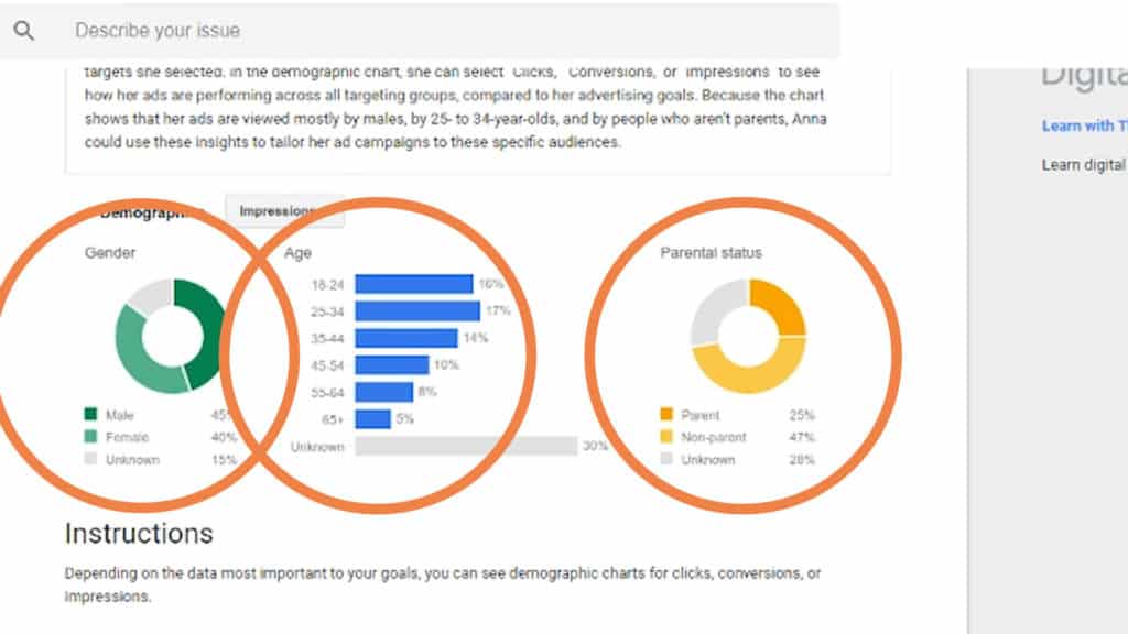
And — you don’t have to guess which stock photos or which actual real photos to use anymore. You can log into your AdWords account, go to the demographics tab, and you can see which ages and genders are making up the majority of your conversions and use those personas for all your imagery.
Are you only using one landing page? You’ve got like 10 campaigns.
It’s not that I’m mad, I’m just disappointed.
We need to be running single keyword ad groups going to dedicated landing pages. We can’t be lazy. You’re not lazy, I know that.
You’ve got to take the time to set up your landing pages correctly so you can actually target them to the search intent or the buying intent they had when they clicked on your ad.
We want a seamless advertising experience. That’s critical for your conversion rate.

Do You Have A Terrible Lead Generation Landing Page? — Takeaway
Watch out for these signs of a terrible lead generation landing page:
- Your landing page has external links
- You’re missing a call to action (CTA)
- You’re not on mobile or mobile friendly
- Your call to action is lame
- You’re using stock photos
- You have 10 campaigns, but only 1 landing page
You might have a terrible landing page today, but that’s okay.
If you follow these recommendations, you can go from okay or kinda poor — maybe even terrible — to exceptional by just being consistent with the little things. Best of luck creating your lead generation landing pages!
Remember to subscribe to the channel and leave a comment below with any ideas you’ve tested or things you’ve seen that make landing pages terrible. Thanks and have a great day!

-
 CEO
Garrett Mehrguth
Did you enjoy this article?
Share it with someone!
