


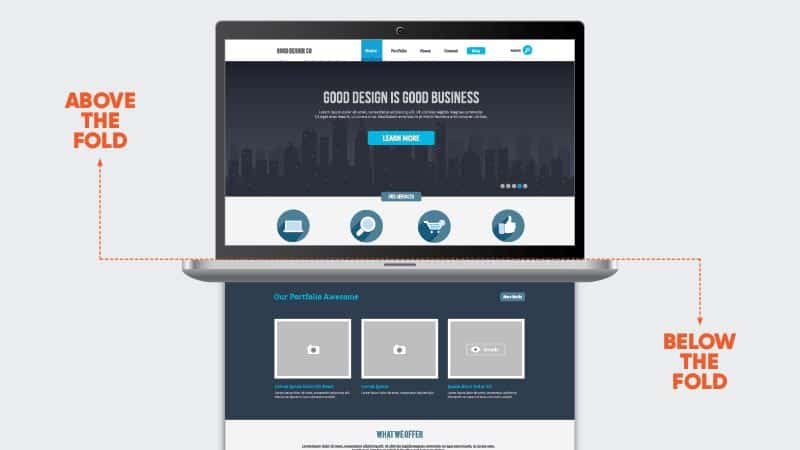
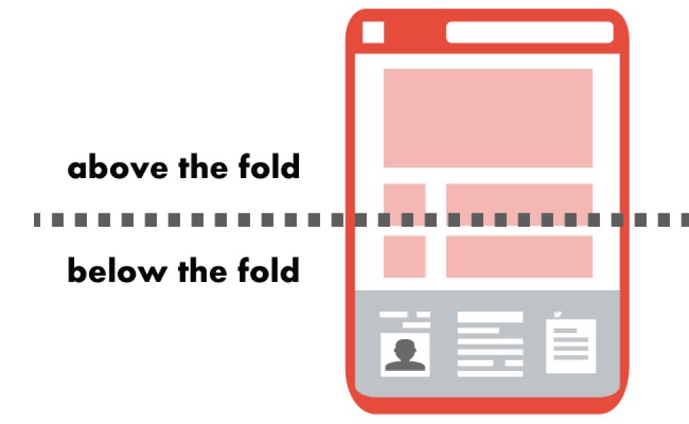
Above the fold is the upper portion of a webpage that is visible when you land on that page. Here is where an important news story, information, or photograph is often located.
Above the Fold is a phrase that dates back to the early days of publishing. First used for newspaper publishing, “above the fold” was a term coined for content that appeared in the top half of the front page of a newspaper.
When newspapers were displayed on a newsstand, the stories that appeared above the fold were the most visible to passersby, and usually contained catchy, attention-grabbing headlines, enticing images, and dazzling quotes to grab readers’ attention and, hopefully, make a sale.
As news publications gradually moved from print to online, web design began to evolve and change to fit the modern mediums. In the 1990s, most media was available online in addition to in print, but the term, “above the fold” still stuck.
Today, the “fold” in “above the fold” no longer refers to the actual fold in a newspaper. Instead, when you see publications talking about the “fold” in online media, they are now referring to the bottom of a browser window, which is usually approximately 600 pixels from the top of the page.
Why is Understanding the Term "Above the Fold" Important?
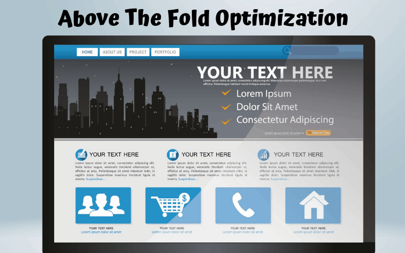
Whether in print or online, the placement and layout of your content are important because it determines what your site visitor see first. When an Internet user first loads your webpage, everything you’ve placed above the fold is going to be the first thing they see.
If you have chosen content that is not relevant or interesting, chances are you’ll lose the user’s attention and they’ll leave your page in search of something else. With this in mind, you must treat the space above the fold as the prime location for certain pieces of content. Anything that is relevant, informative, and eye-catching belongs above the fold.
How is Above the Fold Measured On Desktop vs Mobile
Different websites will have different fold placements, so it is difficult to say definitively where the fold appears on every webpage. As there are a number of monitor sizes (think laptops vs. desktops), browser plugins, screen resolutions, and even screen types (think of the various sizes of smartphones and tablets), pinning down where the fold should be placed is almost impossible.
The best answer is that it varies depending on the screen you’re using and the screens your target audience is using. Some websites are suited to all screen types while others are not, and this can make a huge difference in how users interact with a business.
With all of this in mind, however, it is important to note that when determining where to place the fold on a webpage, most web designers find that the fold line is at approximately 600 pixels tall and 1,000 pixels wide.
This measurement translates well across the most common monitor and browser combination – 1024×786 pixels – i.e. how the average webpage looks when the window is maximized and there are no installed toolbars at the top.
To help you determine where the fold should land for your particular website, you can rely on your website’s analytics program. It should be able to provide data on which screen dimensions are the most common for your visitors so you can plan accordingly. Remember – though 1024×768 has been the most common dimension layout, new dimensions are rising every day and growing in popularity.
In fact, 320×568 and 360×640 are becoming more commonly used.
To decipher which dimensions are best for your website, play around a bit, consult your web analytics, and think about who your target audience is. If your audience is comprised of younger individuals who use social media and do most of their Interest browsing on their phones or tablets, you should make your site available on all screen types.
What Kind of Content Should Be Displayed Above the Fold for SEO?
Keep in mind that the best content to display above the fold is attention-grabbing content that is relevant to your business goals and your target audience’s needs. With these criteria, you may think it is best to place ads above the fold so that their viewability is increased, but this can backfire. Never go overboard with ads, even if they’re relevant, attention-grabbing, and clearly showcase your business goals.
In recent years, Google has released several algorithm updates that actually penalize websites that place so many ads above the fold that they actually force their actual content below the fold. If there are too many ads above the fold, it can result in a poor experience for the user, which can lose your business a potential customer.
To keep in line with SEO and avoid triggering algorithmic updates that do not work in your favor, be sure to do your keyword research, to employ your keyword strategy, and to both update old content and create new content that is perfectly optimized for common search engines. This way, you cover all your bases.

Creating content to be featured above the fold may be daunting, especially if you don’t understand the nitty-gritty of CRO tactics. To help you make the best decisions for your website, let Directive look over your website and offer our expertise across all channels.
Get a free proposal with us today and learn how you can ensure your content is doing what you need it to do.