Let’s say you’re spending a lot of resources on SEO and PPC services. Your traffic is improving month-over-month by 10 percent; however, conversions are flat. What do you do?
This was a struggle for one of our clients that creates construction project management software. Traffic was improving, but no one was signing up for their demos.
That’s when we shifted our focus to conversion optimization. Blog posts earned the most traffic, so we felt this was a smart place to start. We decided to prioritize content marketing funnel tactics.
For our client, most conversions came in January and February (late winter/early spring). By the end of this campaign, we increased conversions by 10 percent in May compared to February—typically their busiest month.
We also saw a 50 percent increase in year-over-year conversions for Q2.
In this post, I’ll walk you through our entire CRO project and review how you can utilize strategic design to build more revenue for your company but utilizing the content marketing funnel.
I’ll cover:
- Finding the right areas to optimize
- Determining actionable goals
- Crafting calls to action
- Placing buttons strategically
- Running smart tests
Ultimately, a few small optimizations to blogs and resources were enough to turn the historical conversion nadir into the highest-performing month of the year.
Step 1: Finding the Right Areas to Optimize
To start, my team started by reviewing pages with numbers of unique visitors.
Why?
More visitors meant shorter testing cycles and quicker results. We ran tests on the homepage and demo sign pages. Then we got to thinking and realized blog posts and resource pages had the most unique visitors, but no calls to action to send users to the next step of the funnel.
We hypothesized that if we added call-to-action banners to view demo videos, that could increase the likelihood of visitors requesting a demo.
So, we added these banners through WordPress at key break-points in the articles. We didn’t think blog visitors would be ready for a demo yet. However, they would be prepared to watch a video that didn’t require interaction with another person.
Many of these posts focused on construction management and accounting. People landing on these posts likely had an established construction business and were actively trying to solve for a known management problem.
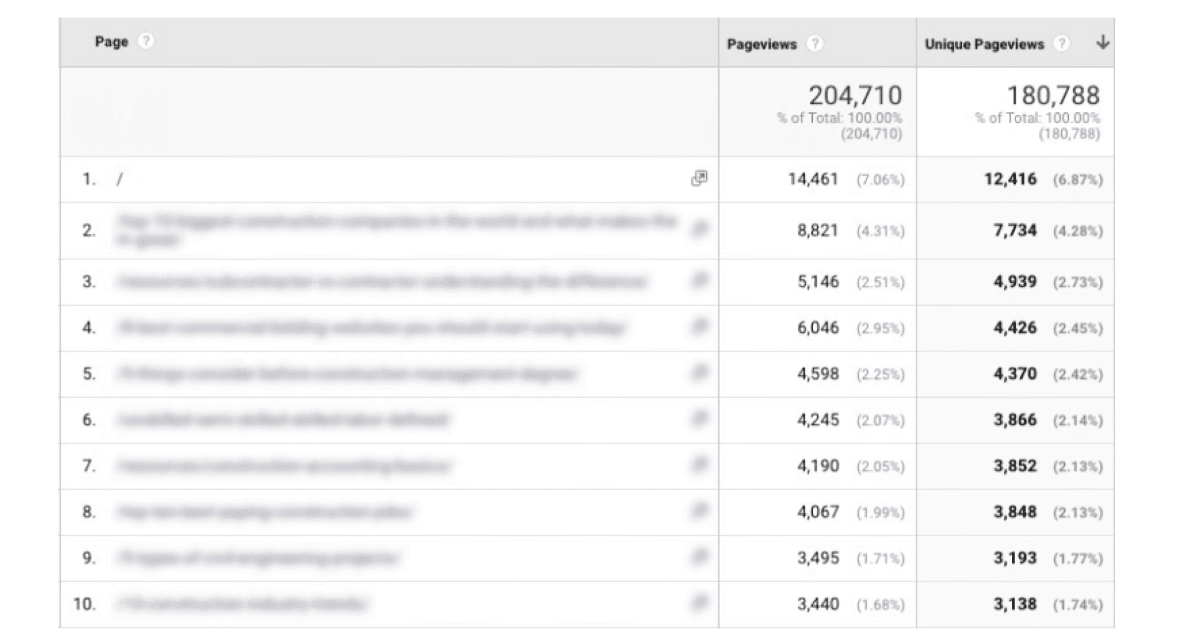
The starting point was finding pages with quality content and a high number of unique visitors. A page with only 27 unique monthly visitors wasn’t going to get enough button clicks to test our hypothesis.
We compiled a list of the top ten pages and focused on a couple of posts that lived in the middle of the funnel.
Step 2: Determining Actionable Goals
The goal we set with the client for this project was a 20 percent increase in conversions, opportunities, and deals. So, the best way for us to start tracking this was to tie our efforts to the very last goal in the sales funnel trackable via the website: demo sign-ups.
Once someone requests a demo, the sales team can reach out to the potential customer from there.
The most beneficial tactic we could track was the last step before the lead turned into an opportunity.
See below:
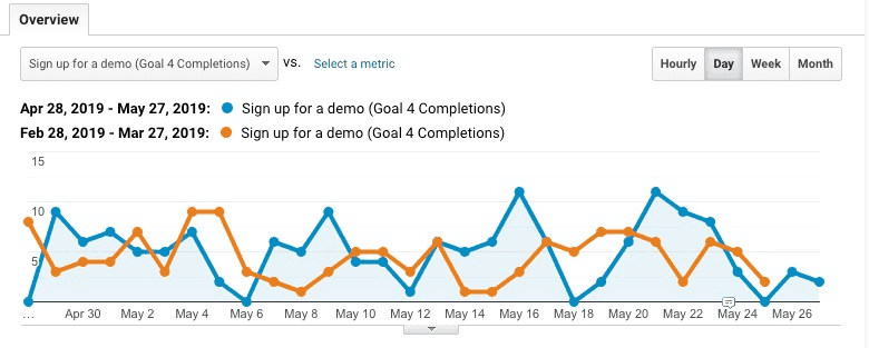
To do this, we set up a demo sign-up conversion for anyone who reached the demo sign-up thank you page.
Step 3: Crafting Calls to Action
After finding the pages to start with, we created call-to-action (CTA) banners.
For more top-of-funnel posts, we focused on a banner offering a demo video. This button led to a landing page that housed the demo video. On the thank-you page of this demo video, we would provide an option to get a live demo.
This was an effective way to lead blog visitors through the sales/content marketing funnel meaning:
- If they liked what they read, maybe they would want to see a demo without having to interact with people yet.
- If they liked what they saw in the video, perhaps they would be sold on speaking to someone who could walk them through our client’s capabilities.
We ensured that we explained the value of our offer in the CTA, including what the user would experience, what they would learn, and why it was valuable:

Our CTAs relied on a few widely applicable principles:
- Relate to customer pain points: People were trying to connect their workers in the construction field to their system back at the office.
- Highlight the value proposition: We mention our client’s “complete document control” and explain how it solves customers’ problems.
- Relate the CTA to blog content: This CTA appeared on a post that talked about construction accounting and project management.
Step 4. Strategic Button Placement
Where should the CTA banners go? A CTA at the end of the post offered an opportunity to keep visitors engaged. Without it, why should they stay on your site?
For longer posts, duplicate CTAs throughout the post also made sense. Our design team created mockups of where to place the buttons (a necessary task to get client approval before creating the test).
Place additional CTAs at critical sections and breakpoints throughout the blog post. Test changing the language of each banner to relate to the section that the user just read.
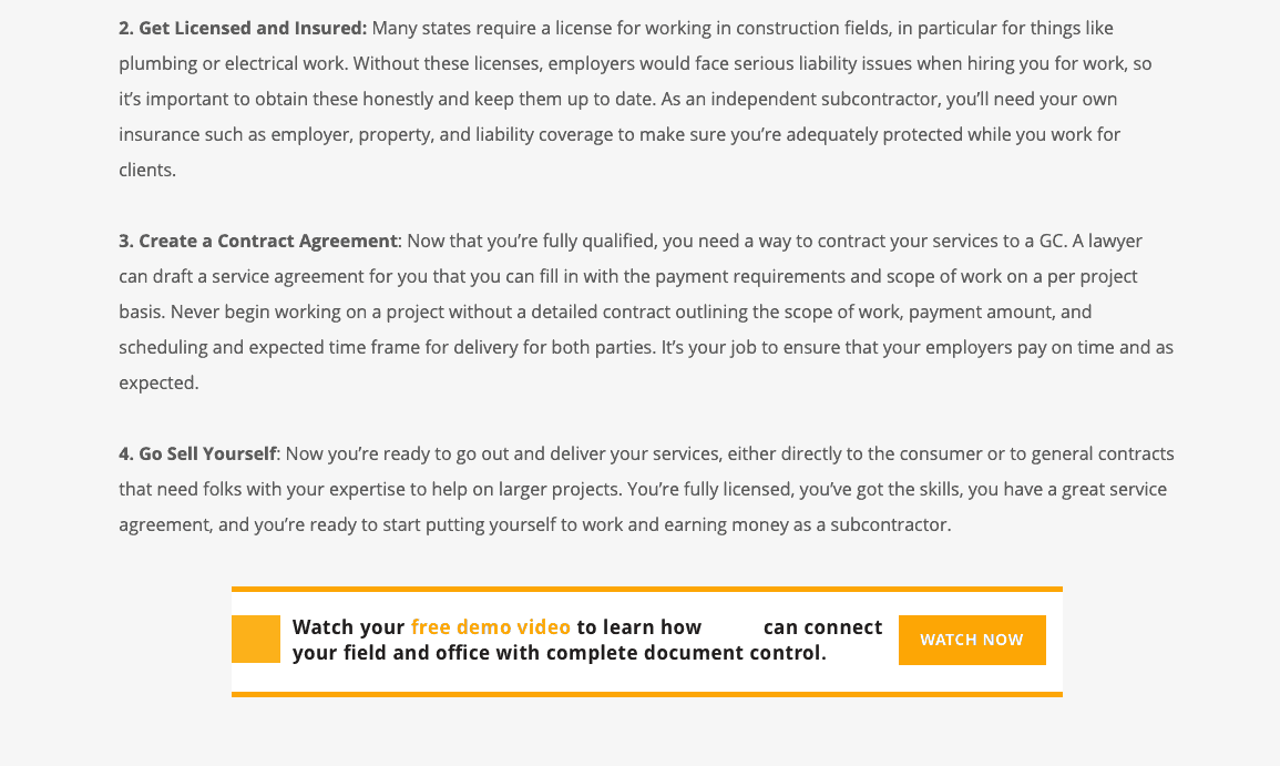
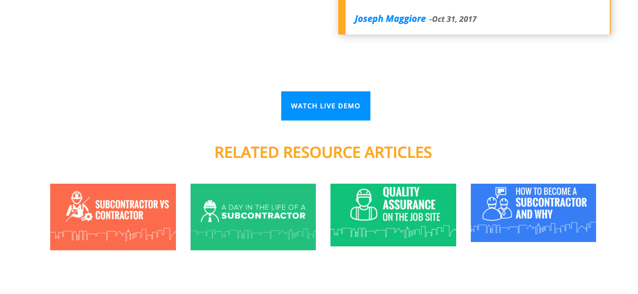
We created a mockup of the page and placed this free demo video CTA throughout the blog posts at section breakpoints.
Step 5: Running Smart Tests
We used Google Optimize for these tests, which is an excellent platform because:
- It’s free
- It’s hooked up to Google Analytics
- It’s easy to implement simple changes
The downside is you can’t add anything new to the site unless you know HTML and CSS. To simplify the process, we copied button elements from other pages and pasted them into the sections we wanted.
To do this yourself, right-click the button in question, click “Inspect,” then right-click the element, which then becomes highlighted in the Elements window. Click “Copy element” to get what you need for your Google Optimize experiment.
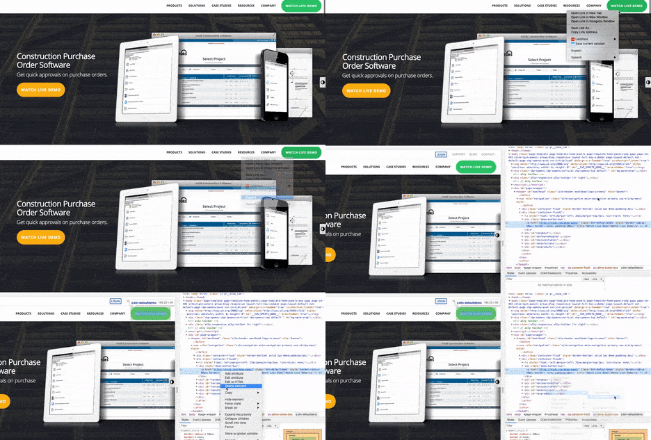
If you’re making a button from scratch, they need to be set up something like this:
<a href=”https://name.com/demo-page/” class=”btn btn-default” style=”border-radius: 50px; border: none; padding: 20px; background-color: rgb(46, 204, 113) !important;”>Watch Live Demo</a>
That code makes this button:

<!– Start Free Demo Video Large Version for Resource Page–>
<p style=”margin: 40px 0px;”><a href=”https://name.com/demo-page/” target=”_blank” rel=”noferrer noopener”>
<img class=”aligncenter size-full wp-image-8781 dailyreportwhite” src=”https://name.com/wp-content/uploads/2018/02/name_CTA_Desktop_950x100.png” alt=”daily report banner” width=”950″ height=”100″ /></a></p>
<!– End Code Free Demo Video Large Version for Resource Page→
The above code creates this banner:

To create a new test:
- Go to your Optimize Account (Main menu > Accounts).
- Click on your Container name to get to the Experiments page.
- Click CREATE EXPERIMENT.
- Enter an Experiment name (up to 255 characters).
- Enter an Editor page URL (the web page you’d like to test).
- Click A/B test.
- Click CREATE.
You can learn all about Google Optimize through their support documentation here or read this article.
Once you’ve created the test, go to the area in the code where you want to add the button. Right-click the area and click “Edit HTML”. Then, paste your button code toward the end.
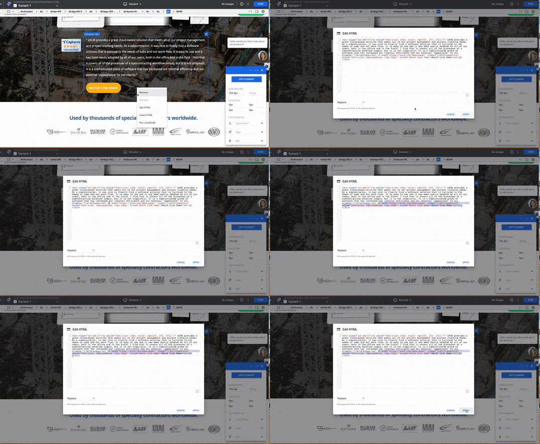
Configure Your Experiment Objectives on the OBJECTIVES Tab:
- Select a Google Analytics view.
- Select a Primary Objective.
- (Optional) Click + ADD AN OBJECTIVE to add an objective. Optimize users can use up to three pre-selected objectives per experiment and see data for those objectives in Optimize reports.
- Add a description and hypothesis.
- Click SAVE.
Testing Without Google Optimize
We created these demo video banner tests directly in WordPress instead of A/B testing them. It was much easier to implement in WordPress than in Google Optimize.

To track how the change affected the primary goal of demo sign-ups, we annotated Google Analytics on the day we made the change.
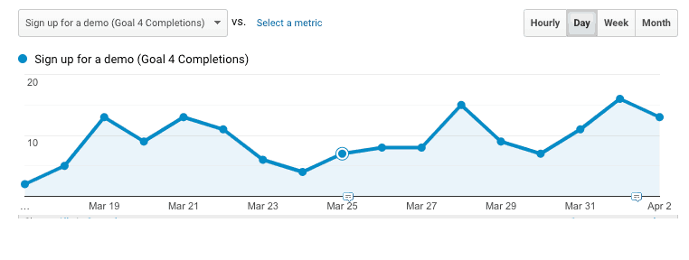
By simply adding a few demo video banners on top-performing blog posts, we saw a 12 percent conversion increase on the demo video landing page.
We made additional tests in Google Optimize, adding live demo sign-up buttons throughout key breakpoints on each post. These posts were more middle-of-funnel talking about construction accounting and project management software (which is what our client does).
So, it would make sense why this audience would find a live demo more valuable than a short demo video.
Due to the MoFu nature of these posts, we felt it was more appropriate to offer a live demo.

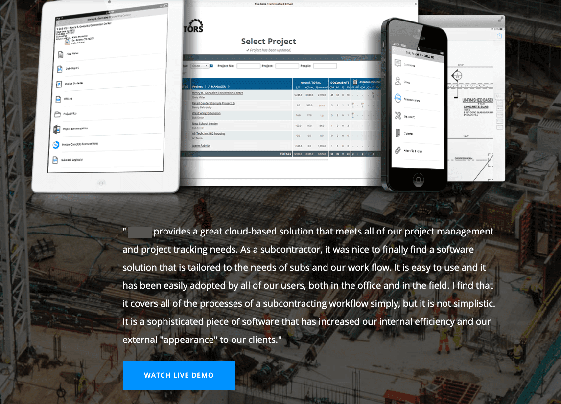
After your test runs for a while, you will be able to see how it performs on the reporting tab.

For the purchase orders page, there were 106 sessions, five conversions for Sign up For Demo, with 10.8 percent conversion rate! With this 98 percent confidence rate, we can call this a winner.
Content Marketing Funnel Tactics – The Results
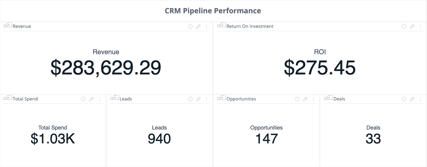
Our goal for opportunity growth was 10 percent MoM, and 20 percent by the end of our two-month project. From February to March, we saw a significant increase in opportunity volume by 32.43 percent, which you can see below in our Sisense dashboard.
March 2019: 147 opportunities (remember: this is usually the slowest part of the year every year)
February 2019: 111 opportunities (This is the busiest time of the year)
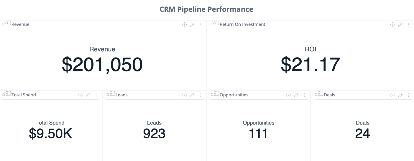
February Opps: 111
March Opps: 147
% Difference: +32.43%
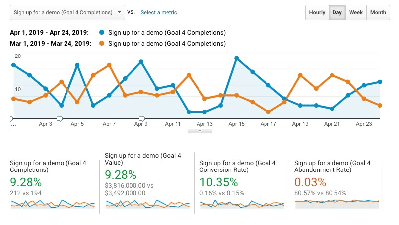
Sign-ups for demos have continued to increased month over month by 10 percent. We still believe this is attributed to the addition of our in-line CTAs on product/solutions pages, and exit-intent pop-up implementation. Here is a look at demo request conversions from April compared to March when comparing the same time frames:
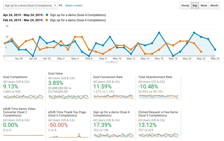
In May, we’ve seen a 17.39% increase in demo sign-ups as compared to sign-ups just before this CRO project started.
We believe this can be attributed to all of the changes being applied to the live site. The conversion rate has improved 11.59 percent since the start of this project in March.
In Conclusion
Using content and resources pages to push bottom-of-funnel CTAs will not guarantee that these leads will turn into sales. However, if you’re dealing with a small pool of qualified leads, would you not prefer a pool that is at least 20 percent larger?
By increasing the amount of BOFU leads, you’re increasing your chances to turn more of those leads into opportunities and then deals.
These efforts take time, and you should not try to tackle all high-traffic pages at once. A/B testing is a process that should be done in smaller increments. However, if you start slow with a few of your top pages, you will be able to see a pattern of what works and what doesn’t.
Once you’ve established this pattern, you can roll out similar changes more quickly on more pages, gradually increasing your conversions and conversion rate as you go.
Start with the areas of highest impact that discuss mid-funnel topics and have a large number of unique visitors. You will begin to see success with in-line CTAs that lead to the next step of the sales/content marketing funnel.
-
Olivia Ross
Did you enjoy this article?
Share it with someone!
