If you’re managing any form of paid digital campaign, you have probably spent a great deal of time optimizing your landing pages. Of that time, a large chunk is hopefully dedicated to psycho-analyzing your Call-to-Action. This is the conversion that you want your user to perform. It should be clear, concise, well-placed, and should align with where your user is in the buyer’s journey.

Having said that, at Directive Consulting we spend a large part of our initial project suggesting ways to optimize our client’s CTAs.
This is primarily for two reasons. Reason number one: oftentimes, marketers fail to recognize the psychological importance of their CTA. Reason number two: optimizing the landing page CTA often yields some of our best results, lead gen wise.
To help educate the industry on the importance of CTAs, we’ve compiled a data report analyzing the top 100 ranked software companies and their CTAs. You can click below to download the report for free.
Click here to download the
CTA Psycho-Analysis Spreadsheet
This blog post will dive into the analysis of these CTAs and how they can be focused/improved. The post will also discuss the psychology behind low-friction Call-to-Actions. The logic is to make the process easier for your users and empower your sales team after the fact. Keep reading to learn how you can improve the delight-factor and efficacy of your CTAs to generate more paid leads from your landing pages.
Auditing Your Landing Page Call-to-Action
So why is it that nearly every initial project includes suggested changes to the landing page CTA? It would seem that there are enough “landing page best practice” blog posts out there to fix all our CTA problems. But, unfortunately, we keep finding vague CTAs and haphazard landing pages.
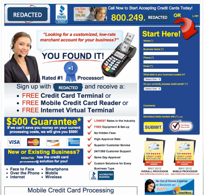
Landing pages like the one above will usually struggle to generate the leads they are looking for. What’s a bigger issue for LP’s like this, is pinpointing where your specific conversion problem is.
Is it your copy or the offer? Is it the design of your landing page or did you misplace your CTA where it can’t be found? Or is your offer simply at the wrong point in the buyer’s journey to begin with?
There is an endless slew of possible problems, each with its own solution. To make things a bit easier, we’ve narrowed down the possible CTA and Landing Page diagnoses into five general categories.
- Goal Conversion Lacks Clarity
- Incorrect Timing in Buyer’s Journey
- Poor CTA Placement on Landing Page
- Too Much Commitment in Form
- Good to Go (no changes necessary)
Having identified what the common problems are for CTA optimization, let’s see how we can fix them.
What Makes a Strong CTA?
The best Call-to-Actions are clear, direct, and align 1:1 with your ad copy, landing page design, and value offer.
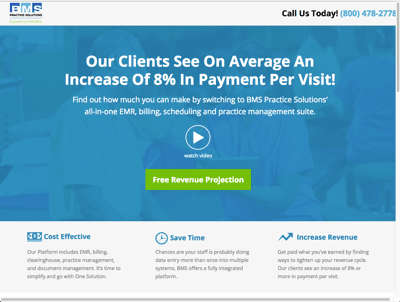
Their should be no question in your user’s mind as to what the goal of your landing page is. To ensure that there is no confusion-caused bounces, you should usually limit your landing pages to one CTA and one goal conversion. This way the success of each ad and landing page is easier to track as a win/loss.
On top of that, streamlining your landing page and CTAs should also improve your user experience. The easier and more delightful your user’s experience on your page, the more likely they are to convert.
For example, by replacing a “Schedule a Demo” CTA and replacing it with a demo video to watch, we were able to see some massive growth in conversions. You can see in the Unbounce screenshot below that having a video ready for the users to watch upon landing increased conversions by an absurd percentage.

Your CTA should also be accompanied by the reasons to convert. Whether it is feature-driven or benefit-driven copy, you need to give your user tangible reasons to click your button. The more ways you can eliminate friction by providing the user with necessary and helpful information, the more conversions you’ll see.
Landing page CTAs should invoke trust and delight in your user’s mind. You can check out this infographic on How to Build Landing Page Trust to see more.
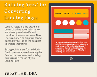
Click here to download the full infographic on LP Trust
As we established earlier: your CTA is the handshake of your brand and landing page. You need to make a clear and strong first impression to ensure you are converting enough leads to justify your Cost Per Click (CPC). Now that we know the dos and don’ts of CTAs and landing pages, let’s see how these 100 Software sites hold up.
CTA Spreadsheet Explanation (+ Download)
Let’s start off by defining the data set. There are quite a lot of software companies out there, so we couldn’t analyze them all in this report. Instead, we focused on software companies in the B2B space that have a domain authority (DA) of over 50.
These are sites that are usually well-off in terms of PPC. They may not be running perfect campaigns, but they aren’t so early on that they are beyond help. For sites with less established campaigns, the problem may not be that they aren’t converting, but that they aren’t generating enough traffic or clicks to start.
We chose to focus our data set on these above-50-DA sites because an optimized CTA can generate the biggest improvements in this range. You can download the full spreadsheet by clicking here or on the thumbnail below.
Now that you’ve seen the full CTA-breakdown, we can dive into what these sites are doing right (or wrong) and what we can learn from them.
Common CTA Issues & Quick Fixes
I’ve already mentioned which problems most constantly plague CTAs and Conversion Rate Optimization. Now let’s take the time to dive a bit deeper into each type of problem and how we can fix it.
For each type of CTA-issue, I’ll focus on a specific example from the spreadsheet. This way each insight has a tangible example for you to refer to as you move forward with optimizing your own CTAs.
Goal Conversion Unclear
The first issue is the most common and often the most troublesome. Unclear conversion goals usually occur when you are sending traffic from PPC ads to non-dedicated landing pages.
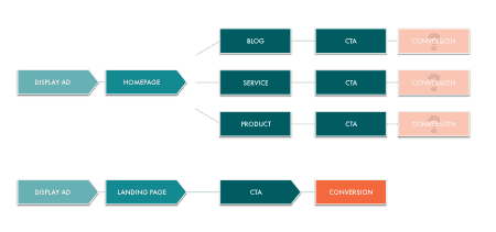
Imagine you are creating a new ad to convert some new leads for your most recent software solution update. If you are trying to generate those unique conversions, sending the users who click on your ad to your home page or a service page doesn’t make much sense.
While these pages have plenty of valuable content about your site, they aren’t focused enough. They don’t tell a singular conversion story.
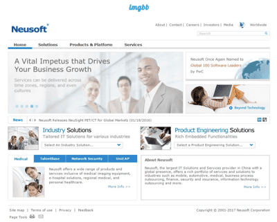
Your user just clicked on an ad looking for a specific software solution. If you don’t want to loose grasp of their attention, you better show them what they’re looking for.
Another reason for unclear CTAs is that, for some reason, some marketers don’t feel the actual copy of their CTA is vital to their landing page’s relevancy. Like the screenshot below, these landers have plenty of content explaining the conversion. But their CTA is left unaddressed and is still using vague copy.
While the text for such a small button doesn’t seem super important, it’s either a booster or dead weight. These sites assume that if they have a dedicated page for a unique ad, they’ve checked their boxes – the “get started” or “download” CTA should do fine.
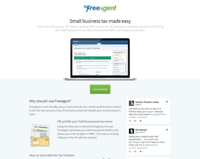
And if you’re aiming for “fine” results, then keep moving forward with your conversion-sabotaging copy. But if you really want to generate qualified leads en masse, you’ll keep reading.
Incorrect Timing in Buyer’s Journey
Now, even if you’re using some strong and explicit copy in your Call-to-Action, that doesn’t mean you’re in the clear. It can be difficult for search marketers to figure out where to place their ads in search engines to best connect with the right users.
In search marketing, it doesn’t matter how many people you reach, but that you reach the people that matter.
It’s important that you know at what point in the buyer’s journey your users are. This way you can tailor your content and offers to better appeal to early or late-stage readers.
For example, if a user hasn’t been given the right contextual information to understand their need for your service, offering a free trial in your CTA is a bit misplaced. Instead, you might want to offer your readers some earlier level, educational material. Or you may even want to change the keywords you are targeting for that given ad.
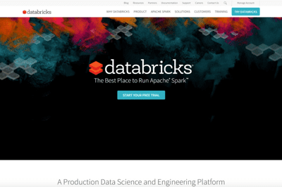
Especially in the B2B marketing world, sales cycles can be longer than we’d like them to be. This makes it all the more important that we use our ads and content to generate demand and brand awareness for our service/solutions before we start selling.
Keep in mind that “incorrect timing” or an “incorrect value offer” doesn’t mean that your ad and landing page is broken. It simply means you need to change what your user is downloading. Either that or provide more context on the page to explain why they should download it.
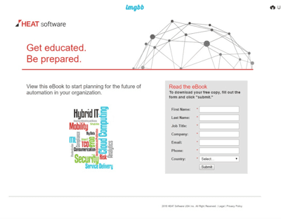
You can see in the screenshot above that this landing page provides no explanation of what the eBook even is. There isn’t even a title for the eBook – unless you count the word jumble cover.
How is any user supposed to know what they are getting out of this conversion? It’s not just poor timing in the buyer’s journey, without any context, I have no idea where this asset should be placed.
High Friction/Too Much Commitment
Now we come to a major issue that plagues most marketing managers and CROs (conversion rate optimizers). That issue is identifying the balance between low-friction CTAs and high-friction form submission fields.
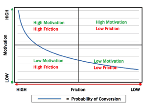
As you can see from the graph, the more you increase the friction, the more you have to increase the motivation to convert. When you are asking for personal information like emails and phone numbers and competitive data, the motivation has to be pretty high.
This is why it is so vital that your offer aligns with the original intent of the searcher. It’s also why your landing page needs to provide all the context and information the user needs.
The more mental road blocks you can eliminate from the user, whether they be a lack of information or too intense of a form-fill-out, the better off you’ll be.
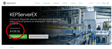
In the screenshot above, there is some serious friction the moment you land on the page. Having your price visible to the user is a nice attempt at transparency. But it’s most likely going to scare more of your users away.
Instead, try and describe the value of the offer and the need for the asset in the beginning. The price (and should) still be shown, but maybe in a light box that pops up after the click the button. This way you aren’t scaring away initial searchers who weren’t necessarily looking to convert right away.
In the screenshot below, you can see a similar high-friction problem occurring form having the entire form submission field visible on the landing page.
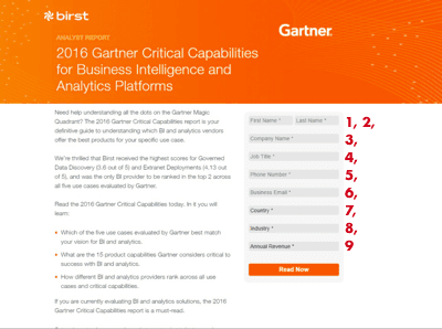
It’s vital that you can find your user’s “conversion comfort zone.” This is that sweet spot where you are providing the perfect amount of context and value to inform your readers and not overwhelm them. The perfect 1:1 ratio of motivation and friction should create a constant flow of qualified users converting to your page.
Poorly Placed Button
The last common CTA issue under analysis in this post is poorly placed CTA buttons. Now, there isn’t much to discuss on this topic in my opinion. Most marketers believe that placing the CTA button above the fold is an absolute must. In most cases, I’d agree.
But it’s important to consider the psychological journey of your user on your page. It may very well be the case that building suspense and intrigue as they scroll down the feed may increase your conversions if you can hold onto your CTA until page’s end.
For instances such as the one below, highlighting the CTA button above the fold should be an easy way to increase conversions. Ensuring that short-attention-span users aren’t bouncing off just from not being able to find the button.
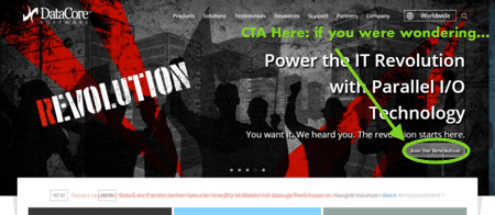
But, the only ironclad rule I can give you for CTA button placement is this: Place your button where your user’s attention will be most effectively drawn. Whether it’s top, bottom, or side-to-side, make sure your button is seen and highlighted. Leave no doubt that this is the conversion your user needs.
Innovative Tactic: Using Dual CTAs
Now I’ve spent the last 2000 or so words explaining why the best landing pages and CTAs focus on a singular, dedicated goal. But that’s not to say that your landing page is doomed if you have more than one button on it.
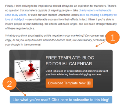
Secondary CTAs can be a great way to save any missed conversion opportunities. It’s important that these alternative CTAs are lower friction than the original goal conversion. For example, a dual CTA we often see is laid out as such:
- Primary CTA: Download the eBook Now
- Secondary CTA: Like what you read? Subscribe to our Blog
This way, even if your reader isn’t ready to convert right now, you aren’t scaring them away with a “take-it-or-leave-it” mentality. If they enjoyed the piece, but aren’t ready to enter your pipeline, they can subscribe for more helpful content.
This also gets you some more helpful contact information. While an email subscription usually is just an email account (no company or budget) you can still hit them with some retargeting or email marketing now.
If you really want to leverage these Dual CTAs, you can try out this gambit of a tactic. Create your ad around your secondary goal CTA. This way, while users see the primary CTA as too high-friction, you’ve cleverly provided an easy alternative for them to convert on. They don’t need to know that you were never serious about the first offer to begin with.
Creating the psychological state of a “discovered alternative” can do wonders for your user’s motivation to convert.
Takeaways: Make Converting Easy
We’ve seen that the success of any paid campaign often comes down to the efficacy of its landing page and CTA. You want these different factors streamlined and focused from the onset of your PPC campaign. Make the conversion process as easy, as painless, and as fast as possible. The more delighted your users are, the more they’ll convert.
As I said at the very beginning of this blog post, your CTA is the handshake between your user and your brand. Make sure you start the relationship off strong. Remember that, when sweeping the buyer’s journey clean of any friction and road blocks, every little detail matters.
Don’t forget to download your free copy of the CTA Psychoanalysis Spreadsheet.
Learn what psychological tricks can put you head and shoulders above your competitors, and start writing CTAs that convert.
-
 CEO
Garrett Mehrguth
Did you enjoy this article?
Share it with someone!

