Looking for examples of the best call to action (CTA) phrases that you can use to drive conversions on your website?
A CTA is one of the most important tools that digital marketers use to compel their audiences into taking the next step in the sales funnel.
Whether the goal is to drive purchasing behavior, encourage free trial sign-ups, or have users watch a demo video, call-to-action phrases combine direct language with strong action words, value propositions, urgency, and promises of convenience that help drive conversions.
The best call to action phrases effectively reduce friction by addressing common objections and relieving consumer anxiety, which further enhances conversion rates.
To help you identify the best call to action phrase for your unique circumstances, we’ve created this resource with 15 of our favorite CTA phrases across five different industry/product categories:
- Digital Software-as-a-Service (SaaS) Products
- Video Streaming Services
- eCommerce
- Video Conferencing Services
- Online Travel Booking Websites
For each call to action on our list, we’ll explain why it’s effective by highlighting the most important elements that persuade customers into taking the next step.
15 Best Call to Action Phrases by Industry
Software-as-a-Service
Moz
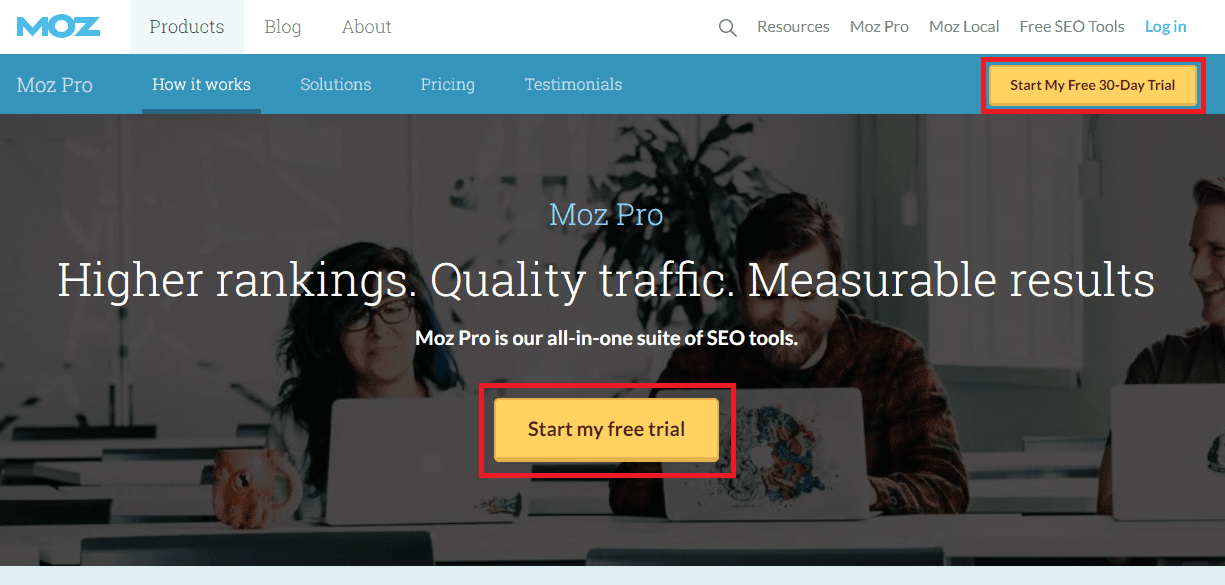
CTA(s): “Start My Free 30-Day Trial“, “Start my free trial”
Overview: Moz Pro is one of the leading all-in-one search engine optimization tool for digital marketers. Moz uses this calls-to-action to encourage users to begin a free trial of their SEO software.
Why it Works: A CTA needs to clearly communicate an offer and a unique value proposition to prospective customers. On this sales page, Moz promises two important benefits that anyone doing SEO is looking for: higher rankings, and quality traffic. The CTA in the center of the page is prominently displayed to encourage clicks, but the one in the top right contains even more descriptive information. It includes a high-value offer (30-day trial) and the word “free”, which reassures users that it won’t cost them money to take advantage of the offer.
Lightspeed
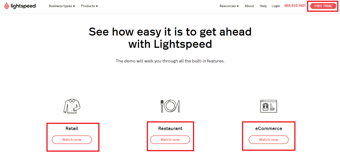
CTA(s): “Free Trial“, “Watch Now”
Overview: Lightspeed is a technology company that builds cloud-based point-of-sale solutions for retail, restaurants, and eCommerce companies.
Why it Works: An effective CTA reduces friction with the customer, making them more likely to take the next step in the sales process. Lightspeed achieves this by allowing its prospective customers across all three verticals to watch a demo video online instantly instead of scheduling a demo with the Lightspeed sales team. As users engage with the “Watch Now” link and view the demo for their industry, the “Free Trial” CTA in the top right primes them for the next step.
MailChimp
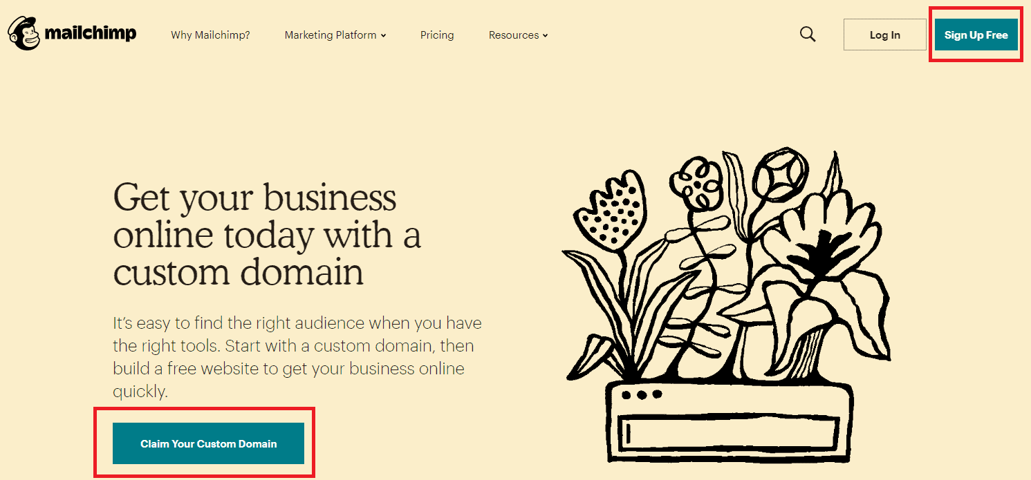
CTA(s): “Sign Up Free“, “Claim Your Custom Domain”
Overview: Mailchimp is an email marketing solution for digital marketers and eCommerce businesses who re-market to their best customers through email.
Why it Works: This CTA is supported with a very clear value proposition: users can get their business online with a free custom domain. We like the word “Claim”, as it suggests users are entitled to something of value and are missing out if they don’t take advantage. The CTA in the top right helps get around early financial objections by indicating to users that they can register for free.
Video Streaming
Disney Plus
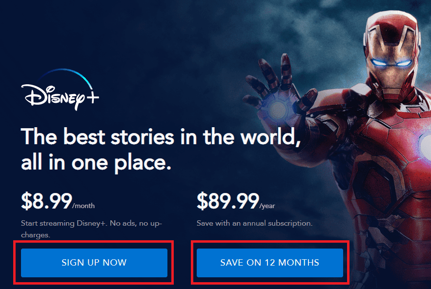
CTA(s): “Sign Up Now“, “Save on 12 Months”
Overview: Disney Plus is one of the most popular streaming services right now, with IP rights to the Marvel and Star Wars franchises and many beloved Disney films.
Why it Works: This sales page highlights a key value proposition for Disney Plus: access to some of the world’s leading movie franchises in a single streaming service. Disney does a great job of removing friction with promises like “No ads” and “no up-charges”. The “Sign up Now” CTA builds urgency, and Disney even offers an opportunity for customers to save money by purchasing an annual subscription.
Netflix

CTA(s): “Get Started”
Overview: Netflix is a pioneer in online video streaming with a major focus on creating new content, securing rights to valuable content, and expanding its global customer base.
Why it Works: This sales page promises users that they can watch their favorite shows from anywhere in the world and cancel their subscription anytime. This promise of convenience helps put customers at ease and drives conversions through a simple email submission form with the “Get Started” CTA.
Hulu
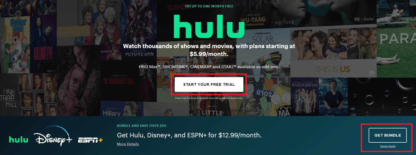
CTA(s): “Start Your Free Trial“, “Get Bundle”
Overview: Disney purchased the video streaming service Hulu for $5.8 billion in 2019 and continues to market the platform with thousands of different movies and television shows available.
Why it Works: This sales page highlights several key factors that encourage users to register: a low monthly price, lots of available content, and the opportunity to add on other desirable channels or packages like HBO Max and Showtime. The promise of a free trial here encourages users to click through and start enjoying the available content with zero up-front cost. We also like the “Get Bundle” CTA, which is supported by a strong value proposition and pricing information.
eCommerce
Ebay

CTA(s): “Cue the Fireworks”
Overview: Ebay is the original eCommerce marketplace and maintains a market share of just under 5% of retail e-commerce sales in North America.
Why it Works: With this CTA, eBay demonstrates the value of a contextually relevant call to action. For the July 4th holiday, eBay is promoting items that are associated with summer fun: an Xbox One S Bundle for gaming with friends, cookware for entertaining guests, and running shoes for exercising outside. “Cue the Fireworks” is an unconventional CTA, but its contextual relevance to the shopper makes it both attention-grabbing and persuasive for shoppers.
Groupon
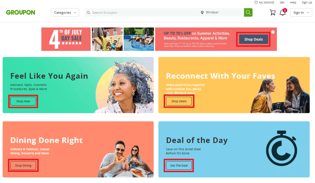
CTA(s): “Shop Now“, “Shop Deals“, “Shop Dining“, “See The Deal‘”
Overview: Groupon is a group buying website that offers its users discounts and coupons for local and online retailers and service providers.
Why it Works: Groupon features a large number of revolving deals each day, so effectively categorizing the available discounts is crucial to connecting customers with offers that inspire a purchase. Groupon does a good job of categorizing deals by type and offering a unique call to action for each category. There’s also a 4th of July Day Sale banner with the “Shop Deals” CTA that encourages clicks by promising up to 75% off regular prices.
HBO Shop
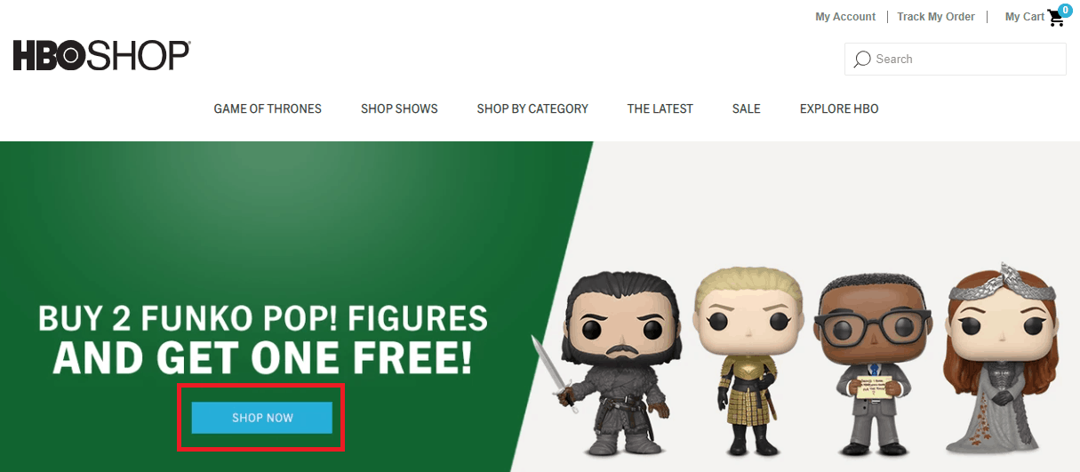
CTA(s): “Shop Now”
Overview: HBO Shop is the online eCommerce outlet for the Home Box Office (HBO) television network. Customers can buy merchandise from their favorite HBO shows here, including Game of Thrones.
Why it Works: “Shop Now” is one of the time-tested CTAs for eCommerce websites. It sets clear expectations, creates urgency, and effectively primes users for engagement on the next page, where they’ll see a range of products they can purchase in their chosen category. The featured “Buy Two, Get One Free” deal is situated front-and-center on the HBO Shop home page and offers great value for interested purchasers.
Video Conferencing
Zoom
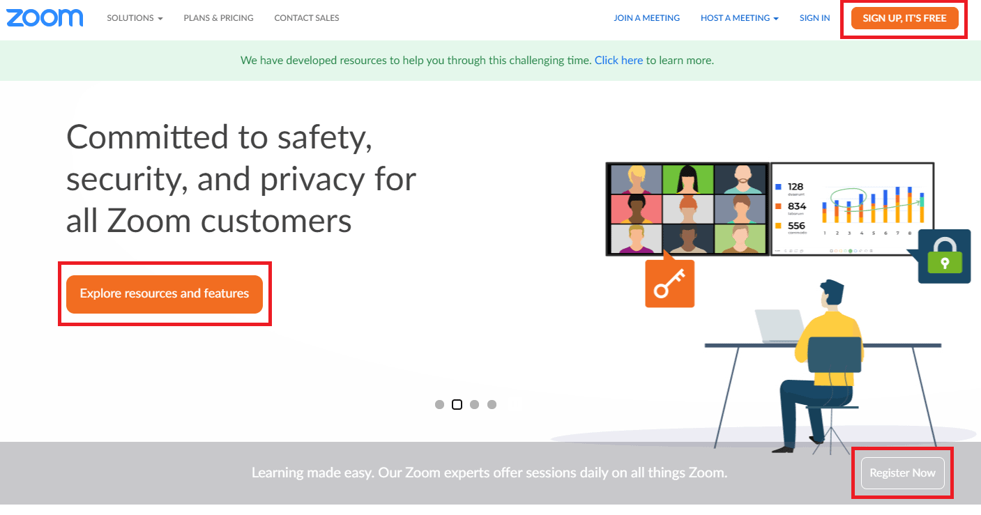
CTA(s): “Sign Up, It’s Free“, “Explore resources and features“, “Register Now”
Overview: Zoom Meeting is a video conferencing software tool for businesses and personal use.
Why it Works: Zoom uses its best call to action phrases to target customers at various stages of the purchasing journey. Users can sign up for free using the CTA in the top right, learn more about Zoom by clicking the CTA in the middle of the page to explore resources and features, or register for a daily learning session with Zoom experts using the CTA button in the bottom left.
Microsoft Teams
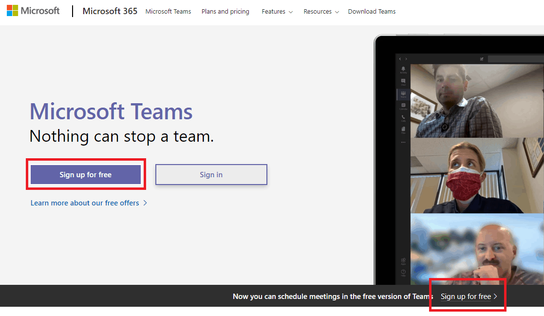
CTA(s): “Sign up for free”
Overview: Microsoft Teams is a web-based video conferencing solution for business teams.
Why it Works: Microsoft Teams operates on the “Freemium” model, where users can sign up for free but must purchase a subscription to access more advanced features. The “Sign up for free” CTA encourages users to get started with the free version so they can assess the functionality and business value of MS teams before deciding to purchase.
Skype
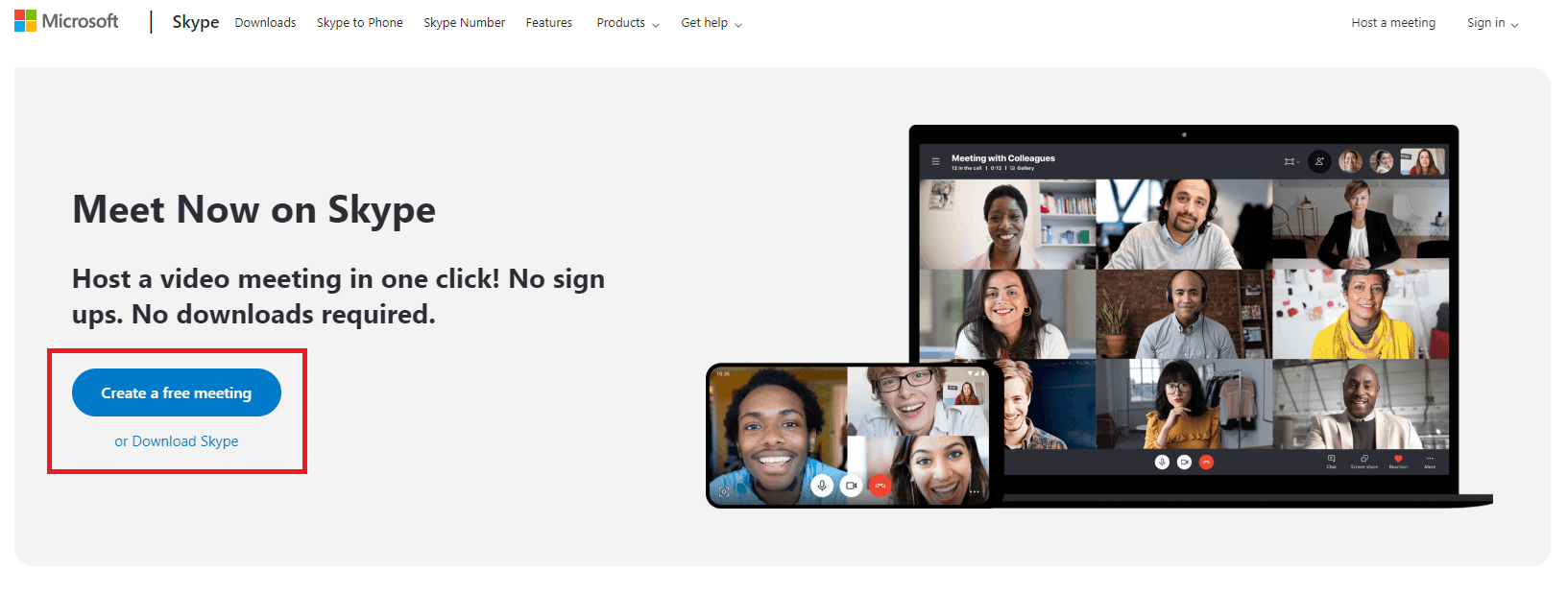
CTA(s): “Create a free meeting“, “Download Skype”
Overview: Skype is a video communications software tool that offers video chat and voice calling services for customers around the globe.
Why it Works: On this sales page, Skype emphasizes the shortest path for prospective customers to get started with the program: creating a free Skype meeting online with a single click and no download required. A strong value proposition, promises of convenience, and removing friction with the word “free” combine to make this one of the best call-to-action phrases for video conferencing solutions.
Online Travel Booking
Car Rentals
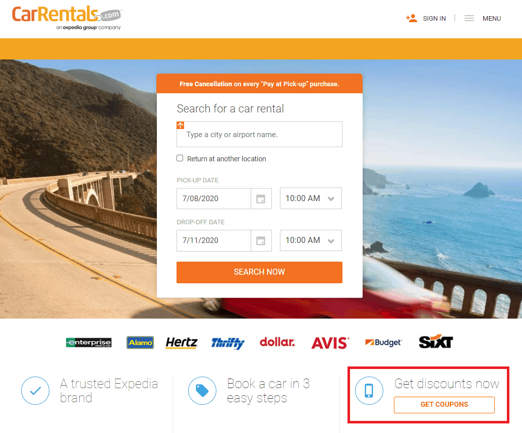
CTA(s): “Get Coupons”
Overview: CarRentals.com is the leading online car rental booking platform for travelers.
Why it Works: If you’re visiting this website, chances are you’re looking to book vehicular transportation for an upcoming trip. This sales page highlights that Car Rentals is a trusted Expedia brand and promises a convenient booking process in just three steps. The process of getting a discount on their purchase with a free coupon makes this an attractive CTA for prospective customers.
Booking.com
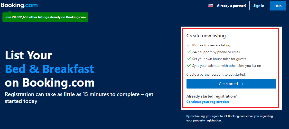
CTA(s): “Get Started –>”
Overview: Booking.com is one of the leading travel booking sites for hotel and airfare. Individuals and businesses can list their guest houses, spare rooms, bed & breakfast establishments, or apartments on Booking.com to generate extra income.
Why it Works: The CTA text itself here is fairly generic, but the strength of this sales page is that it supports that call to action with effective sales copy. Booking.com emphasizes that listing your property with them is free, easy and convenient. The page highlights features like 24/7 support, free listings, and the ability to sync calendars with other booking sites – addressing some of the most common objections and pain points for target customers.
Travelocity
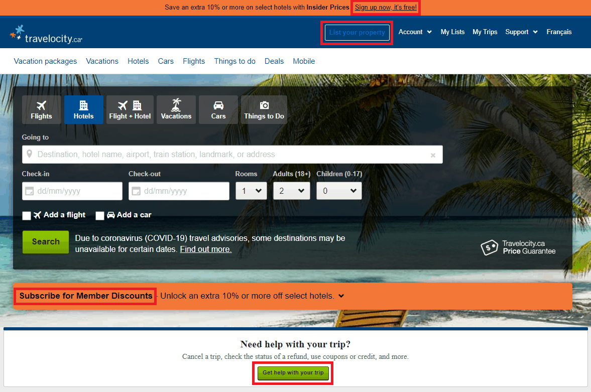
CTA(s): “Sign up now, It’s free!“, “Subscribe for Member Discounts“, “Get help with your trip”
Overview: Travelocity is an online travel booking company with hotel, flight, and resort listings from around the world.
Why it Works: Travelocity’s focus on its home page is to have visitors sign up for the membership so they can start receiving the 10% discount. Users sign up with their email addresses, creating opportunities for Travelocity to offer them personalized travel deals that are more likely to result in conversions. Travelocity combines several elements of an effective CTA to make this page more effective:
- Value Proposition: “Unlock an extra 10% or more off select hotels”
- Urgency: “Sign up now“
- Fear of missing out: Save an extra 10% or more on select hotels with Insider Prices“
- Reducing friction: “It’s free!“
The way these elements work together to encourage conversions makes this one of the best call-to-action examples on this list.
Summary
Thanks for checking out our list of the 15 best call-to-action examples by industry!
We hope these examples inspire you to craft an exceptional CTA that works for your product, service, or offer. For more details on how to optimize a CTA for your industry, check out our in-depth guide on Directive Institute.
-
 CEO
Garrett Mehrguth
Did you enjoy this article?
Share it with someone!
