Today we’re going to talk about how to create a landing page that converts and sells your services.
Here at Directive Consulting, we talk a lot about driving traffic, trying to rank for certain keywords, and showing up on certain websites, but doing that is just the first step of the bigger picture. Generating traffic into an opportunity, deal, or revenue is the bigger picture of what you’re trying to accomplish. What we’re going to walk you through today is how you can do that while still keeping SEO in mind. We’ve gone through a variety of variations and tests and we’ve got our homepages to convert at over 15%. Today, we’ll explain the full anatomy of a landing page when selling services and how you can get similar results.
H1 & H2
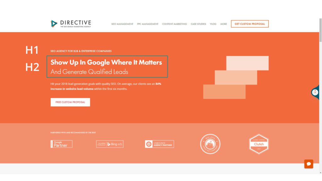
The first thing you’re going to want to do is have your H1 tag. Now, a lot of times it can be difficult to have both an H1 that targets a keyword and sells your brand or differentiates your services. In our case, what we do, is we make our H1 the specific keyword we’re targeting in a smaller font, then we make our H2 into a bigger font where we can actually differentiate our brand and talk to our ideal customer persona.
You might want to start with the smaller H1, if you have a specific keyword you’re targeting that matches your title tag, and then your H2, right below that, can be a specific call out or a value prop of why someone should select your brand or use your services.
Subtext
Beneath our H2, we have some subtext. This is a great time to leverage data.
We have a tendency of thinking that the reason someone chooses us is that:
- “We have the best customer service”
- “Someone chooses us because we spend more time with you”
- “We’ve been doing it for 30 years”
While those things are critical and important, the best thing you can do to sell your services is use data and statistics that only you have based on your services. For example:
- “In the first six months, we do X, Y, and Z for our clients.“
- “On average, our clients see this reduction or that increase in the first X amount of days.“
By using specific data, you can differentiate your brand in a way that only you can do because it’s proprietary data to your business.
CTA
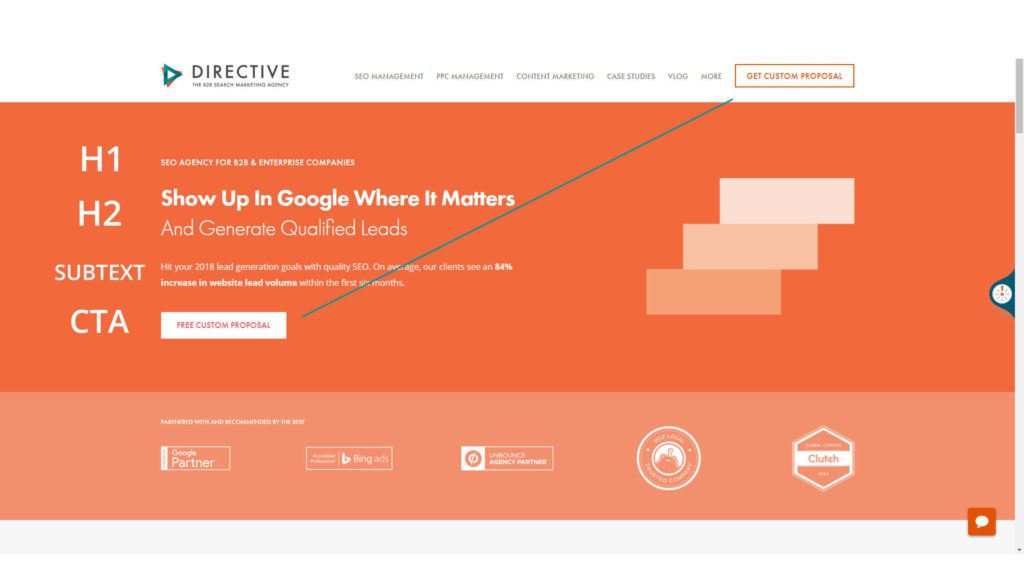
We’ve talked a lot about the top part of the page, right? You have your H1, your H2 that’s really differentiating your brand, some subtext with unique data that only you have access to, and below that we love to have a call to action.
Your CTA should match whatever call to action you have in the top right corner of your site. It should be something that doesn’t have a lot of friction — where it feels like the person who is actually taking the action is getting something instead of giving you something. That psychological change will allow you to drive your conversion rate. This way, they can “get a free proposal” instead of “request a consultation“. “Requesting a consultation” means that they are giving you their information with the hopes of getting something. While ‘Get free proposal‘ means that they are getting something for free, for giving you their information. That changes the dynamic.
I also recommend you illuminate what you get with a free proposal. So if you’re saying you get a free proposal now, you should also list:
- 30 minutes
- Detailed research
- Competitor analysis
- Free quote
- Whatever it is that would make someone want to get that proposal
You can highlight or forecast the agenda and say, “This is what you’ll experience if you get this free proposal.”
Social Proof
Right below that call to action, I love to have social proof. Social proof says: “You are in good company. It’s not just you who’s decided to make this decision, but other people that you respect and admire in your vertical are willing to work with us or fill out the form and want to be a part of what we’re doing.”
I think social proof is a very powerful dynamic to drive conversion rate. When we’re converting at 15%, it could probably be better. I’m not saying we have the perfect page or that we have the perfect code, but we’ve tested a lot. We actually start at 2% and these are people requesting proposals. These are hard call-to-actions. To get there, we’re using a lot of social proof. In fact, so much that right below the logos, the social proof section, we like to put case studies that are specific to the service.
Case Studies
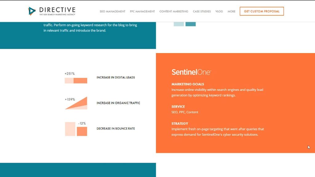
We have SEO-related case studies that talk about what we did, the results, quotes from our clients and we feature the logos for social proof. This lets others know that these people got this free proposal and after we worked together, this is what we were able to accomplish together.
Show Your Process
Now at this point in the page, what we want to do is walk through our process. This will let potential clients know: “If you work with us, we have a systematic way of achieving the results that we’ve already gotten for people. In fact, this is our process.”
It’s a great time to show people step one, step two, step three, and really highlight what it’s like to work with you or even your approach of why what you do differently than everyone else, and they can only get what you do through you, which is a special opportunity for you.
Testimonials
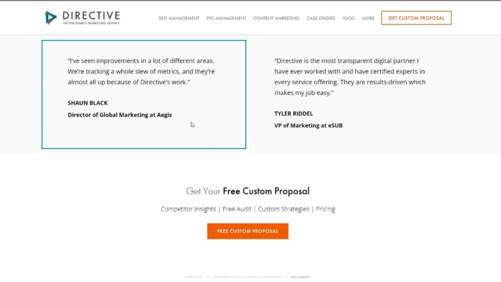
Lastly, you might want to add some testimonials. Do you have some authoritative people who you’ve worked with who said, “You’re great.” This an awesome opportunity at the bottom of your page to showcase some testimonials and finally wrap it up with a call to action.
Final Thoughts
The purpose of this whole page is it take somebody from finding you on Google, from searching whatever is it is you offer to:
- Experience our brand and learning about your differentiators
- Understand why you’re statistically different
- Review the people that you have worked with
- Learn about your approach
- See what people have to say about you
At the end of this process and by the time someone has gone through your whole service page, they should be so inclined to work with you that if they leave, having a pop-up doesn’t solve this equation. This isn’t pop-up marketing. This isn’t trying to force people into converting. This is a process of selling your business when you know in the back of your mind that they have two other tabs open. Why would they choose your business, your service over anyone else’s? — That is the story we need to tell.
Here at Directive Consulting, we talk a lot about driving traffic, trying to rank for certain keywords, and showing up on certain websites, but doing that is just the first step of the bigger picture. Generating traffic into an opportunity, deal, or revenue is the bigger picture of what you’re trying to accomplish. What we’re going to walk you through today is how you can do that while still keeping SEO in mind. We’ve gone through a variety of variations and tests and we’ve got our homepages to convert at over 15%. Today, we’ll explain the full anatomy of a landing page when selling services and how you can get similar results.
H1 & H2
The first thing you’re going to want to do is have your H1 tag. Now, a lot of times it can be difficult to have both an H1 that targets a keyword and sells your brand or differentiates your services. In our case, what we do, is we make our H1 the specific keyword we’re targeting in a smaller font, then we make our H2 into a bigger font where we can actually differentiate our brand and talk to our ideal customer persona.
You might want to start with the smaller H1, if you have a specific keyword you’re targeting that matches your title tag, and then your H2, right below that, can be a specific call out or a value prop of why someone should select your brand or use your services.
Subtext
Beneath our H2, we have some subtext. This is a great time to leverage data.
We have a tendency of thinking that the reason someone chooses us is that:
- “We have the best customer service”
- “Someone chooses us because we spend more time with you”
- “We’ve been doing it for 30 years”
While those things are critical and important, the best thing you can do to sell your services is use data and statistics that only you have based on your services. For example:
- “In the first six months, we do X, Y, and Z for our clients.“
- “On average, our clients see this reduction or that increase in the first X amount of days.“
By using specific data, you can differentiate your brand in a way that only you can do because it’s proprietary data to your business.
CTA
We’ve talked a lot about the top part of the page, right? You have your H1, your H2 that’s really differentiating your brand, some subtext with unique data that only you have access to, and below that we love to have a call to action.
Your CTA should match whatever call to action you have in the top right corner of your site. It should be something that doesn’t have a lot of friction — where it feels like the person who is actually taking the action is getting something instead of giving you something. That psychological change will allow you to drive your conversion rate. This way, they can “get a free proposal” instead of “request a consultation“. “Requesting a consultation” means that they are giving you their information with the hopes of getting something. While ‘Get free proposal‘ means that they are getting something for free, for giving you their information. That changes the dynamic.
I also recommend you illuminate what you get with a free proposal. So if you’re saying you get a free proposal now, you should also list:
- 30 minutes
- Detailed research
- Competitor analysis
- Free quote
- Whatever it is that would make someone want to get that proposal
You can highlight or forecast the agenda and say, “This is what you’ll experience if you get this free proposal.”
Social Proof
Right below that call to action, I love to have social proof. Social proof says: “You are in good company. It’s not just you who’s decided to make this decision, but other people that you respect and admire in your vertical are willing to work with us or fill out the form and want to be a part of what we’re doing.”
I think social proof is a very powerful dynamic to drive conversion rate. When we’re converting at 15%, it could probably be better. I’m not saying we have the perfect page or that we have the perfect code, but we’ve tested a lot. We actually start at 2% and these are people requesting proposals. These are hard call-to-actions. To get there, we’re using a lot of social proof. In fact, so much that right below the logos, the social proof section, we like to put case studies that are specific to the service.
Case Studies
We have SEO-related case studies that talk about what we did, the results, quotes from our clients and we feature the logos for social proof. This lets others know that these people got this free proposal and after we worked together, this is what we were able to accomplish together.
Show Your Process
Now at this point in the page, what we want to do is walk through our process. This will let potential clients know: “If you work with us, we have a systematic way of achieving the results that we’ve already gotten for people. In fact, this is our process.”
It’s a great time to show people step one, step two, step three, and really highlight what it’s like to work with you or even your approach of why what you do differently than everyone else, and they can only get what you do through you, which is a special opportunity for you.
Testimonials
Lastly, you might want to add some testimonials. Do you have some authoritative people who you’ve worked with who said, “You’re great.” This an awesome opportunity at the bottom of your page to showcase some testimonials and finally wrap it up with a call to action.
Final Thoughts
The purpose of this whole page is it take somebody from finding you on Google, from searching whatever is it is you offer to:
- Experience our brand and learning about your differentiators
- Understand why you’re statistically different
- Review the people that you have worked with
- Learn about your approach
- See what people have to say about you
At the end of this process and by the time someone has gone through your whole service page, they should be so inclined to work with you that if they leave, having a pop-up doesn’t solve this equation. This isn’t pop-up marketing. This isn’t trying to force people into converting. This is a process of selling your business when you know in the back of your mind that they have two other tabs open. Why would they choose your business, your service over anyone else’s? — That is the story we need to tell.
Hopefully, you’ve learned how to create a landing page that converts from this video. We’d love to have you subscribe to the channel and leave a comment below. As always, have a great day!
-
 CEO
Garrett Mehrguth
Did you enjoy this article?
Share it with someone!
