Are you searching for innovative landing page ideas that can help you increase conversions for your email marketing or PPC advertising campaigns?
Landing pages are the focal point of your digital advertising funnel. These are the pages on your website where visitors “land” after clicking on one of your paid advertisements or email marketing links.
While other pages on your website may encourage exploration and discovery, landing pages focus on specific goals known as conversion targets. A conversion target is an action that users can perform on the page to move into the next stage of the marketing funnel. Conversion targets can include behaviors like filling out a lead generation form, watching a demo video, or purchasing a product or service.
Once you learn how to create a landing page, you can start to experiment with different landing page design elements to optimize conversion rates and drive campaign success – a process often referred to as conversion rate optimization (CRO).
To help you get started with CRO, we’ve created this list of the best landing page ideas to boost your conversions.
[optin-inline id=’d5yewatvtrhn8vieh0e4′]
10 Best Landing Page Ideas to Boost Conversions
Test Short-form vs. Long-form Landing Page Copy
Before you start experimenting with individual design elements on your landing pages, it may be worthwhile to run content experiments where you test short-form vs. long-form landing page copy.
Short-form landing pages may be up to two pages in length, but are frequently just one page long (or less). As a result, short-form landing pages contain very little content, which helps keep the user’s attention laser-focused on the conversion target.
Long-form landing pages are typically three or more pages in length. They typically contain all of the same design elements as short-form pages but may incorporate additional product information, FAQs, social proof, and other features that encourage conversions.
Short-form landing pages usually work best when you’re encouraging a landing page visitor to exchange their email address for a high-value offer. Long-form landing pages can be more successful when you’re trying to convert sales on a high-ticket item and need to address lots of customer concerns/pain points/objections on the page before your prospects feel comfortable making a purchase.
Test and Optimize Your Headlines
One of the biggest landing page ideas you can use to drive increased conversions is headline optimization.
Most landing pages are published with a headline at the top of the page. The purpose of a headline is to grab the user’s attention, encouraging them to remain on the page and to convert on your offer.
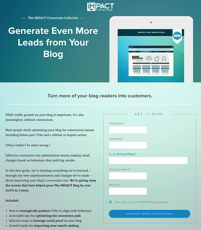
Caption: This headline grabs the user’s attention by conveying the exact pain point that the product/offer will address.
If you notice that your landing pages have high bounce rates (40-60% or more), with users departing soon after the page loads, you should run experiments with different headlines to discover whether there’s a better way to captivate users as they arrive on your page. The best headlines target a pain point that your prospect can relate to – then you can use subheadings and additional text to explain how your offer solves the problem.
Maintain a 1:1 Attention Ratio
The concept of Attention Ratio is a ground-breaking landing page idea that was first explained by Unbounce co-founder Oli Gardner at the Carnegie Dartlet Conference in 2015.
Attention ratio is defined as a ratio between the number of things that users can do on a page, versus the number of things that users should be doing on a page.
For any landing page, we know what users should be doing: they should be fulfilling the conversion target, whether that means signing up for a newsletter, webinar, or starting a free trial.
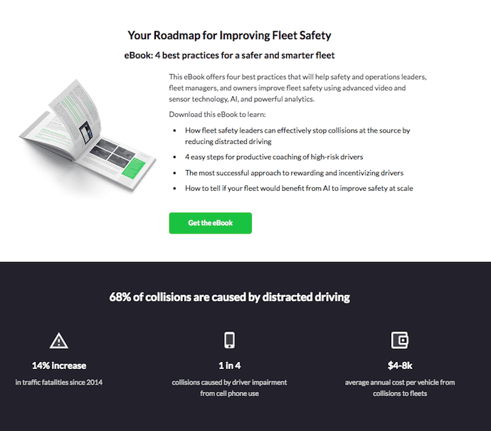
Caption: This landing page keeps a 1:1 attention ratio by offering exactly one CTA button with a link to the conversion target and no other navigation options on the page.
To keep user attention focused on the conversion target, we can maintain a 1:1 attention ratio by reducing the number of things that users can do on the page. As a marketer, you can draw attention to the conversion target by removing navigation menus and extra features from the page. This prevents your audiences from paying attention to anything that isn’t your conversion target.
All of this follows from the philosophy that each landing page you create should have one purpose: to convert visitors from the corresponding marketing campaign. Maintaining a 1:1 attention ratio means creating landing pages that are laser-focused on conversion targets and provide few other interactive or navigational options for users.
Incorporate Social Proof
Social proof marketing is one of the most powerful landing page ideas of the last five years – look at any great landing page for a B2B SaaS company and you’ll most likely see that social proof is being used to build trust with prospective customers and encourage a purchase.
The basic premise of social proof marketing is that individuals in an uncertain situation are most likely to conform to the behaviors and actions of others. The purpose of social proof marketing, therefore, is to offer some evidence to your prospective customer that other individuals or businesses have purchased from you in the past and been satisfied.
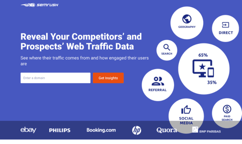
Caption: This landing page by SEMrush incorporates the logos of high-profile customers, a powerful form of social proof that can build trust with prospective customers and increase conversions.l
There are many ways to incorporate social proof marketing into your landing pages. You can experiment with social proof marketing by adding landing page features like:
- Customer testimonials
- Customer success stories or case studies
- Raw statistics indicating how many customers you have satisfied or how many users have accepted your offer in the past
- Logo images of companies that are your customers
- Trust badges or awards your organization has received
- Images or links to third-party websites with reviews or ratings of your product/service
Optimize and Improve Your Calls to Action
If visitors to your landing pages tend to stick around for a while without converting, you might see improved results after optimizing your call-to-action (CTA) buttons. As a marketer, you can combine best practices in CTA button design with your own unique CTA copy to provide a unique experience and encourage your visitors to convert.
Some of our favorite ways to optimize CTA buttons include:
- Writing a CTA that clearly explains what you’re offering and what your visitors must do to redeem the offer.
- Changing the tone of your CTA
- Creating CTA buttons that look click-able and contrast well with the background.
- Making your CTA button stand out using negative space.
- Experimenting with differently-colored CTA buttons
- Changing the style or font of your CTA text
Optimize Form Fields to Reduce Friction
If you’ve created a landing page to support your lead generation efforts, your page probably includes a form where you can collect information from prospective customers.
Determining how many fields should be included with your landing page forms is always a trade-off.
If you include more fields and ask for more specific information, you’ll end up with a lower volume of potentially higher-quality leads. If you include fewer form fields and ask for less information, you’ll see a higher volume of leads but you’ll need to undertake additional steps to collect additional information and qualify those leads.
The best way to maximize lead generation from your landing page is to shorten your lead generation forms, only collecting the most important information you need to advance your prospects through the sales funnel.
The simplest lead generation forms reduce friction by asking visitors to enter just their email address to redeem the offer.
Experiment with a New Offer
If your landing page isn’t getting results with your current offer, why not try offering something else?
Maybe your visitors aren’t particularly excited about joining your email newsletter or signing up for a webinar, but they’d love to download one of your white papers or a set of templates related to your product, service, niche, or industry.
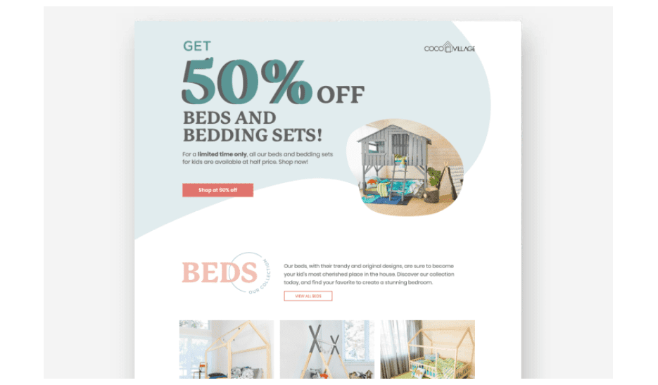
Caption: This eCommerce landing page offers a 50% discount for shoppers – highly valuable for a prospective customer with the intent to purchase.
If your prospects don’t find your offers genuinely valuable, it will be difficult to drive conversions regardless of how well you optimize other design elements on your landing pages. Bringing the right offer to the table can make the difference between a successful landing page and an underperforming one.
Leverage Conversational Marketing
Conversational marketing is a new landing page conversion strategy that uses automated chatbots to start conversations with visitors to your landing page. These chatbots can be programmed in advance with responses to the most common questions that your prospects may have before converting on your offers.
As a marketer, you can even jump into conversations and speak directly to your prospects as they browse your landing pages. Conversational marketing makes it easier to start connecting with your visitors on a one-to-one basis, identifying barriers to conversion on your landing pages, and addressing those issues to drive overall campaign performance.
Experiment with Video Content
If you’ve invested marketing dollars to put together a video that effectively showcases the features and benefits of your product along with the pain points that you address, it might be worthwhile to include that video on your landing page.
Leveraging video on your landing pages makes it easy and low-effort for visitors to get a full understanding of your product, service, or offer, and researchers have found that marketers who incorporate product videos into their campaign experience higher-than-average conversion rates.
Optimize Page Loading Speed
Our final landing page idea for boosting conversions is to optimize your page loading speeds.
Over a decade of browsing data has shown that slow page loading times are positively correlated with poor landing page conversion rates; if your landing page takes too long to load, visitors will leave before they ever find out what you have to offer.
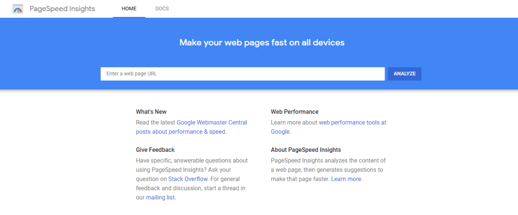
We recommend testing your pages with a tool like Google PageSpeed Insights to assess page loading times, diagnose the causes of poor load speed, and improve your load speed to drive conversions.
Summary
Increasing conversions on your landing page is the most efficient way to start generating more revenue from your ad campaigns without spending more advertising dollars to generate traffic. With the right landing page ideas and some design inspiration, you can create landing pages that are quick to load, capture the attention of visitors with a compelling headline, present a genuinely valuable offer, and drive conversions with a strong CTA.
We hope you’ll use these landing page ideas to inspire your CRO efforts and drive results in your upcoming email marketing or PPC advertising campaigns.
-
 CEO
Garrett Mehrguth
Did you enjoy this article?
Share it with someone!
