


What is Responsive Design?
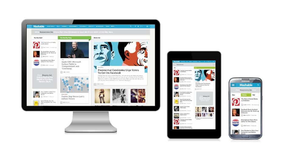
Responsive design is a website design technique that allows a website to render and function well across different hardware platforms, including desktops, laptops, tablets, televisions, and mobile phones. The purpose of responsive design is to deliver a consistent customer experience regardless of the device used to access the website. Responsive design incorporates technologies that work together to determine the width of the screen displaying the content and adapt the website content to the optimal display proportions for that device.
Responsive design has become an essential component of effective web design as consumers continue to migrate from desktops and laptops to mobile devices. Desktop computers now account for less than half of all web browsing traffic. Consumers are increasingly using their mobile devices to research brands and products they’re interested in before making a purchase, and between 2012 and 2018, the average amount of time spent on a mobile device for adults in America increased from 88 minutes to 203 minutes per day.
Even as web browsing trends change and new devices hit the market, responsive design ensures that your website can be presented well on any size screen and with any device used to access your pages. That’s the magic of responsive design: your website “responds” differently based on the device being used to view it.
A Brief History of Responsive Web Design
In the early 2000s, mobile technology was starting to rapidly change the way that people accessed the internet. As mobile and tablet usage grew and screens increased in size, consumers started using their mobile phones instead of their desktops and laptops to view web content. Consumers expected to see the same features and layout on any website they visited, regardless of what device was used to view it.
Things became more complicated as major electronics manufacturers started to release new devices with larger screens each year. With so many different models available, it would be time-consuming and cost-prohibitive for website designers to program a unique version or configuration of their website for each type of device that could view it. Everyone knew that their websites that were designed for desktop computers looked bad on other devices, but there was no way yet to completely address this issue.
During the 2000s, some companies met the expectations of consumers by building separate websites for display on different types of devices. This period also saw some early prototypes of responsive design elements, like the adaptive browser window, featured on Audi.com as early as 2001, but it wasn’t until 2010 that the term “responsive design” was used for the first time. By 2012, responsive design was considered one of the top trends in digital marketing.

Three Critical Aspects of Responsive Design
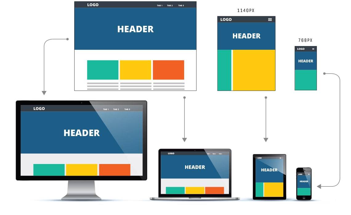
Web pages are written in a special coding language known as the hypertext mark-up language (HTML). Each web page is styled using a special type of file called a cascading style sheet (CSS). For each URL on your web page, there is an HTML file with the coding and page contents and a CSS file that contains information on how the page should be styled.
Responsive design works by applying an alternate CSS file based on the device being used to access the website. There are three technologies in play that make responsive design technology work:
Fluid Grids – Fluid grids, also called flexible layouts, are essential to the technology of responsive design. A fluid grid means that design elements on the page are sized with x and y coordinates instead of fixed-width parameters. Elements in the grid can be resized or rearranged for optimal viewing based on the side of the screen.
Flexible Images – A flexible image is sized in percentages rather than fixed units, so it can easily be scaled up or down depending on the size of the screen used to view the image.
CSS3 Media Queries – CSS3 media queries can be used to check many parameters, such as the width and height of the viewport, width, and height of the viewing device, the orientation of the viewing device and the screen resolution of the device or monitor. These automated queries measure the capabilities of the device to determine which CSS file should be used to style the website.
What are the Benefits of Responsive Design?
In 2015, Google famously updated its search algorithm to prioritize websites that displayed its contents well on mobile, tablets and other viewing devices. For the first time, it was made crystal clear: responsive design matters for SEO. As of 2018, Google is also doing something called mobile-first indexing, which essentially means that Google crawlers are viewing your website as displayed on mobile, rather than as displayed on the desktop.
Beyond satisfying Google, here are a few more reasons why you’ll benefit from implementing responsive design for your website:
Responsive Design Improves Website Usability
Websites that are poorly optimized for mobile provide a less-than-stellar experience for consumers. If your website is built with fixed-width elements, mobile users may have to choose an alternate viewing option to see some elements of your page. They may have a difficult time navigating to the information they want, and the text may be too small for them to comfortably read.
Unless you’re selling detective equipment, the customer journey should almost never include a magnifying glass. Simply making your website user-friendly for visitors on different devices increases the likelihood of converting those visitors into prospects.
Responsive Design Helps Decrease Bounce Rate
Search engines track user behavior on your website, including your bounce rate, a measure of how frequently visitors land on your page and leave within a short time without interacting. High bounce rates will result in SEO penalties that affect your search rankings, as Google will believe that your content was not relevant to the needs of the user. In fact, your content might be totally relevant – it just isn’t being displayed in a way that’s very user-friendly.
Responsive design helps your website make the best first impression for users with all devices, so they’ll stay long enough to find the value that you’re offering.
Responsive Design Optimizes Social Sharing
Responsive design ensures that every element on your web page is optimized for mobile when necessary, and that includes the social sharing button. Social sharing is a valuable source of free traffic that can help grow your audience and brand value.

Achieve Mobile Marketing Success with Directive Consulting
Responsive design – making your website look great on mobile devices and tablets – is a necessary first step to mobile marketing. Beyond that, there are many steps that businesses can take to optimize their digital marketing campaigns for mobile, and that’s where Directive Consulting can help.
We’ve mastered the intricacies of mobile marketing, including techniques like content networking, optimizing content for social channels, and semantic/voice search. We can help you market your business on mobile, starting with a responsive website design that optimizes your website presentation for prospective customers, however, they choose to find you.
Ready to learn more? Get in touch and we’ll send you a free proposal.