Looking for some examples of the best lead forms to emulate?
Whether you’re doing e-mail marketing, PPC advertising, or generating leads through social media, you will need to create landing pages with a lead generation form to capture information from prospective customers of your business.
And the way you design your lead forms has a direct impact on conversion rates.
When you take the time to build an intuitive web form that’s optimized for user experience, you’ll be rewarded with higher conversion rates on that page. If your lead forms are confusing or ask for too much information, you’ll see poor conversions with fewer prospects choosing to sign up.
[optin-inline id=’ujxmfpiltnphq81waroa’]
What is a Lead Form?
A lead form, sometimes called a “lead capture” or “lead generation” form, is an area of your website where users are asked to input their contact information to either indicate interest or receive an offer.
The offer could be a piece of gated content, an invitation to a webinar, a subscription to an email newsletter, a free trial of the software, or a scheduled product demo.
The purpose of a lead form is to capture information about prospects who may be interested in a product or service, evaluate their interest level based on cross-channel marketing signals, assign lead scores to prospects, get them into your CRM, and designate them for follow-up by either sales or marketing.
To effectively gather leads on your landing pages, you’ll need to optimize your lead forms for user experience, and reduce friction, while still collecting enough data for lead qualification and scoring.
Here are seven great lead form optimization examples that you can follow!
7 Lead Form Examples to Generate More Leads
Hotjar
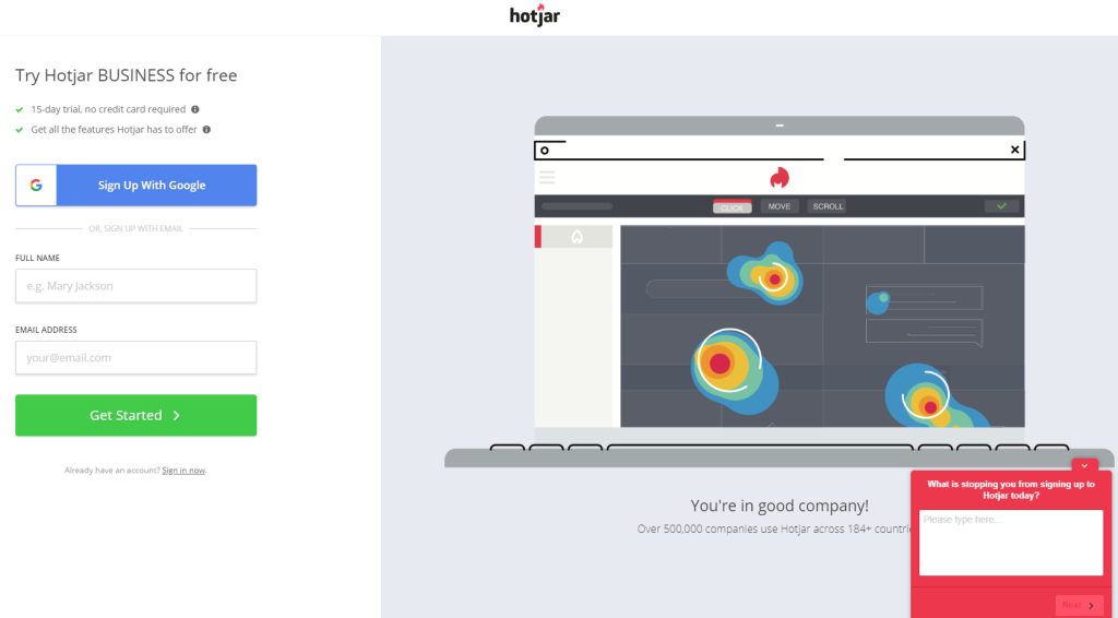
Overview: Hotjar is a conversion rate optimization tool for webmasters and digital marketers. Hotjar’s main feature is heat maps, which marketers can use to track the behavior of their website visitors. This lead form allows users to create a free basic account with Hotjar.
Key Features:
- Multiple Sign-Up Options – Users can choose to either type in their full name and email address, or sign up with an existing Google account. From the user’s perspective, signing up with Google reduces friction – it’s both faster and less manual.
- Social Proof – We see a lot of organizations including social proof on their website lead forms. Here, Hotjar lets new users know that they’re joining an existing community of 500,000 companies in 184+ countries.
Conductor
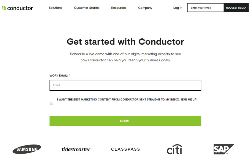
Overview: Conductor offers a customer intelligence platform that helps digital marketers gain deeper insight into what customers are really searching for across digital channels. Conductor uses a smart lead form to progressively guide its potential customers through the process of requesting a demo.
Key Features:
- Assisting Text – The assisting text at the top ensures that visitors to this page know exactly what they’re signing up for – a live demo with a digital marketing expert.
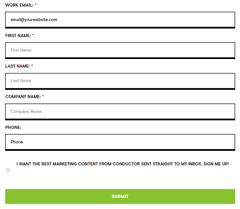
- Smart Lead Form – A smart lead form is a multi-step form that determines what fields are required based on how previous fields were filled by the user. This multi-step process is designed to guide visitors through the registration process while asking only the most relevant questions.
- Field Titles & Placeholder Text – This lead form uses descriptive field titles (positioned to the upper left of each form field) and helpful placeholder text (inside each form field) to guide users through registration.
Forrester
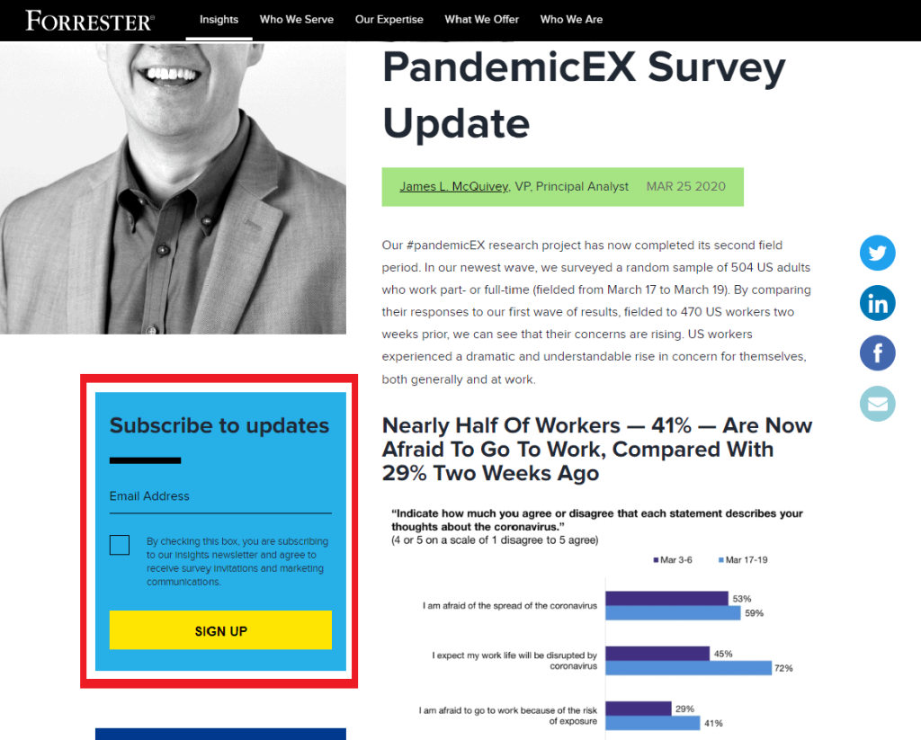
Overview: Forrester Research is an American consulting and market research firm. Forrester uses e-mail lead forms on its website to drive subscriptions to its insights newsletter while growing its network of potential customers and survey recipients.
Key Features:
- Simple Design – With just one field to fill and a single box to tick, this email opt-in form is the very definition of low friction.
- Placement – Website lead forms don’t have to exist exclusively on campaign-specific landing pages. Forrester includes this email lead form on one of its regular blog posts but positions it above the fold and in contrasting colors to make sure visitors to the page take notice.
UiPath
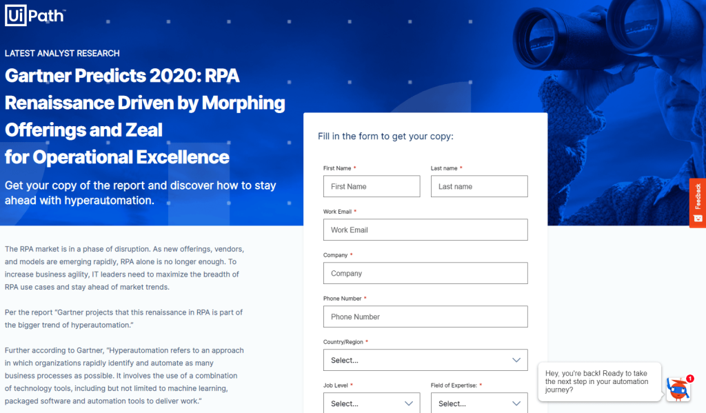
Overview: UiPath is a technology company that builds robotic process automation solutions. Behind this lead form is gated content that visitors can only access after filling in their details.
Key Features:
- Long-Form Assisting Text – In addition to the assisting text above the form itself, there’s an entire half-page of sales copy encouraging visitors to complete the form and access this report.
- Required Fields Indicated – This form requires a lot of information from the visitor – required fields are indicated by the red asterisk after the field title for each field.
- Valuable Offer – The key to the success of this lead form is the value of the offer. Visitors want to see this research from Gartner so much that they’re willing to fill in eight required fields. UiPath uses long-form assisted text to effectively communicate the value of the offer and encourage sign-ups.
Yieldify
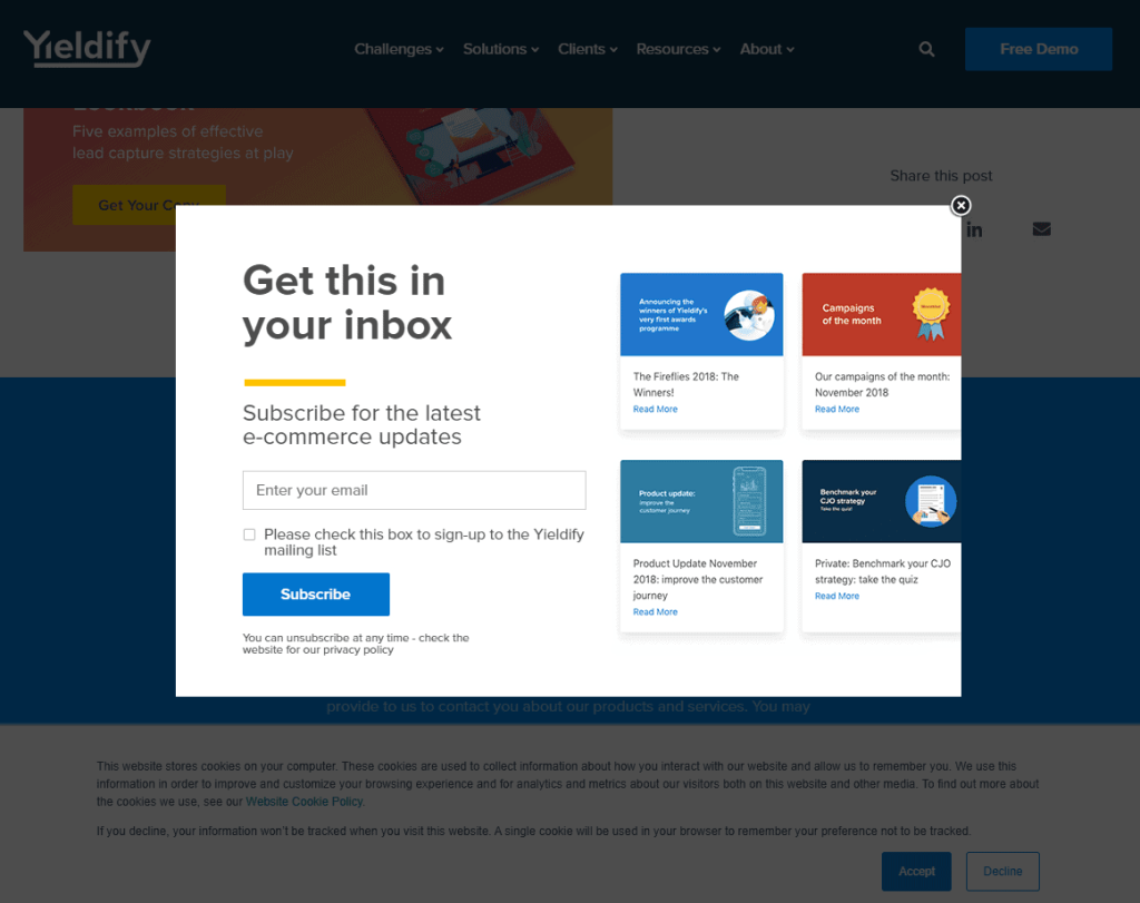
Overview: Yieldify is a customer journey optimization tool for webmasters, digital marketers, and eCommerce store owners. This pop-up lead generation form offers visitors the chance to join Yieldify’s mailing list.
Key Features:
- Ultra-Clean Sales Copy – Every element of this simple lead form is designed to communicate value and expectations to the user. Looking at the header text, assisting text, placeholder text, check-box description and CTA text, users very clearly understand what the offer is and how to take part.
- Content Preview – There are plenty of email submit forms that just say “Join our mailing list and we’ll send you updates.” Yieldify takes this a step further and includes a preview of exactly the sort of content you can expect when you sign up.
monday.com
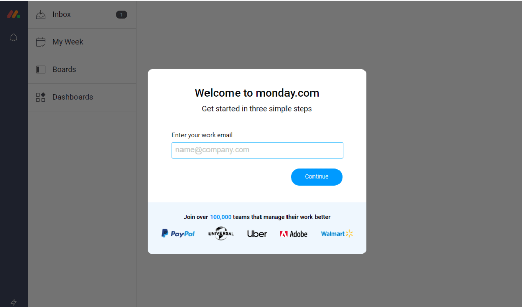
Overview: monday.com is a project management software company that’s experiencing rapid growth. If you navigate to their home page and click on “Create Free Account”, you’ll be taken to the registration form pictured above.
Key Features:
- Content Preview – monday.com operates a three-step registration process, but do you see what’s in the background? This is a different type of content preview where the free trial registration form is displayed as an overlay on top of the software platform. This is a unique way of presenting offer value and helping users feel like they’re just seconds away from getting started.
- Social Proof – Not only does monday.com highlight that over 100,000 teams are using their software tool, they include logos for some of the most high-profile companies as additional social proof.
Shopify
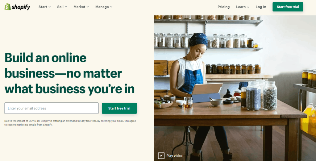
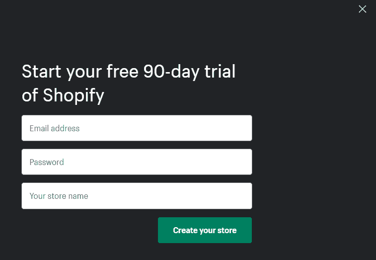
Overview: Shopify is the world’s leading eCommerce software platform. As a response to the 2019 COVID outbreak, Shopify offered new users a free 90-day trial of its platform using this lead form.
Key Features:
- Multi-Step Registration – Users are first prompted to enter just their email address. Once they click on “start free trial”, a screen overlay appears that prompts users to fill in a password and a store name. This two-step process starts by getting the smallest little bit of buy-in from the visitor – just an email address. Once the user is committed to the free trial, it’s only a tiny bit of extra effort for them to create their account and enter a store name. For longer multi-step forms, we would recommend implementing a progress bar to help users track their progress.
- Call-to-Action Text – This lead form uses a different call to action at each step. With the first CTA button click, users are accepting a free trial. With the second, they’re clicking through to create their first store. CTA text is effectively used to communicate value while setting visitor’s expectations for the next step in the process.
Summary
Thanks for reading all the way to the end!
Next, we’d recommend checking out our lead form optimization lesson on Directive Institute. You’ll learn how to optimize form fields, how to select the best form builder for your needs, how to save time with form templates and loads of other useful tips and best practices.
We hope these examples and best practices help you enhance your website lead forms and achieve amazing lead generation results.
-
 CEO
Garrett Mehrguth
Did you enjoy this article?
Share it with someone!
