Three. It only takes three conversion rate optimization tips to advance your team’s sales.
In today’s digital landscape, it’s often beneficial to consume CRO articles with over 10 pointers to lead you to better results. If you want to see these comprehensive articles, I’ve created them for various digital outlets here:
- Moz: How to Optimize Your Conversion Funnel, from ToFu to BoFu
- Moz: 21 Ways to Triple Your B2B E‑Commerce Conversions
- Unbounce: 12 Simple Rules to Boost Your Ecommerce Conversion Rates
- Unbounce: Could the Breadcrumb Technique Help Boost Your Landing Page Conversions?
- Directive: Landing Page Design Best Practices: Increasing Conversions Strategically
However, today, I’ll simplify three tactics further. I’ll provide fundamentals that help to elevate successful CRO campaigns from their mediocre counterparts.
Think of this process as learning how to create the mother sauces of French cuisine. Once you have the main sauce recipe down, you can discover the hundreds of different entrees, soups, and stews that partner well with this sauce.
Many marketers understand the concepts of changing landing page button colors, updating forms to be multi-step, and adding social media logins for eCommerce carts. What is not discussed as often is the power of copywriting and how to sell effectively to your customers. It’s time to open that conversation.
1. Justify Your Value: Focus on Unique Benefits
Have you ever heard the phrase WIIFM? “What’s In It For Me?” Aim to answer this question for your target audience on every web page you create. It’s one of the most vital conversion rate optimization tips there is.
Why should your prospective customers buy from you over anyone else? What language can you utilize that reveals to them that you value their specific needs? Include your team’s unique value propositions upfront as soon as possible.
Take this example from one of our clients.
Original Variant
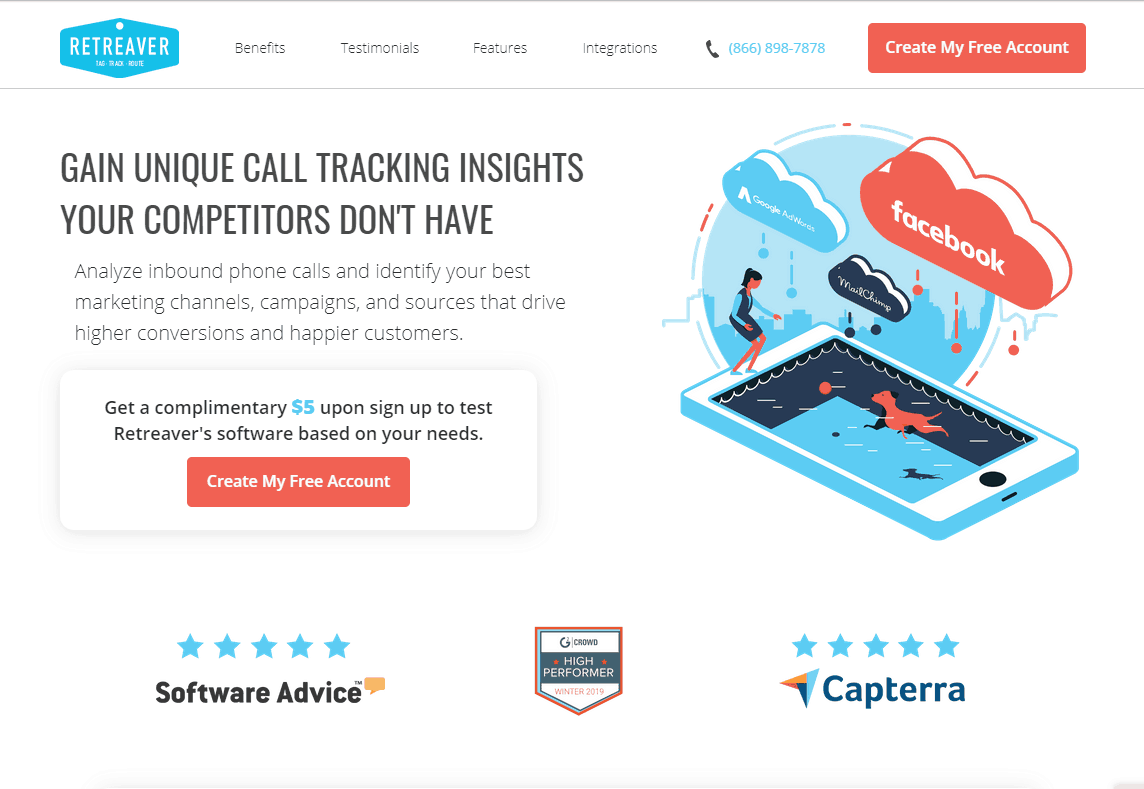
In this initial version, the headline read, “Gain unique call tracking insights your competitors don’t have” and the subheading beat around the bush. Several optimizations can be included here to increase conversions.
Currently, the copy is:
1. Vague and nonspecific. What are the “unique call tracking insights”? This is a statement every competitor could claim about their software too; it doesn’t provide any unique value.
2. Not result-focused. What types of results can these customers predict by using this tool? How much conversion lift could a person expect to see from this?
Additionally, this page’s CTA doesn’t include the enticing language that it could. Why should the customer create a free account for $5? What do you want the potential customer to do?
Revised Version
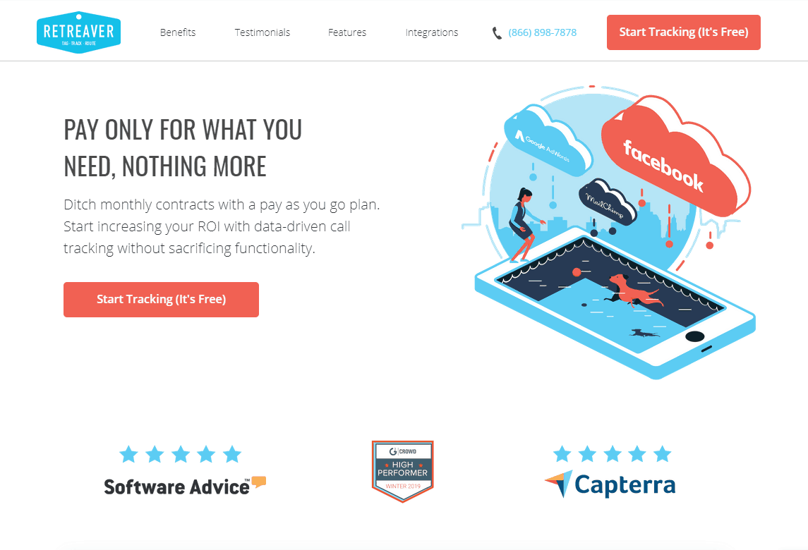
After noting these concerns, the team enhanced the headline, subheading, and the CTA to be more benefit-driven.
Additionally, the new headline read, “Pay only for what you need, nothing more.” This met a customer’s pain point of potentially wasting money or carrying strict budget constraints.
Also, by letting prospects know that they’re not going to be locked into a recurring contract, the copy silences fears they may have around testing Retreaver.
Next, the CTA was updated to “Start Tracking (It’s Free)”.
This copy educates visitors, so they are aware there is no monetary risk involved. It also is distinctive as it varies from the “Free account” verbiage that numerous verticals implement on their sites.

After employing this test, the new variant’s conversion rate nearly doubled. By focusing the copy around the benefit to the customer, these results were made possible. Remember, “WIIFM”?
2. Social Proof is King
Do you even visit restaurants anymore without checking the ratings?
Reviews have become a significant part of B2C and B2B interactions. Whether it’s a restaurant, a hotel, a beauty product, or a new hiring software, prospective customers always look to reviews.
Here are some stats from G2 on how people truly see reviews today:
68% of millennials trust online reviews, with positive ones producing an 18% average uplift in sales. User-generated content is trusted by millennials 50% more than traditional media (Crowdtap via VPDM, 2014).
97% of shoppers say reviews influence buying decisions (Fan and Fuel, 2016).
Displaying reviews for higher-priced products can increase conversion rates by 380% (Spiegel Research Center, 2017).
92% of B2B buyers are more likely to purchase after reading a trusted review (G2 and Heinz Marketing, 2017)
If people are reviewing something as affordable as a sandwich, why should we expect any less from our customers with enterprise products or services? That’s what makes this conversion rate optimization tip is critical.
Each of your prospects long to know what your existing customers have to say about you. This information is likely more valuable to them than what you, the business being reviewed, has to say.
If you’re not using social proof on your website or landing pages, expect to have a much lower conversion rate.
You can utilize social proof in several ways:
1. Ask your current customers for feedback. Apply your testimonials on your homepage, product pages, demo sign up pages, and landing pages to show that real people are advocates of what you offer. Show the trust that your product or service provides.
2. Utilize third-party review sites. Aim to show up in top “lists” that your potential customers review before they land on your website. If your business is B2C, some good sites would be Yelp, Amazon Customer Reviews (for Amazon eCommerce), Choice, and Trustpilot. Angie’s List is great for contractors.
If you are in the B2B space, Google My Business or Capterra, SoftwareAdvice, and G2Crowd are great platforms that people utilize to compare competing businesses. Hubspot covers 26 options here!
3. Develop case studies from your pleased customers. Explain the problem, and, most importantly, the results that your team received for you clients.
Additionally, here’s what you shouldn’t do when working with social proof:
1. Don’t create vague testimonials. This can include, “It’s a great product! I highly recommend it to everyone!” This statement is not providing proof to your prospects of why they should trust your team with their money. Plus, this statement could be said for any product.
- Here’s a great testimonial: “Sumo Logic gives us a higher amount of revenue protection than any other vendor.” – Lending Tree
- Or how about this “Sumo Logic reduced our total cost of ownership by 50%.”
The second testimonial is excellent because it provides real data with the 50% statistic. The more real numbers in your social proof, the more believable you are to your target audience. Additionally, you’re able to quantify your value.
2. Don’t lead case studies with client names. People don’t want to see this. With all respect added, these visitors want to see the results you provided them with instead. Most business websites have a scrolling bar of clients on their homepage and other pages already. So, use your case study to focus on results first and then client logos.
Try the following formatting instead of a vague headline like “CapitalOne partners with Company Name”.

You will notice that Eckstine Electric is still mentioned, but it’s much smaller than the title that states the result. By updating this client’s case study layout to focus around results, we increased engagement with the case studies by 400%.
Here is another successful example. Our client provides car insurance services in a specific location. Although this click-through page was already performing exceptionally well, there was room for improvement.
We wanted to test adding specific user reviews from a trusted review site to add credibility to this smaller insurance company. We chose testimonials that spoke to the most significant pain points of the consumer and added the logo of the review source for quick brand recognition.
Original

Added Social Proof
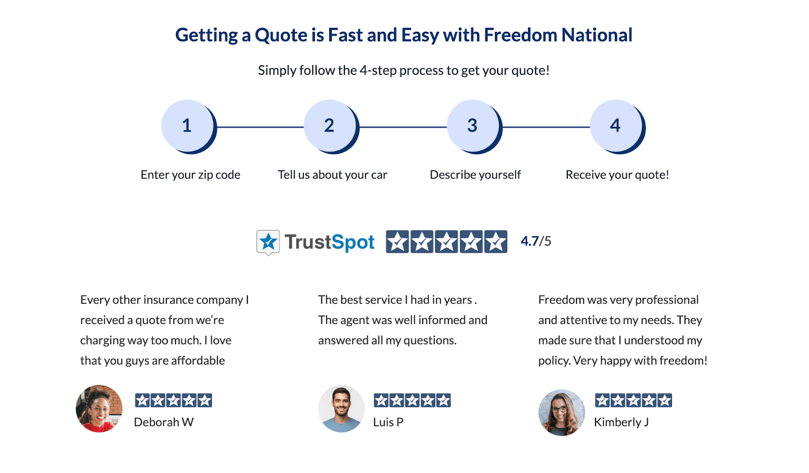
Test Results

After adding this section below the hero, we saw a 65% lift in conversion rate for an average conversion rate of 96.67% in the new variant!
If your homepage is missing any elements of social proof, we recommend that your team tests adding user-generated reviews to build credibility for your targeted audience. You may see your conversions increase by 20% or more.
3. Rethink Your Sales and Marketing Funnel
Another key conversion rate optimization tip is to avoid pushing for a free trial, which is a bottom-of-funnel offering and typically requires a lot of the visitor’s personal information.
Instead, offer a low-friction demo. This also allows your sales team to convince prospects to get a free trial later on.
We naturally aim for every lead to turn directly into a sale. So, we focus on the action that will transform the lead; however, this is not always the best option. If you are finding that offering a trial is not working for months on end, no matter how much you optimize, it may be time to take a step back in the sales funnel.
Instead of pushing free trials, why not offer a demo video in exchange for a prospect’s email address? From there, you can offer a live demo or trial on the “thank you page” of this demo video offering. You can also pitch your live demo/trial in your follow-up email, now that you have the visitor’s email address.
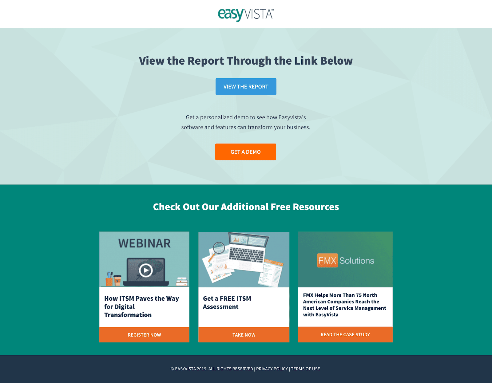
Your offer could read, “If the data presented in our demo video inspired you to learn more, schedule a call with our team so we can answer more of your questions.”
Tie copy like this to your new CTA to get your prospects on board to continue their interest in your product or service.
This may seem backward, but our team has seen a lot of success with this conversion rate optimization tactic. Focus on “baby-stepping” people into the process instead of laying the final step before purchasing on them immediately.
To continue on this topic, our team created a landing page focused around demo requests. This page was not performing nearly as well as we would have hoped, so we decided to change the offer to a demo video.
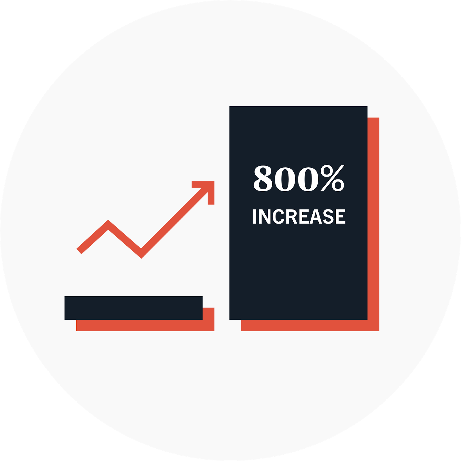
By switching the offering from a scheduled demo to a short 5-minute demo video, we saw a tremendous lift in conversion rates. It made sense when we realized that the people in our target audience were in the awareness stage and were not interested in spending 30 minutes to an hour with a stranger explaining a product that they were not ready to buy.
The demo video outperformed the full demo by an increase of 800%.

Now, these leads may not be primed to sign their name on the dotted line just yet; however, if you are finding no traction at the bottom of the funnel, then it’s worth gathering a larger pool of leads that could potentially have people ready to buy within that pool.
Our test resulted in 71 emails we could nurture vs. only the two from before. Again, not all of these will be qualified, but they are at least in the realm of possibility since they downloaded a demo video.
Moving Toward Prosperity
The primary purpose of this article is to decipher the fundamentals that our team sees broken over and over again. Without these foundational elements in place, marketing teams encounter roadblocks, which halts growth success.
Focus your energy on the acronym WIIFM (What’s in it for me?) when thinking of your target audience in your content. You’ll discover that large portions of your copy will need to be reworked, and that’s okay. Think about the immense potential for increased sales, simply by being more explicit about your real value over competitors.
Next, use all of the social proof you can, wherever you can, to prove your value further. Remember, no one goes to a restaurant without checking ratings. So, expect potential customers to look you up everywhere before they come in contact with you.
Lastly, as scary as it might be to move away from your free trial offer, if you do not see the traction you need, scale back to a live demo or a demo video and move forward from there. You’ll have more potential customers to nurture into the next steps toward a sale.
-
Olivia Ross
Did you enjoy this article?
Share it with someone!

