Imagine you want to take a bath after a long day at work. You run the water at the perfect temperature and walk away for a bit while the tub fills up. You come back several minutes later, but the water has barely risen an inch.
There’s a leak somewhere in the bathtub and you can’t find it. If you had let that faucet keep running, you would have been left with a hefty water bill and no bath to show for it.
Now take this analogy and apply it to B2B lead generation. Your landing pages are the tub, paid traffic is the water flow, and that leak is your lack of optimization on your web pages. There are few things more frustrating for a B2B company than paying for heavy traffic to their site that doesn’t convert visitors into leads.
All of this spending on a traffic flow that leads to nothing – what a waste! Your lead volume can be a huge determining factor in the success of your business, so you must plug these leaks.
Usually, this doesn’t have to do with your B2B product or services. The problem is that your B2B landing pages aren’t built with the customer’s pain points in mind. As businesses, we get so excited about our own products and services that we forget to consider what the customer needs.
Too often, the landing page best practices are unknown or ignored, and these mistakes can end up costing them hundreds of potential conversions.
To avoid these mistakes and more, we’re going to go over easy optimization opportunities that have been under your nose this whole time. These practices ensure your landing pages will not only look great, but they’ll increase your B2B lead generation as well.
Here are three landing page crash courses to get you started.
Hubspot Academy
Unbounce 5-Day Conversion Crash Course
Landing Page Basics from Kissmetrics
G2 Crowd Landing Page Go-to-Guide
But for those of you who already know what a landing page is, let’s dive into how to optimize yours for more qualified leads.
Align Your Landing Page Forms With Your Offers
There are many different steps to the sales funnel process, so your landing pages should match those steps accordingly. For example, someone searching “how to get rid of ants” is in a very different stage of the funnel than someone searching for “Orkin pest control”.
So, if you’re using landing pages for your PPC campaigns and someone is searching for SEO services, you could offer a free assessment of their current search campaigns. Having a form that includes their website URL, phone number, and their marketing budget is appropriate for that giveaway.
On top of matching your landing pages to search intent, different questions should be asked for different offers. Someone who is simply searching for information is not in the mood to give out any personal info.
If you are providing a whitepaper, you’re going to see a big dropoff in leads if you insist on asking for a name, email, and phone number. Why should the customer give their phone number to get a pdf?
They don’t want to talk to anyone, they just want information on how to solve the problem on their own. For the top-of-funnel offers such as whitepapers, ebooks, and case studies, you should stick to only asking for name and email. You can justify asking for the email address because you need that address to send the info to the visitor.
You can’t justify asking for a phone number.
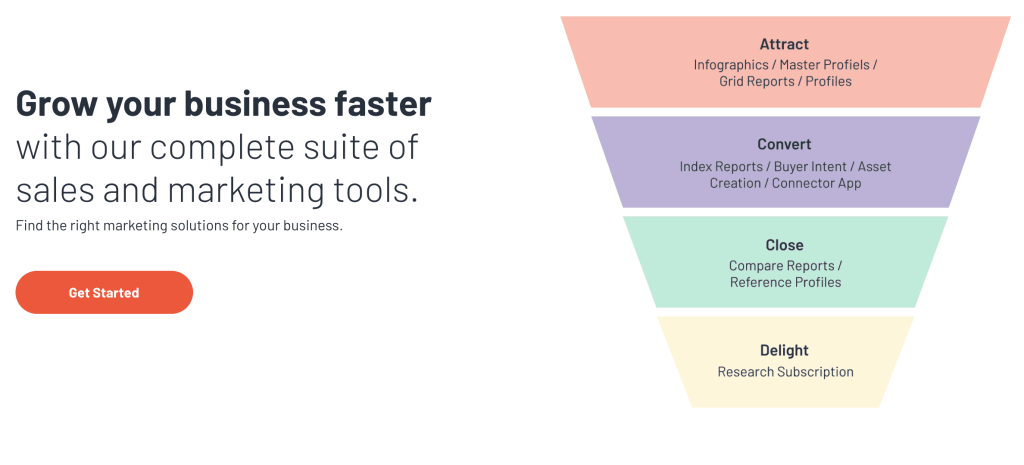
Your goal will always be to capture a lead in one way or another. Visual graphics like G2 Crowd’s vendor funnel help describe exactly how your product or service can help source new business and lead them through each step of the funnel. You can follow up the graphic with a form as well when it suits the situation for your target audience.
Keep Calls to Action Above the Fold
The sole focus of your B2B landing page is to get your users to convert. Therefore, your call to action should receive primary focus on your page. Even if it’s not the first thing your user looks at, it still should be above the fold.
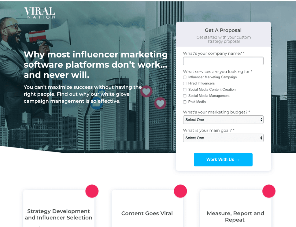
Take a look at one of our landing pages below. You’ll notice that our CTA stands out without the visitor needing to scroll. We also placed duplicated CTAs throughout the page, so the visitor has opportunities to click through as they make their journey down the page.
However, that first CTA above the fold sets the tone for the whole page.
One Call to Action
On your website, the key difference between a landing page and a product page is that a landing page will have only one dedicated action tied to it. Your product pages still have additional links such as the navigation bar and other links going to resources or other information sources.
A landing page should only have one purpose and one call to action. We call this the attention ratio and we want to keep that ratio at 1:1 for all landing pages.
If you have more than one CTA on your landing page, you could confuse or overwhelm your customers. They won’t know which offer they should be clicking on, and they might not click at all.
Why? There is no set action that will greatly reduce your B2B lead generation rates. By keeping only one CTA, you remove all unnecessary distractions from the page.
Because landing pages have a dedicated action tied to them, they tend to have much higher conversion rates than the standard website pages. This is because once a user lands on your landing page, they should only have two options; convert or leave.
Take a look at this page below. There are no navigation links, and no buttons leading to other pages. All of the buttons lead back to the form at the top of the page.
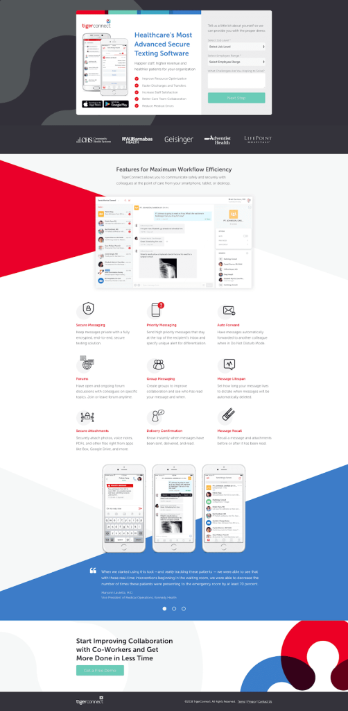
As you can see, once a user lands on this page, they can only submit the form to get the demo or they can exit.
You want your B2B landing pages to be specific and focused. It may seem like a good idea to offer multiple giveaways to capture many different audiences, but landing pages with too many promotions can be distracting.
Include Social Proof or Testimonials
Let’s say you have a premier product that solves all of your customers’ problems. How can you prove to new potential customers that what you are saying is true? This is where social proof comes into play.
Another vital aspect to include on all B2B landing pages is showing proof of your offering. This can come in the form of a quote from a current or previous client, reviews from third-party sites, or awards and badges from prominent publications.
Including social proof should give your users an extra boost of confidence needed to continue down your sales funnel. A visitor won’t give you any of their information if they don’t believe you are trustworthy.
Social proof helps ease that uncertainty. The more positive reviews you have, the more comfortable a user feels. They’re more likely to trust you with their information, and (hopefully) their business.
Using a testimonial from a previous or current client is another essential aspect to include on your landing pages. If you can, include a picture of the client along with the testimonial. For example, the small business CRM company, Highrise, started adding client images with their testimonials and saw their conversion rate rise by 102.5%.
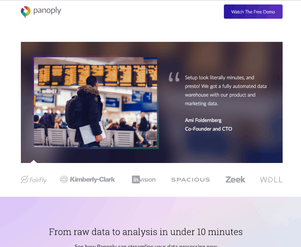
Take a look at the landing page we built for one of our B2B software clients. You can see that it includes testimonials and the logos of businesses that have used their software.
For B2B companies, it’s highly recommended to include a list of partners and previous clients. While online reviews are great, online reviews from known and respected partners are even better. This helps build trust with anyone who lands on that page, even if it’s their first time hearing about this company.
For e-commerce companies, tools like YotPo can help you get reviews from previous customers. These reviews are then integrated into your B2B landing pages.
If you’re in the software industry, you can use a review site like Capterra or G2 Crowd. For more service industries, use Yelp or Google My Business pages. For software development or digital agencies, a site like Clutch.co works great for building reviews.

Use Directional Cues to Draw More Attention to Your CTA
Directional cues are visual aids, like arrows or the eye gaze of a model, that point toward the most important elements of your landing page. This could be your form, the CTA, videos, testimonials, or to push customers to read the information below the fold.
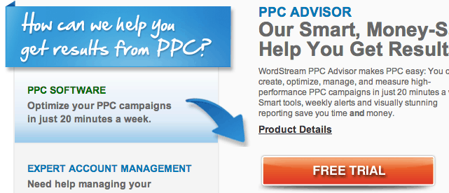
Above, is an obvious example from Wordstream: an arrow that points directly to the CTA.

Above, here is a subtle example from Salesforce: an arrow, created through white space, that points to the form.
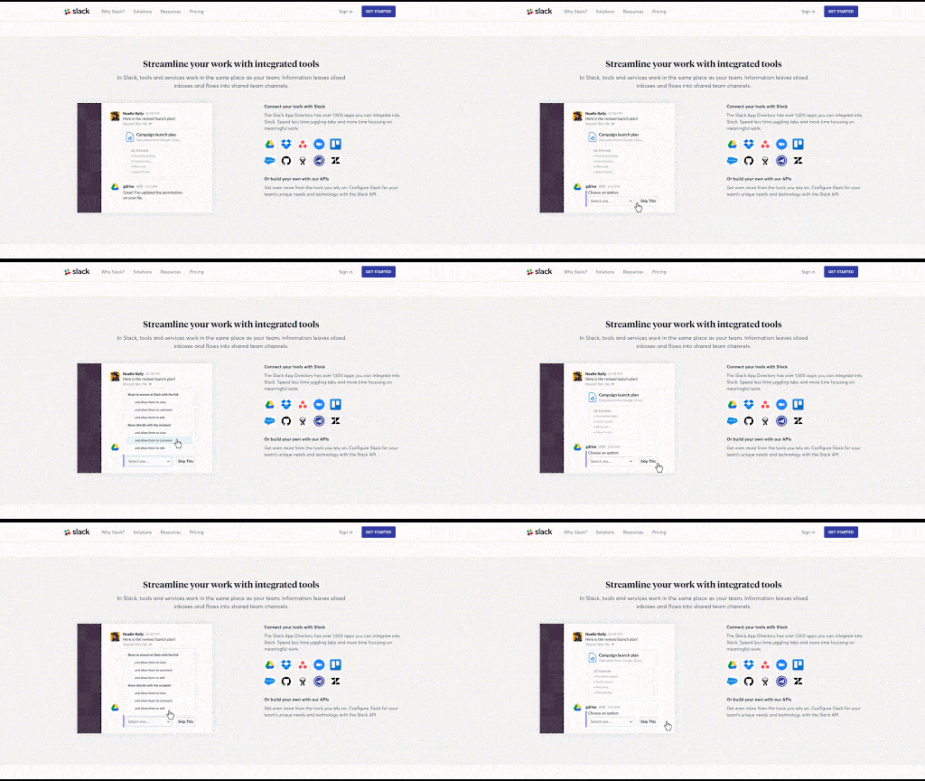
GIFs are another favorable way to draw your visitor’s attention to your CTA. Images can be ignored, and videos can be paused, but a GIF is very hard to miss. Plus, you can use GIFs to better explain your offering!
You’ve heard the phrase, “A picture is worth a thousand words”? Well by that logic a moving picture is worth 10,000! By using GIFs, Slack does a great job explaining some of the things you can do with their software.
Include Important Information About the Details of Your Offer
Imagine you’re in a restaurant and the only thing on the menu is Dinner #1, Dinner #2, and Dinner #3. You’re going to be pretty skeptical to go ahead and order, without fully knowing what comes with what that restaurant is offering.
This is similar to your landing page. Your visitor wants to know exactly what they’re going to get before they hand over any of their information.
However, they also don’t want to read a novel about everything you are offering. That being said, you need to find the right balance of providing enough information, without overwhelming your visitor with a wall of text.
The best way we’ve been able to do this is by providing 4-6 bullet points that explain exactly what comes with our offer.
Additional Tip – Gather Qualitative Data
Some of the best optimization can be achieved by utilizing user feedback. Use software like HotJar or CrazyEgg to analyze user recordings. With HotJar, you can watch actual visitors and see how they interact with your page.
If your landing page isn’t converting at the rate you’d like, the recordings give you insight on where the hiccups in your design are. Maybe visitors are falling off at a particular part in your form, or maybe they’re getting confused with a misleading image that looks clickable.
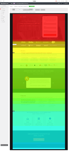
This Hotjar heatmap shows how far people are scrolling on your page. If you’re seeing a drastic drop-off, you may want to consider putting your most important information above the fold, or you may need to change your offer altogether.
The drop-off could be caused because your landing page is not aligning with what people are searching for.
Conclusion
It’s a challenge to balance providing enough information to your visitors without overwhelming them. Focus on your one offer and support that offer with the key information that solves the customers’ pain points. Our call to actions should be easy to find, and they should align with where our lead is in the buyer’s journey.
It’s also important to test different things! While we’ve seen these best practices work well, things change amongst industries constantly. You’ll never know just how high your conversion rates can be unless you’re consistently testing.
Let us know in the comments if these changes helped your conversion rates. We would love to hear about any other optimization tips that have worked for you!
-
Olivia Ross
Did you enjoy this article?
Share it with someone!


