

Conversion web design is all about customizing your website to drive more lead generation, more sales, and more revenue into your business.
When users land on your website from a Google search or a referral link, you’ll have an opportunity to convert them into paying customers. Doing so requires more than spiffy sales copy, however – you’ll need a solid web design that’s optimized at every level to make your visitors more likely to convert. Your website is like your online storefront: if it doesn’t look attractive and inviting, folks simply won’t want to shop there – regardless of how compelling your products and offerings might be.
To help you make the most of your upcoming digital marketing campaigns, we’ve put together 10 quick tips on how to optimize your online lead generation and sales with conversion web design. We’ll show you how to support your sales copy with effective web design elements that make visitors to your site more likely to convert into paying customers.
Conversion Web Design: 10 Tips to Increase Online Leads & Sales
Create One Landing Page per Ad Campaign
Our first tip is related to both web design and pay-per-click (PPC) advertising strategy.
If you sell a product or service online, you should have identified ideal customer personas, representations of the types of people most likely to purchase and benefit from your products.
We recommend creating one ad group for each established customer persona when building a PPC advertising campaign. Each of your ad campaigns should target a single ad group (and by extension, a single buyer persona) with a highly targeted message designed to appeal to that specific audience.
To maximize results, digital marketers should design a unique landing page for each ad campaign. This creates an end-to-end advertising experience that is personalized and specific to an established ideal customer persona, making it highly relevant and more likely to result in conversions.
Implement a Visual Content Hierarchy
A content hierarchy simply means that some content on a page is more important than other content and that the most important content should be emphasized in the right way to drive user actions.
Web designers can use many different tools to establish a content hierarchy on the page and guide the attention of their visitors to the desired actions. First, however, web designers should understand how users are most likely to engage with the pages that they create. Human users in the United States are used to navigating two different kinds of content hierarchies:
- Z-pattern Hierarchy – For a website with lots of images and minimal text, a human user would be likely to scan the page using a Z-pattern. That means scanning a page from left to right, then diagonally down to the bottom left, then across the page again, as if they were reading lines of a book.
- F-pattern Hierarchy – For a website with lots of text, most users would scan the page in an F-pattern. Users may not read every word right away. Instead, they may look across the top of the page, then start looking down the left side for clues about where to find useful content, then scan from left to right again once some interesting image or text captures their attention. This F-pattern is one of the most commonly observed results when measuring how users interact with web pages.
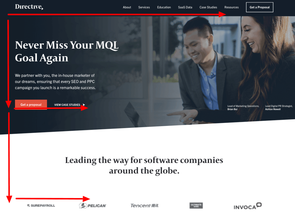
Image: Pay attention to how content on this page is organized in an F-pattern, catering to the natural tendency of users to engage with text-based pages in this way. We expect users to read the top navigational menu first, where they’ll encounter the first CTA on the page. Then, we expect they’ll scroll down until they encounter other attention-grabbing elements, like our above-the-fold CTA and logo carousel, prompting them to scan across the page. These page elements are organized into a visual hierarchy that is familiar and accessible for our visitors.
By understanding the ways that humans interact with and browse individual pages, conversion web design experts can position the most important design elements in the right places where they will have the maximum impact on conversions.
Use Colors & Contrast to Emphasize Key Elements
Colors and contrast are two additional tools that web designers can use to emphasize the most important on-page elements and drive conversions.
If there’s an element on the page that you really want your visitors to interact with, make sure visitors notice it by giving it a unique color that contrasts well with the background.
If there are two separate-but-related elements on the same page, give them the same background color and your visitors will naturally group them together. In the same way that you can emphasize similarity by using the same background color, you can emphasize differences by using two different background colors.
The best conversion of web designers understands how to communicate and direct their prospective customers using color and contrast.
Optimize CTA Design and Positioning
A call-to-action (CTA) is a phrase on your website that tells your visitors exactly what action they must take to advance to the next stage in the customer journey.
How you design your CTAs and where you position them on the page are both critical elements of conversion rate optimization. Try the following tips to see improved conversions on your site:
- Avoid text-based CTAs or simple hyperlinks.
- Use a brightly-colored CTA button to capture the attention of your website visitors.
- Choose a color for your CTA that contrasts well with the background.
- Place CTAs in the middle of the page above the fold, or on the right side of the top navigation menu.
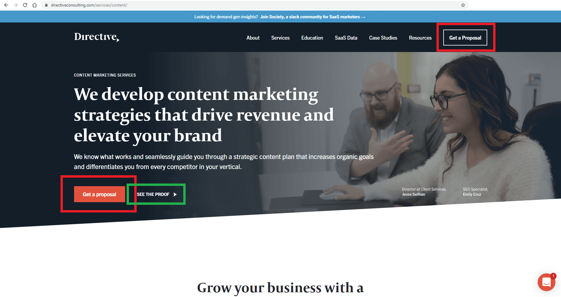
Image: We’ve optimized our CTA placement on this page with high-contrast CTA buttons in the top-right of the navigation menu and above the fold on the left. There’s also a secondary “See The Proof” CTA for visitors who aren’t ready to get a proposal yet.
Optimize Lead Generation Forms
If one of the goals on your website is to generate leads for your business, you may have one or more lead generation forms present on your website. Optimizing the design of your lead generation forms can reduce friction for your visitors, leading to improved conversions. Here’s how to get started:
- Position your lead generation form above the fold.
- Shorten your lead generation forms by reducing the number of form fields and collecting the minimum required information.
- Include a clear offer of value, and a promise of convenience and privacy when presenting a lead form to your website visitors.
- Include a powerful CTA with your lead generation forms to encourage visitors to take action.
Use Engaging Visuals & Human Faces
When a visitor lands on your website for the first time, you may have just a few seconds to engage that person and capture their interest.
As it turns out, compelling visuals and images of real humans are two of the best ways to accomplish this.
Image: Human images engage audiences, trigger emotions, tell a story and build trust in just a few seconds, helping you connect with your visitors and drive downstream conversions.
The human brain processes images 60,000 times faster than it processes text, and up to 90% of the information that gets transferred to the brain is visual. From that perspective, a picture really is worth a thousand words when it comes to capturing the attention and sparking the interest of audiences.
Pictures of humans have an added dimension of effectiveness when it comes to driving conversions. A picture of your team members featured on your website builds trust with your audience, humanizes your business, and puts your potential customers at ease when dealing with you.
Incorporate Social Proof
The concept of social proof is based on the idea that when individuals aren’t sure how to act in am ambiguous situation, they are likely to look at others for behavioral cues to inform their actions and decision-making.
Here’s what that means from a marketing standpoint: if a customer isn’t sure whether to buy from you or from the competition, you may be able to influence them by demonstrating that their peers have already bought from you and been satisfied with their purchase.
There are several ways of incorporating social proof into your conversion web design:
- Publish case studies or customer success stories describing your past successes
- Publish the logos of companies you have worked with in the past next to your lead generation forms and CTA buttons
- Publish raw data on your website indicating how many successful projects you’ve completed, or how many customers have purchased your product
- Publish testimonials from your past customers on your landing pages
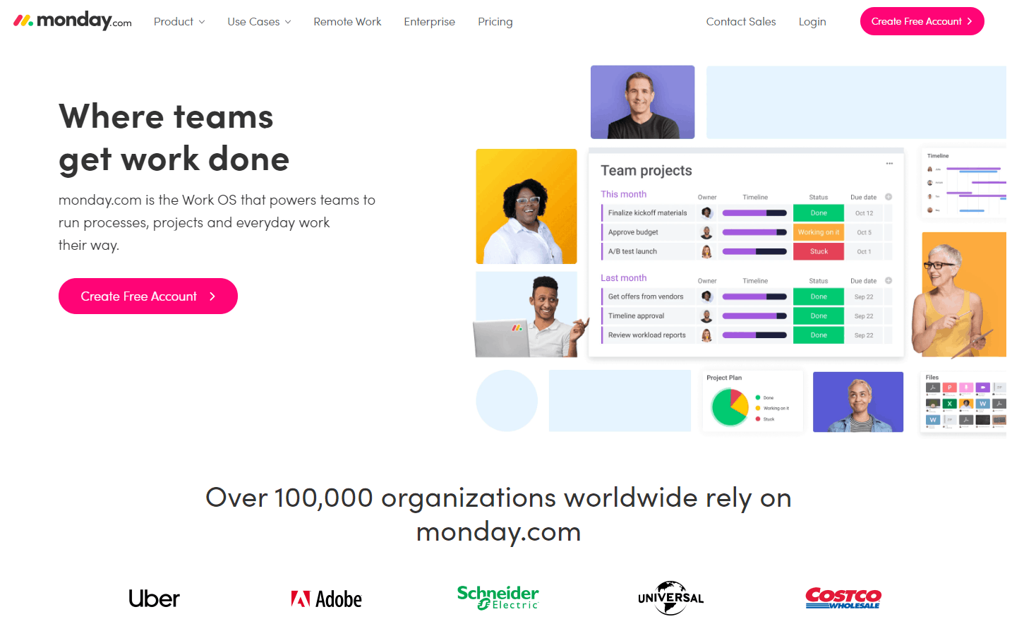
Image: Monday.com uses social proof on its home page, including raw data on its user base and the logos of some of its best-known customers and partners.
Narrow the Options for Your Visitors
Your website should be designed like a sales funnel, with each page playing a role in ushering visitors through the customer journey, from initial awareness to the final purchase.
If a page contains too many links to different areas of your website, you’re increasing the likelihood that a potential customer will navigate their way out of your sales funnel. To avoid this, it’s important to avoid giving users too many options on each page that can distract them from the desired action that you would like them to complete.
Build a Mobile Responsive Site
One of the easiest ways to ruin conversions on your website is to design a website that only works on desktop machines.
In 2020, more than 50% of all Google searches are expected to originate from mobile devices. If your website doesn’t work properly on mobile devices, Google will avoid listing your web pages in the search engine results and you’ll miss out on loads of traffic and conversion opportunities.
To avoid this, a conversion web design specialist would build a mobile responsive website with elements that automatically change their orientation to look and function perfectly on devices of every type and size. Marketers can use a free mobile-friendly test provided by Google to verify that their website works well on all devices.
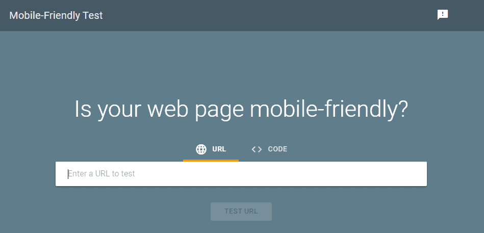
Image: Google’s Free Mobile-Friendly Test is a diagnostic tool that checks whether your website looks and functions properly on mobile devices. Just type in your domain and you’ll be able to access a virtual render showing exactly how your website looks on mobile.
Minimize Page Loading Times
Page speed has a massive impact on user behavior, including downstream conversions. We live in a consumer culture where your website visitors simply don’t have the patience to wait for a slow page to load.
A case study published by mPulse found that pages loading in 2.4 seconds had a 1.9% conversion rate, while pages that loaded in 5.7 seconds had a conversion rate of 0.6% – that’s nearly a 70% loss in conversions due to 3.5 seconds of page loading time!
Even Google found that when page load time goes from 1 second to 3 seconds, the probability of page abandonment increases by 32%. When load time goes from 1 second to 5 seconds, the probability increases by 90%.
The best way to get a handle on your page loading times is to audit your website using Google PageSpeed Insights.
Summary
Thanks for checking out our exclusive guide to conversion web design and reading our 10 web design tips to help improve your online leads and sales.
For an even deeper look at how to leverage conversion-boosting design elements on your website, visit our comprehensive lesson on Directive Institute.