- Technology
- Methodology
- Verticals
- TechnologyTechnology buyers evaluate many solutions before deciding. We help companies stand out and capture demand when buyers research and compare platforms.IndustrialIndustrial buyers research solutions long before engaging vendors. We help manufacturers increase visibility, generate demand, and support complex sales cycles.ServicesService businesses grow when expertise is visible and trusted. We help firms turn credibility into consistent pipeline by strengthening their digital presence.
-
- Divisions
- PerformancePerformance captures demand and converts it into qualified pipeline. We combine media, SEO, creative, and revenue operations to accelerate measurable growth.CommerceCommerce drives revenue across ecommerce and retail platforms. We optimize the full purchase journey—from discovery to retention—to fuel sustained growth.CommunicationsCommunications builds influence, credibility, and audience engagement. We connect brands with creators, communities, and media to expand reach and strengthen brand presence.
-
- Capabilities
- DIVISIONSCAPABILITIESContentDrive qualified traffic and pipeline with performance-driven SEO and content built around how modern buyers search.Paid MediaCapture high-intent demand and accelerate pipeline growth with full-funnel paid media strategies.Performance CreativeCreate high-performing creative built for testing, optimization, and conversion across modern advertising platforms.ProgrammaticReach high-value audiences at scale with data-driven programmatic advertising that maximizes efficiency and impact.Revenue OperationsAlign marketing, sales, and data systems to improve pipeline visibility and enable scalable revenue growth.StartupsLaunch and scale growth programs for startups with lean strategies built to accelerate traction and pipeline.CAPABILITIESMarketplaceIncrease product visibility and revenue through optimized marketplace strategies across major retail platforms.Lifecycle MarketingIncrease customer lifetime value with targeted lifecycle programs that deepen relationships, reduce churn, and drive repeat revenue at every stage.ShoppingMaximize product discovery and conversions with optimized shopping campaigns across search and retail media networks.
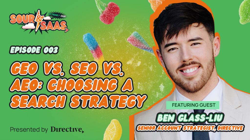
B2B Discoverability That Drives Revenue
DiscoverabilityOS helps B2B brands win visibility where buyers research and shortlist solutions.CAPABILITIESInfluencerBuild trust and reach through influencer partnerships that connect your brand with engaged audiences.Organic SocialGrow brand authority and engagement with strategic social content designed to strengthen your presence.Paid SocialDrive awareness, engagement, and pipeline with targeted paid social campaigns across leading platforms.PRIncrease brand visibility and credibility through strategic public relations and earned media coverage.A Smarter Way to
Generate CustomersDiscover how our methodology connects marketing execution to measurable pipeline growth.PERFORMANCECOMMERCECOMMUNICATIONS
-
- Resources
- WE CAN HELP YOUResources Library
 WE CAN HELP YOU
MORE RESOURCES
ABOUT
-
- Book Intro Call