Looking for strategies that can help you increase website conversions and generate more leads, sales, or revenue from your online marketing efforts?
Increasing conversion rates on your website is one of the best ways to generate big improvements in your marketing results with relatively less effort.
Increasing traffic to your website can take weeks or months to positively impact your revenue and lead generation numbers. In contrast, spending just a few minutes or hours on conversion rate optimization (CRO) can have an immediate and positive effect on how well your website converts visitors and supports your marketing campaign objectives.
To help you get started, we’ve created this resource with 10 tips to increase website conversions. We’ll highlight 10 of the best website changes that can increase your conversion rate and maximize the results of your digital marketing efforts.
[optin-inline id=’whxnqh7trrgis2o7fppx’]
10 Tips for Increasing Website Conversions
Create Unique Landing Pages for Each Ad Group
One of the most important best practices for increasing website conversions is creating individualized landing pages for each of your ad groups. Here’s why:
Advertisers enjoy the best conversion rates when they provide audiences with personalized and contextually relevant experiences.
To achieve this in PPC advertising, advertisers can customize each ad group around a clearly defined customer persona, then create advertisements with messaging targeted specifically to that ad group/customer segment.
This measure on its own is likely to increase CTR, but advertisers can go a step further by creating unique landing pages for each ad group. Landing pages should include offers and messaging that appeal specifically to the target ad group or customer segment, resulting in a more cohesive ad experience and increased conversions.
Optimize Lead Generation Forms
The design of lead generation forms on your website can have a significant impact on the number of leads you generate through your digital marketing efforts.
While optimizing lead generation forms is something we always recommend, that doesn’t necessarily mean you should implement every lead form optimization tip you can find. Common advice like removing unnecessary form fields are likely to boost conversions, but can also result in fewer conversions in some cases!
The key is to carefully test variations of your lead form to determine which one performs the best.
With that said, here are a few ways to get started:
- Enable autofill so users can fill in their information more quickly.
- Remove form fields that aren’t absolutely necessary.
- If you can’t avoid having a long lead generation form, consider breaking it up with a multi-step form.

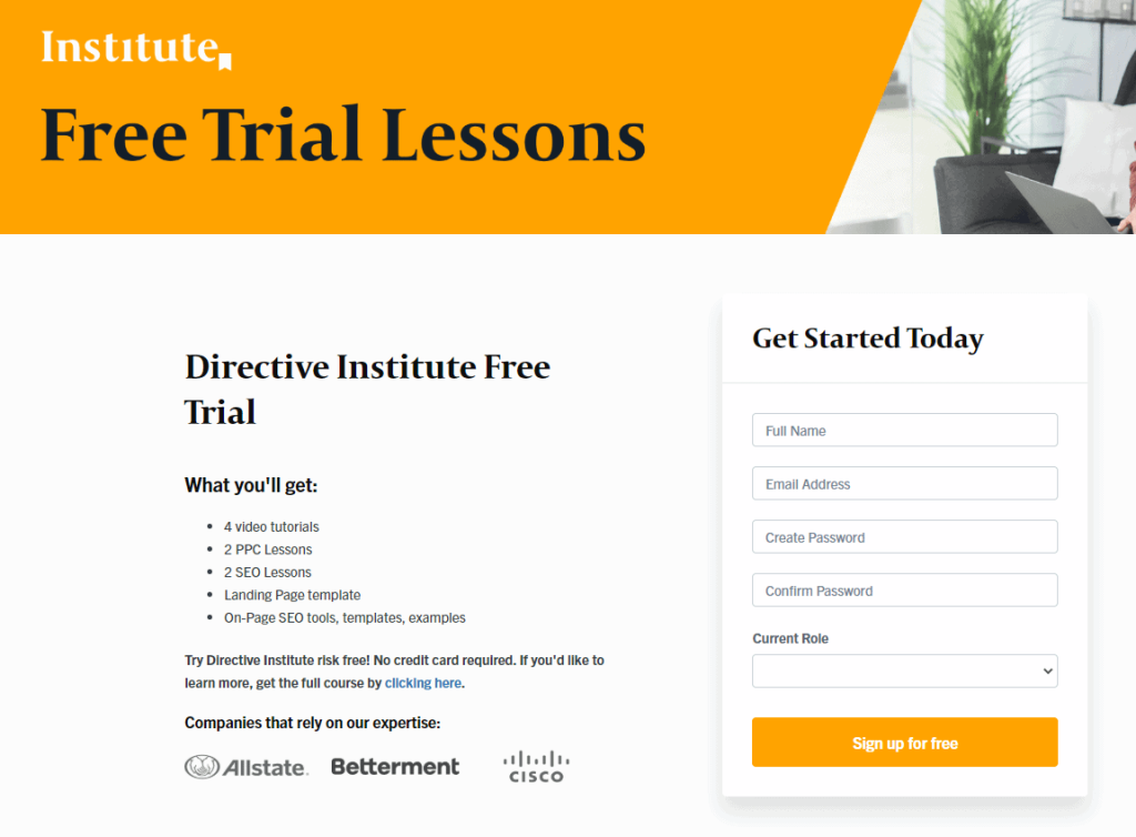
Image: We’ve optimized and shortened our sign-up form for the Directive Institute Free Trial, hoping to encourage more of our readers to register and experience our insightful marketing lessons and video tutorials.
Communicate Your Unique Value Propositions (UVPs)
Your unique value proposition is the core element of your marketing message. It consists of a short sentence or a few words that describe the benefits of your product, the pain points that your product addresses, and how you’re different from competitors in your niche.
Your landing pages should prominently display your unique value propositions, enabling visitors to quickly understand exactly what it is you’re offering and why they should be interested in doing business with you. High-converting websites also use their home page, product pages, and text advertisements to promote unique value propositions – you should too!
Test Alternative Calls to Action (CTAs)
A CTA is an image, button, or line of text on your website that explicitly asks users to take a specific action, such as signing up for a free trial or purchasing a product or service.
While text and image CTAs are still used in many different contexts, we recommend using a brightly-colored CTA button on your website that stands out and grabs user attention.

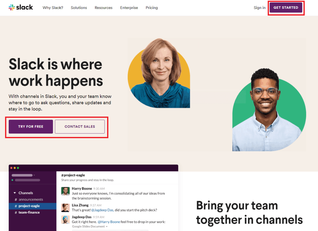
Image: Slack uses high-contrast CTA buttons on its home page. These buttons are positioned above the fold and amidst plenty of negative space, making them immediately noticeable for visitors to this page and increasing the likelihood of a conversion.
There are many different techniques you can use to increase the power of your CTAs:
- Use direct or imperative language
- Trigger the Fear of Missing Out (FOMO)
- Position some social proof near your CTA button, like a testimonial or the company logos of your happy customers
- Change the color of your CTA button
- Change the position of your CTA button on the page (place it above the fold!)
- Offer exclusive content or a free benefit for visitors who respond to the CTA and complete the objective
Test Alternative Copy Elements
When you’re working to increase website conversions, you may be surprised at the results you can achieve simply by testing alternative sales copy on your landing pages.
Again, the key here is to test. Don’t assume that making a change will boost conversions – use an A/B testing software tool to create a variant and test your change against the original before you decide whether it’s really an improvement. You can test any element of the sales copy on your website, including:
- Headlines
- Images
- Subheadings
- Page Length / Amount of content on the page
- Social Proof
Use Pop-ups and Sticky Bars
Pop-ups and sticky bars are extra features that you can add to your website to increase conversions.
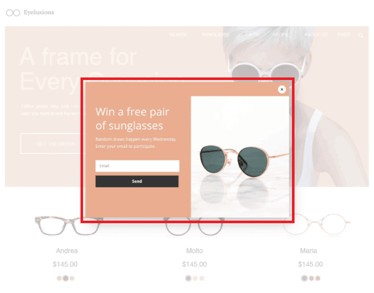
Pop-up offers can be customized to trigger at key times, such as right before a user is about to leave the page. Use pop-ups to present exclusive offers or connect visitors with content that encourages them to stick around.
Sticky bars are pop-ups that stick to the top or bottom of the page, keeping your best offer visible to users as they scroll up or down.

Image: Landing page software tools like Unbounce can help digital marketers implement pop-ups and sticky bars to drive conversions.
Remove Distracting Elements
Each page on your website should be designed with a goal in mind – a specific action that visitors can take to advance to the next stage in the customer journey.
To increase the likelihood that your website visitors will complete the desired action, one of the best things you can do is take away distractions and minimize the options that your visitors have besides completing the goal.
That means reducing the number of links on the page, taking away distracting images or advertisements, and using white space to ensure that your most important page elements (unique value props, hero image, social proof, CTA button, etc.) immediately grab the attention of your visitors.
Secure Your Transactions
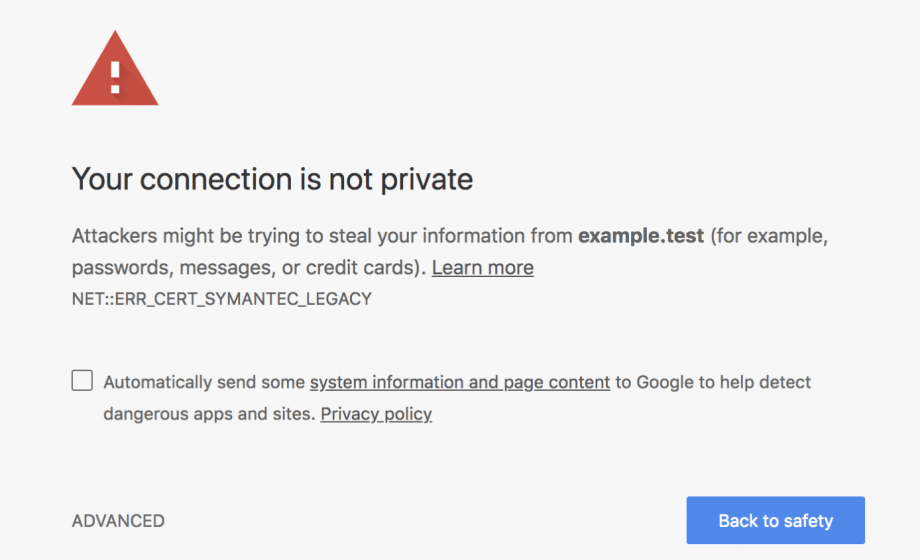
Beginning in 2017, the Google Chrome browser started showing a “Not Secure” message when users complete a lead generation form on a website that does not use SSL encryption.

In addition to securing your website with an SSL certificate, it could be beneficial to add a “Trust Badge” to your checkout screen. There’s plenty of evidence that including a trust badge on your checkout page increases customer confidence that their privacy and security are being safeguarded, making them more likely to complete a purchase as a result.
Create Urgency
Sometimes a little bit of urgency can nudge customers towards a conversion, making them feel like there’s an opportunity for a great deal even if their intention was just to browse.

You can communicate urgency in many different ways, but the key is to offer something valuable that’s only available for a limited time. It could be a discount on a product, a bundle deal, free shipping, a unique product colorway, or something else unique to your niche.
Offer a Free Trial or Money-Back Guarantee
If you’re selling a subscription product, your potential customers may consider it a big risk to pay up-front for your product without having tested it before.
To get around this, offer a free trial period during which customers can test out your software and make sure it’s right for them before purchasing. When a user signs up for a free trial, collect their contact information and use it for follow-up or email re-marketing to complete the sale.
Summary
Thanks for checking out our 10 tips for increasing website conversions!
For a more in-depth intro to conversion rate optimization, check out our Intro to CRO course on Directive Institute.
-
 CEO
Garrett Mehrguth
Did you enjoy this article?
Share it with someone!
