


If you’re struggling daily to increase your website conversion rate, you have arrived at the right place. Let’s talk about the crucial importance behind landing page design.
Most of us know the basic outlines that make up a landing page including a headline, forms to fill out, social proofs, and more. However, we get caught up in this checklist and skip obvious details and miss the opportunity to let our creativity shine as we test different page elements.
I have compiled seven different tips and tricks to help review and re-evaluate key elements on your landing pages to ensure they are on the right track for effective and maximized performance from the second they launch.
1) Unique-Value-Proposition-Focused (UVP-Focused) Headlines
The headline is one of the major pieces on a landing page that people lay their eyes on; it’s literally the first thing they see! However, they are often too vague and unclear of what a service or product does that would captivate a prospect to want to purchase or learn more.
Incorporating the unique value proposition of your service or product in the headline is a powerful way to combat this. If you get stuck on this portion, start by asking what makes your service or product unique and how it benefits your audience.

Does the software help your audience do more productive work by reducing the amount of time from manually inputting data? Does the product have specific features that assist in solving financial or management issues? If the solution saves money for your customers, how much does it save on average?
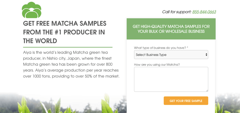
One of our client’s landing pages saw great improvement in performance by constructing a headline this way. We altered their original copy of “Producing the Highest Quality Japanese Matcha Green Tea for 130 Years” to “Get Free Matcha Samples from the #1 Producer in the World” which clarified what people can receive from the offer and why they should count on this particular matcha brand.
The result?
87 percent conversion rate increase!
Crafting a headline that addresses emotions and major pain points of the industry you are targeting will, not only, sell a service or product better, but it indicates how a company is empathetic and understanding as a brand.
2) Prospect-Focused Calls to Action
Next, let’s take a look at the wording for your landing pages’ call-to-action (CTA).
Make sure your offers match your audience’s needs and fine-tune how you present offers on your pages. Make sure to make it real for them, will your product or service actually benefit them?
A good starting point would be to first evaluate whether the current language demands the customer to work in order to get something or to just simply receive something. For instance, there is a clear distinction between “Schedule a Demo” and “Get a Demo.”
The connotation of the first CTA invokes the feeling that prospects need to put in the work to schedule in order to obtain a demo, whereas the second CTA shows it is an effortless process to receive the same offer.
Another approach is to shift the wording from the company’s perspective to customer’s point-of-view. You can easily accomplish this by exchanging the “you” or “your” to “my” or “me,” speaking from their viewpoint rather than selling the service or product to the prospects.
For one of our clients, we tested two different types of CTA offers to see which would outperform the other.
Originally, the CTA button stated “Get a Quote,” but after changing the CTA to “See My Savings,” it increased the conversion rate by 63%!
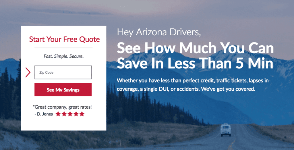
These results show the importance of understanding how to word offers in a way that is digestible to the right people. Remember, the key is to relate to your audience as much as you are able to!
3) Micro-Commitments on Forms
It is common for companies to list out the least possible number of questions that they need in order to capture the people’s contact information, such as first name, last name, work email, phone number and company name in their forms.
Caution: this type of system may be harming your conversion rate! We often forget to take into account that these standardized questions are in reality, actually threatening as we are fundamentally requesting people to risk their valuable, personal information.
In most cases, it is still necessary to collect this information into the database for further follow-ups with potential customers. This is where the micro-conversion technique comes into play.
This is an effective way to create a flow that operates alongside with the human psychology that has natural inclination to want to finish a task that a person has started.
To describe a similar technique, Kendra Cherry states, “…marketers start by asking for and obtaining a small commitment. Once you have already complied with the first request, you are more likely to also comply with a second, larger request.” Source
Making the form into a multi-step form is a great way to implement this technique on a landing page to ease people into the process. The forms can be separated into two to three different steps by asking less threatening questions in the first step.

You can begin by asking questions to learn prospects’ industries, buying cycles, job roles, organization size, type of solution they are interested in, budget, etc.
To maximize this method, you can kill two birds with one stone by asking lead-qualifying questions that your sales team or specialists ask during a call, demo, or trial to identify which prospects you want to keep in touch with.
We ran an experiment testing two variants, one with multi-step form and then another a regular one-step form in the hero section.
The one-step form consisted of fields asking personal and company information, including first name, last name, business email, phone number, company, and job title.
On the other hand, the multi-step form variant utilized the micro-conversion technique by asking low-threat questions like “What kind of company do you work for?” and “Number of Employees,” which is shown below.
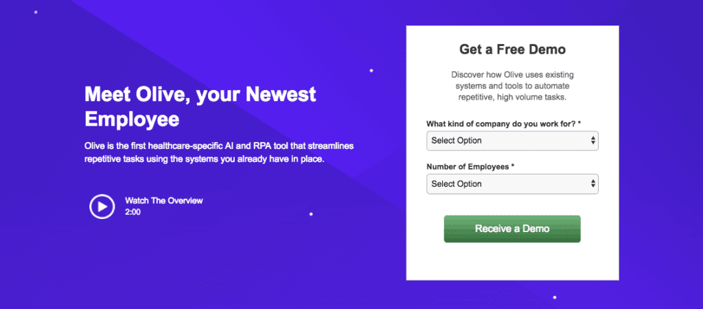
After capturing form submission from the first step, people are led to the second step with the same exact questions as the one-step variant.
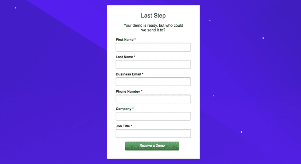
With this method, we got an amazing result of capturing 65 percent more conversions than the regular form variant. When putting this into practice, it’s crucial to proceed in requesting contact information while showing progress as people proceed to the next step!
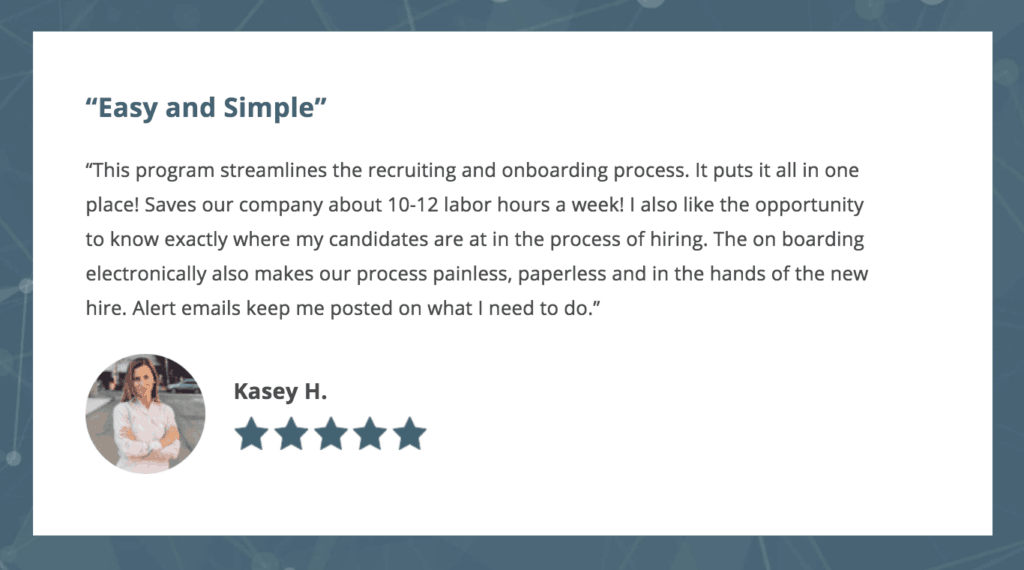
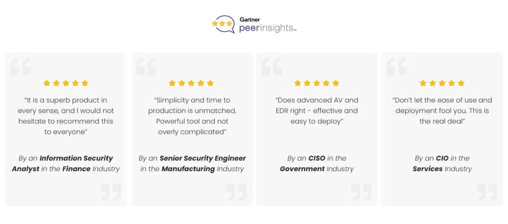
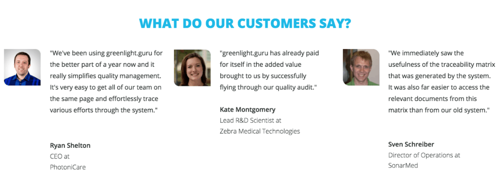
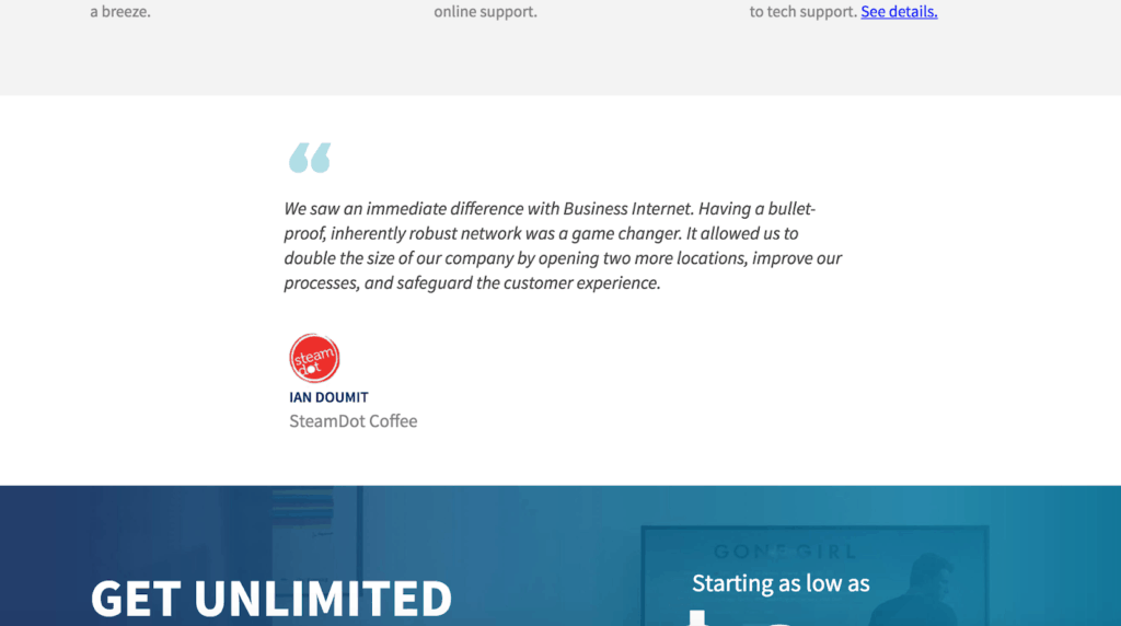
4) Social Proofs
Social proofs are an essential part of a landing page. These include customer reviews, testimonial videos, star ratings, and more, and they can significantly increase your credibility.
If you already have these on your site, great! Don’t forget, there are always ways to enhance these sections to make them more compelling.
Here are solid tips and tricks to boost your social proof section(s):
A. Are your customer testimonials specific about the results that they got? Does it mention how much money they saved? Or how convenient it is to use?
Let’s avoid simple quotes such as “This product is great!” and take advantage of this portion to mention the real benefits and UVPs again.
B. Are you using reviews from platforms that your prospects consider credible and trustworthy? As a software-as-a-service company, it’s beneficial to consider gathering statements from places like Gartner, G2 Crowd, and other review sites.
If you do, make it crystal clear where they are from to increase reliability in the quality of your service or product.
 C. Are you matching reviewers’ demographics to your target audience’s background in the right context? If you are working to reach enterprise companies, do your social proofs also show that you have worked with other enterprise clients? On the other hand, if you are trying to focus on getting small business clients, are the reviewers and logos from other small businesses?
Are you talking to majority-women demographic? And are you drawing an audience who are mostly in their mid-thirties or forties?
With these in mind, attaching headshots next to the quotes can serve as visuals to connect prospects to their peers or ideal selves to increase your website conversion rate.
We recently launched a new landing page experiment for a page that didn’t have a social proof section.
Since the intent is to sell a business-specific solution, we made sure to add testimonials from companies that tell the stories of how this service has helped or is helping them in their system.
This way, prospects are able to differentiate the offer from others as one that can work well with businesses like their own.
As we had expected, this brought us a delightful mark of 35 percent increase in performance.
5) Be Transparent
“Transparency” is a hot word for a good reason. People trust in services and product produced by honest brands that prioritize giving to others rather than just taking from them.
From this point-of-view, it is also beneficial to implement some aspects of transparency in your landing pages.
Now, there are multiple ways to do this, but I find transparency in the “customer journey” works well to boost people’s confidence in converting on our clients’ landing pages.
Take a look at this example.
Originally, I wanted to keep one of our clients’ landing page short and sweet by only including a “hero section” and some social proofs; but by adding a section to show all of the steps that a person needs to go through in order to get a custom quote, I actually increased the conversion rate by 21 percent.
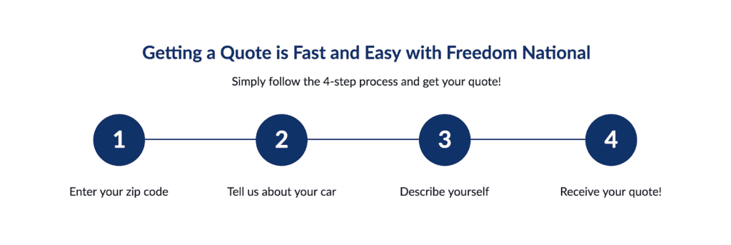
This goes to show that prospects entrust their valuable information to companies that are willing to clearly state what they can expect up front.
6) Directional Design
In this context, directional designs are visual cues that direct people’s attention in the right order to get through major touchpoints on a landing page.
At the end of the day, the ultimate goal should be guiding people to the right CTA by providing critical information along the way before prospects decide whether or not they want to take on the offer.
Here are a few ideas worth testing on your landing pages:
- Add an image or GIF of an arrow. This is especially effective when an arrow is pointed toward a CTA button.
- Use diagonal lines or shapes that lead to information. Not only does this make the page look more dynamic, but also leads the eye toward the bottom of the page fold, visually informing viewers there is more content when they scroll down.
- Make use of background images of people looking or objects pointing in the direction of an intended area on the page.
Here is another clients’ landing page that successfully executed directional designs.
Initially, we already had a good outcome from using a hero image of a nurse looking toward the headline and CTA, which ushered viewers’ attention to the places we wanted them to focus on. Later, we also added an arrow that lent more emphasis on the CTA button.
This added arrow created a 37 percent uplift in conversion rate. Small changes can make a big difference!

7) Positive Color Reinforcements
Last but not least, run experiments on different colors that encourage your visitors to take a specific action or focus on a certain element.
I’ve come across many landing pages where clients limit color choices based on brand style guides. Though brand consistency is important, it’s also necessary to let creativity shine in order to see a better performance on landing pages.
There are certain colors that generate positive emotion, some neutral, and others, negative feelings. It is even ingrained in our own environment as we have learned to stop at red, slow down on yellow, and to go on green traffic lights.
One of our clients had seen a rise in conversions by 28 percent by simply changing their CTA button from red to green, in spite of the fact that it is not part of their brand color palette of red, white, black, and grays.
It’s not guaranteed that people will always click on a green button, but it’s definitely worth discovering which color compels your target audience to convert or even what turns them away.
Increase Conversion Rate!
All in all, what makes or breaks your landing page conversion rate is whether or not you successfully communicate your UVPs. As you communicate them, be sure you’re understanding human thinking patterns and addressing pain points in a particular industry or people group.
Remember, it’s about meeting your audience’s needs, not your own!
Your potential growth is limitless when you develop language connecting you with your potential customers’ emotions and core values through excellent design and copy in your headlines, CTAs, forms, social proofs, and imagery.
Let’s get to it and start watching your website conversion rate skyrocket.
Author Bio: Grace Pan – CRO Designer
Grace Pan is a CRO designer at Directive, a leading B2B and enterprise search marketing agency. After graduating from Biola University with a bachelor’s degree in fine arts in 2016, Grace continued to pursue learning how to cohesively integrate design and business.
Through different touchpoints, Grace discovered CRO design and became even more absorbed in understanding the human psychology behind how customers and businesses interact with other businesses (B2B).
Combining her print and digital design knowledge and experience, Grace now serves both Directive and its clients to create impactful designs by applying top-of-the-line CRO practices, overall increasing conversions and exceeding their business goals.
Outside of work, you can find Grace attending concerts, watching her favorite artists talking about their work, obsessing over good food, and traveling to do missions work in Japan. In summary, she enjoys creating and being around others who are also passionate about their creative pursuits in life.