Imagine you run a 24-hour restaurant. You have hundreds of patrons coming in all hours of the day and night staying for various amounts of time.
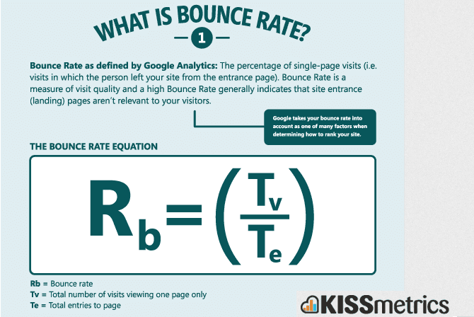
However, a large portion of your patrons only stay five minutes, never order anything, and then leave. This same thing could be happening on your website. Your bounce rate is the percentage of all users who enter and exit on the same page, without any clicks to other pages on your site.
The higher the rate, the higher the percentage of prospects coming and leaving without exploring your other pages, filling out a form, or buying something.
A bounce might be triggered by any number of events:
- Returning to search results
- Closing the browser
- Entering a new URL in the address bar
- Following an outbound link
- Staying inactive and timing out the session
- Reading the entirety of a page but not triggering any events, and then leaving
A high bounce rate is proof that something is amiss with your strategy. Either you’re attracting the wrong crowd, or your target audience is correct, but they are not having a good user experience on your site.
So, I’ve put together a short list of 6 proven tactics you can incorporate right now to drastically reduce your bounce rate and improve conversions on your website and landing pages.
Is your bounce rate too high? It’s the perfect time to find out.
What’s a good bounce rate?
Unfortunately, there’s not one answer for this. What is considered “good” is based off many different factors: the page type, the industry, plus some areas in need of optimization, such as page speed, irrelevant content, or unclear CTAs.
Most websites see bounce rates fall somewhere between 26-70%. In general, a bounce rate in the range of 26% to 40% is excellent, 41-55% is average, and 56-70% percent is higher than average, but may not be cause for alarm depending on the website.
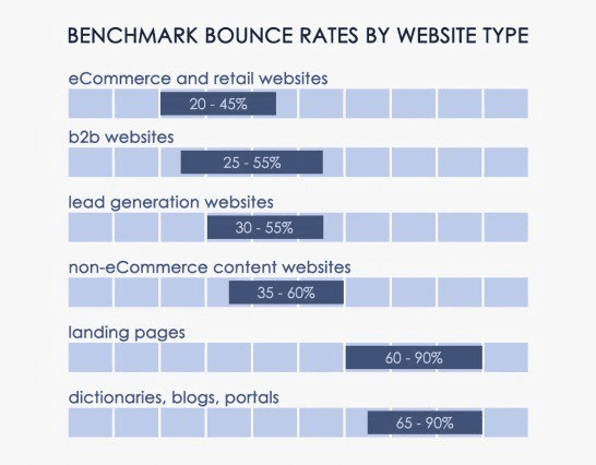
Anything over 70% is disappointing for everything outside of blogs, news, events, etc. So if you’re running a blog, may that give you hope! Custom Media Labs has a nifty infographic breaking down the average based on website type.
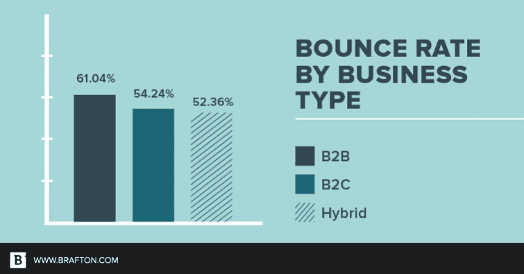
This graph shows general averages for business types, but consider digging deeper into the specifics of your industry. For example, the difference in benchmark bounce rate between the food and drink industry and the real estate industry is more than 20%. To check this, you’ll want to use the benchmarking feature on Google Analytics. Just open the Benchmarking options found in the Reporting tab under Audience.
This will let you see the data for over 1,600 industry categories. You can filter by traffic level (5000-9999 sessions) and geographic location (United States – All Regions).
Compare bounce rate to time on site
Assuming you use Google Analytics, you will have seen the Average Time on Page metric right alongside Bounce Rate. As the self-explanatory name suggests, this is the average amount of time all users spend on a chosen page.
However, this is more of a guideline than an exact measurement. This is because Google Analytics (and other analytics platforms) require two clicks to accurately calculate Time on Page; an “entrance” click and an “exit” click, which is usually a click on a navigational element that leads off of the page.
How many times have you left a tab open for hours but weren’t actually viewing it? Well, Google considered all of that time as if you were viewing that page for 8.5 hours because you never exited the page.
Also, if you close the tab without exit-clicking, Google considers that as a bounce – even if you read the whole page top to bottom. Therefore, many marketers are moving away from bounce rate as a metric as it’s not reliable. Now they are using so-called “attention metrics” such as dwell time and scroll depth. Although it’s improbable to accurately determine your bounce rate, it’s still worth trying to keep your bounce rates low.
Optimize page load time
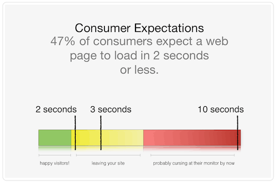
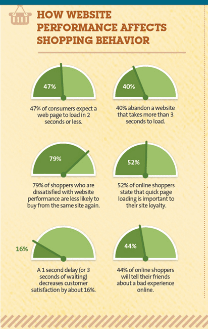
What’s the point of spectacular content if it takes forever to load? 47% of users expect a web page to load in two seconds or less, making on-page optimization crucial to reducing your bounce rate.
This is especially true for mobile sites. According to data from Radware, a connection speed delay of just 500 milliseconds can result in an increase in “peak frustration” of more than 26%, and a decrease in engagement of 8%.
A slow site can ruin your business and keep prospects from buying from you. Considering that Google rates site speed, your business could also drop in rankings. These consumer behavior statistics explain it simply:
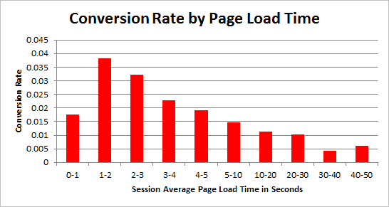
Smart Insights proposes that faster loading pages usually see higher conversion rates. Even if your conversion rates are already stellar, an improved bounce rate will only help more.
Find out your site speed by using Google’s helpful tool called PageSpeed Insights. This grades your website and provides suggestions on what you can do to improve your speed. Once you analyze your site through this tool, you will discover what needs to change to improve site speed.
Check mobile bounce rate
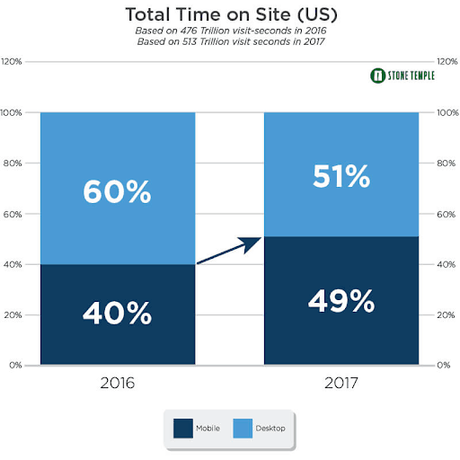
It is now common knowledge that the majority of people browse on their phones more than their desktop, and that gap continues to grow every year. 95% of your customers are on mobile, which is why optimizing for mobile is so important.
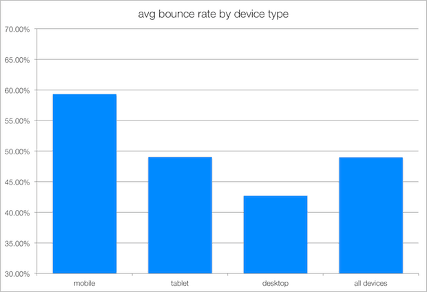
Mobile users are also more likely to bounce across the board, so it stands to reason that any website with a large, growing percentage of mobile traffic will see a higher bounce rate.
Ensure that your site is responsive on all devices. Whether your customer views your site on a desktop, iPhone, iPad, Android, or a tablet, make sure it is displayed correctly.
Test your site, by following these steps:
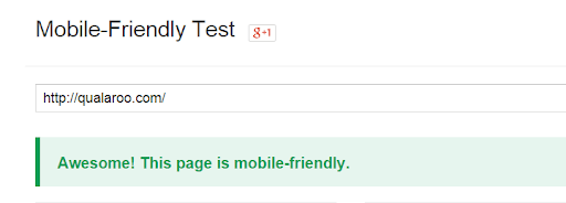
#1: Analyze your site using Google’s mobile friendly test tool. Plug in your site URL (e.g., qualaroo.com). Click the “ANALYZE” button:

#2: Once the page processes, You’ll see the result. A mobile-friendly result looks like below:
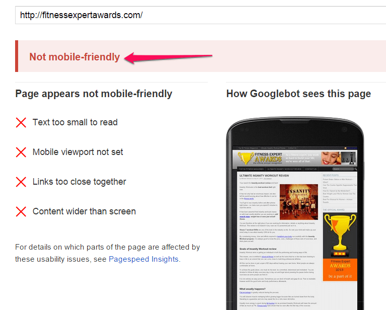
A non-mobile-friendly page will show this:
NARS Cosmetics launched a mobile-responsive site and increased its smartphone checkout conversion rate by 54% (24% for tablets), and they cut their higher bounce rate in half… all in less than two weeks.
Attract the Right Visitors
If you sell crochet needles and other knitting products, which group of people do you want on your site: males ages 18-24 or females ages 65-80? I’m sure there’s a USC student out there with a mean purl stitch, but you’re probably going to get better business from sweet older women.
Higher bounce rates can be caused by getting the wrong visitors on your site. This is why 58% of marketers plan to increase their paid distribution budgets. They’ve seen the impact of the right content on the target audience.
Also, keyword optimization is essential for directing users to your site. Be aware of who your visitors should be and deliver content that speaks to their needs and interests.
Brian Dean boosted his conversions by 785% in one day, with A/B split testing, because he recognized that the traditional ebook giveaway is no longer effective for building a massive list.
Instead, he created the “content upgrade” strategy, which is now a marketing standard.
Here’s a breakdown of the 5-step process:
- Find a high-traffic page on your site.
- Identify a resource that would make the content better.
- Create that resource.
- Add the resource to your site.
- Get more email subscribers.
Many content marketers assume high bounce rate is caused by a lack of quality content, but one person’s definition of quality is not the same as another. Lengthy articles of 2000 words or more are considered quality since they usually address most of the questions the target audience might have.
However, for entertainment, health, or finance, shorter, “snackable” content is preferred. A piece of content that is technically considered quality could still be the wrong content for your target audience. You have to continually reach out to them, via the right channel.

For example, LeadPages launched LeadDigits and their users started to implement it on both desktop and mobile targeting. Those users are seeing an average conversion rate of 91%.
When you create the right content and use the right channels to distribute it, you will reach the audience that is actually interested in what you are selling. Once you’re targeting the right people, you will notice that your bounce rate will greatly improve.
Create relevant and readable content
According to Hubspot, companies that produce blog content generate 126% more leads than those that don’t. However, on top of getting the right people to the right content, your content has to make sense.
If what you’re writing is challenging to read, you probably won’t see many people sticking around. User experience begins when your content is readable and legible. The quality of your messaging is dependant on more than spellcheck.
Too much text is overwhelming to the reader, so the copy needs to quickly communicate to the prospect the following:
- You understand their need.
- You have a solution that could solve this need.
- They need to just take the next step.
If you’re not hitting these key points, a visitor will bounce and not continue.
You can test how readable your site is at www.read-able.com.
Here are some tips to provide credible and readable content for your prospects:
- Include correct spelling and grammar (obviously).
- Make your contact information visible at all times.
- Include the appropriate use of headers.
- Have frequent subheadings to explain your topic a bit more than just user a headline.
- Use suitable images and break up heavy blocks of copy with photos, charts, gifs, quotes – anything that breaks up the monotony of a wall of text.
- Include lists to explain benefits or points worth noting.
- Bold keywords a few times but not too much!
- Give readers an invitation to participate by asking lots of questions in your content. It helps prospects to think more critically about your message.
- End your content with a subheading entitled “conclusion.” This tells the reader to quickly read the last few words and take action. Make your conclusion actionable.
- Link to external sites that reference your company.
Now that you have readable content being read by the RIGHT audience, you need to keep it going! By consistently adding fresh content, you’re gradually building awareness of your brand and establishing trust.
This means that your repeat visitors will begin to exceed new visitors, which begins to increase your conversion rate. You can generate more revenue from repeat visitors because you’ve established a level of trust with them.
Learn more about quality content creation by clicking here!
Use compelling CTAs
There’s a reason why we suggest one CTA per landing page. If you provide too many options, you could overwhelm your prospects leading to a bounce. Your visitors should have no doubt about the action that you are asking then to complete, so they need to be able to quickly find what they are looking for and not have to choose between getting a demo, getting a free trial, or just downloading a guide.
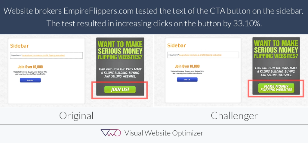
Do you think “continue” is a clear CTA? Does that tell you as a visitor what you are expected to do next? By making your calls to action very specific, you will keep confusion and concerns at bay, promoting your visitors to continue through the sales funnel. Check out this example from VWO.
Think about user intent and where your visitors are in the sales funnel. How are your pages going to provide a solution for these prospects? Make sure your CTA is clear and relevant to potential customer’s needs.
Avoid too many different offers, ads, or pop-ups
I’m sure we’ve all been annoyed by a pop up that showed up right when we landed on a home page, giving us no chance to look at anything else but that cheesy newsletter sign up request. If you’ve ever left a website because of its intrusive pop ups or ads, then you’re not alone.
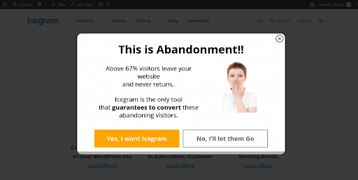
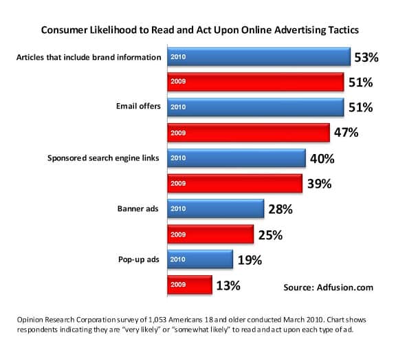
According to statistics, only 14% of consumers will consider responding to a popup ad, compared to 51% who respond positively to email offers. However, as obnoxious as they can be, popups still work and can grow your email list very quickly. Just as anything in life: everything in moderation.
If you want a site with a steady flow of organic traffic, consider limiting or avoiding popups altogether and instead focus on the user experience of your site.
Conclusion
We’ve gone over several different ways to reduce your bounce rate, which will, in turn, increase your conversion rate. If your site loads too slowly, expect a higher bounce rate. If your content is irrelevant to your audience or difficult to read, expect a bounce there too. Research your audience, find out what they’re looking for, and craft your content to their needs.
This is a gradual process so don’t expect an improved bounce rate overnight. You will need to continue creating relevant content regularly to keep growing your audience and repeat customers.
Try these tips out and share what worked for you. What were your results? Happy testing!
-
Olivia Ross
Did you enjoy this article?
Share it with someone!

